Status Bar
In this Topic ShowHide
 An area in a screen or a window to which the messages reflecting the current state of an application execution (for example, error messages) are displayed.
There is a possibility to configure different Status Bar views by applying the corresponding Template Name to the status bar element.
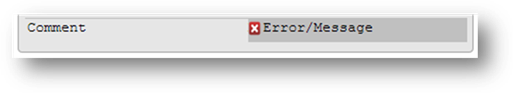
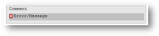
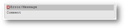
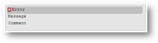
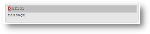
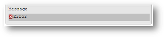
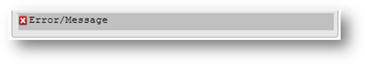
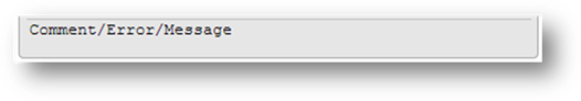
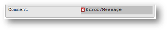
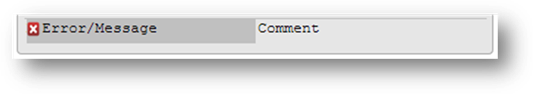
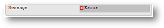
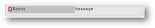
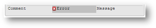
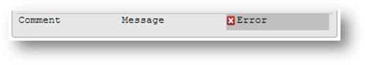
Predefined Template Names for the Status Bar
Here is the list of the predefined template names with the screenshots illustrating how they influence the status bar appearance at runtime:
How to Modify the Status Bar Appearance With a Theme
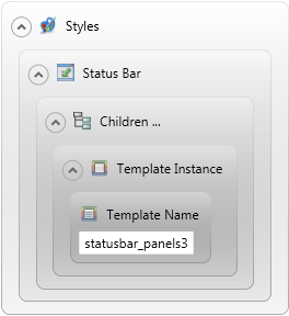
To apply the template name property to the status bar, it is recommended to use the theme filters in the following sequence: Status Bar element -> Children filter -> Template Instance element -> Template Name property.
E.g., the template name "statusbar_panels3" should be performed as illustrated below.
Design Area
Theme Syntax
<ElementFilter ElementName="StatusBar">
<StyleSheet>
<ChildFilter>
<StyleSheet>
<ElementFilter ElementName="TemplateInstance">
<StyleSheet>
<DoStyleAction>
<SetProperty>
<PropertyPath>
<PropertyName>TemplateName</PropertyName>
</PropertyPath>
<PropertyValue>statusbar_panels3</PropertyValue>
</SetProperty>
</DoStyleAction>
</StyleSheet>
</ElementFilter>
</StyleSheet>
</ChildFilter>
</StyleSheet>
</ElementFilter>
Usage
On setting the "statusbar_panels1" as a template name with a user theme we recommend to set the Background -> FillColor property for the message, as if it happens that both comment and message labels appear simultaneously at runtime, the content of these two labels will overlay each other as their backgrounds are transparent by default. The code snippet below illustrates which filters should be used to prevent any undesirable consequences:
<ElementFilter ElementName="StatusBar">
<StyleSheet>
<ChildFilter>
<StyleSheet>
<ElementFilter ElementName="TemplateInstance">
<StyleSheet>
<DoStyleAction>
<SetProperty>
<PropertyPath>
<PropertyName>TemplateName</PropertyName>
</PropertyPath>
<PropertyValue>StatusBar_Panels1</PropertyValue>
</SetProperty>
</DoStyleAction>
<ChildFilter>
<StyleSheet>
<ElementFilter ElementName="Label">
<StyleSheet>
<WithPseudoClassFilter PseudoClassName="Message">
<StyleSheet>
<DoStyleAction>
<SetProperty>
<PropertyPath>
<PropertyName>Background</PropertyName>
<PropertyName>FillColor</PropertyName>
</PropertyPath>
<PropertyValue type="CustomizedColor" RedColor="230" GreenColor="230" BlueColor="230" Alpha="255" />
</SetProperty>
</DoStyleAction>
</StyleSheet>
</WithPseudoClassFilter>
</StyleSheet>
</ElementFilter>
</StyleSheet>
</ChildFilter>
</StyleSheet>
</ElementFilter>
</StyleSheet>
</ChildFilter>
</StyleSheet>
</ElementFilter>
How to Modify the Status Bar Appearance From Within 4GL
Besides the status bar modification by setting the required template name with a theme, it is possible to control the status bar appearance from within the 4GL source code as well. This can be done by specifying the corresponding style attribute:
OPEN WINDOW w1 AT 1,1 WITH FORM "f1" ATTRIBUTE(BORDER, STYLE="panels3")
CALL w1.openWithForm("w1", "f1", 1, 1, "STYLE=/"panels3/"")

The style attribute names which are used to modify the status bar appearance correspond to the predefined template names for the status bar without the 'statusbar' prefix, e.g.: statusbar_default = default, statusbar_lines1 = lines1, and so on.
Related topics:
OPEN WINDOW
openWithForm()