Step 4: Formatting the chart

When you have selected the chart type and bound the chart to the data set, you can format your chart.
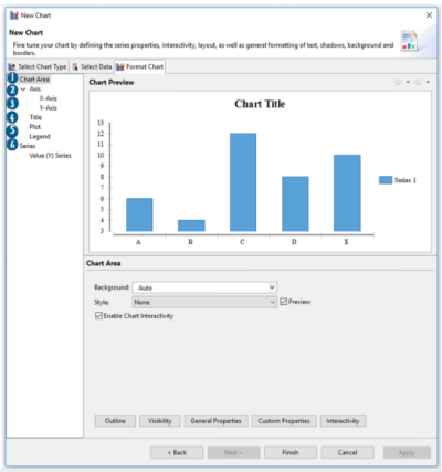
The Format chart tab of the New Chart wizard allows you to style your chart including its title, series, plot, legend and axis.
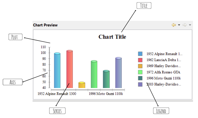
The Format chart tab includes several sub panes where you set the series properties, interactivity, layout, general formatting of the text, etc.
The Format chart tab allows you to format your chart step-by-step:
Preview pane changes depending on which part of your report you are formatting:
Formatting options
Chart area
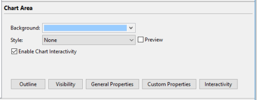
The Chart area pane allows you to customize the chart background and to apply styles to the chart:
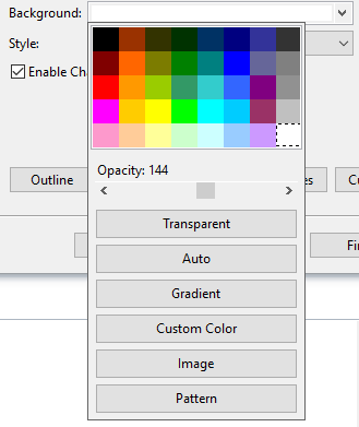
In the Backgroundfield, you can:
- select one of the default colors or a custom color for the background
- make the background transparent
- apply any gradients
- set an image for the chart background
- choose a pattern to serve as the background, and
- change the background opacity
 ,
,
You can format the chart area by applying styles.
To apply a style, select it among the available ones in the Style drop-down:

By checking the Preview checkbox, you allow preview of the changes in the Chart Preview pane:

By checking the Enable Chart Interactivity checkbox, you make it possible to add triggers to different parts of the chart, so that it stops being simply an image and becomes interactive (e.g., making chart bars clickable and connected to other report pages):

In the sub-panes of the Chart area, you set properties for the chart axes as well as its title, plot, and legend.
Axis
In the Axis pane of the Format chart tab, you can format the chart axis.
Below the first image shows the general pane for both axis, and the second image shows the same pane but for a separate axis:

In the general pane, you can:
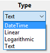
- set the axis type - DataTime, Text, Linear, Logarithmic:
- change the color of each axis,
- make an axis visible or invisible,
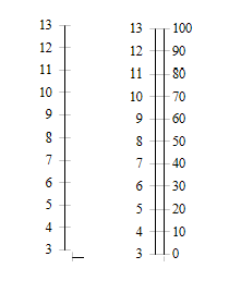
- arrange the series separately (on different sides of the chart) or together side-by-side (for several y axes):
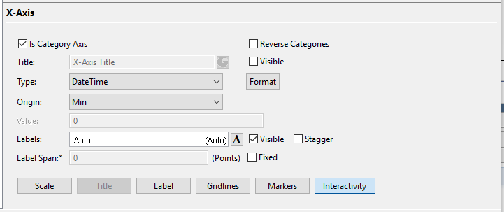
For a separate axis you can:
- set its title;
- define the axis origin - max, min, or value;
- define the axis type, and
- format the axis.
Title
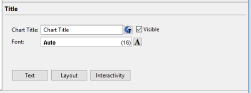
In the Title pane of the Format chart tab, you add, modify, and remove title for the chart.
To add the title to your chart, you
Step 1. Check the Visible checkbox.
Step 2. Type-in the name in the Chart Title field.
Step 3. Format the title.
The Titlepane includes these buttons:
|
|
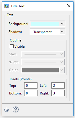
opens the window where you can specify the properties for the title text, its outline, and insets:
|

|
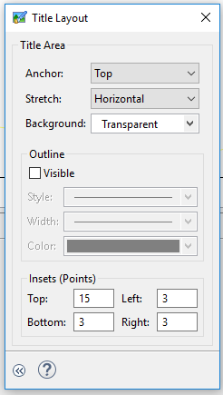
opens the window where you specify the properties for the title area - e.g., legend position, orientation, anchor, stretch, background, direction, etc.
|

|
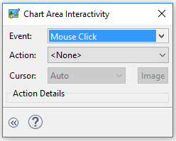
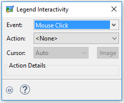
opens the window where you can add actions to the title:
|
Plot
In the Plot pane of the Format chart tab, you can format the plot area of the chart:
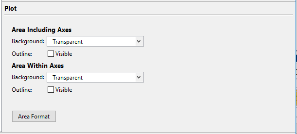
For example, you can
- customize the colors of the plot area;
- set different colors for the area including axes and area within axes (or make them uniform);
- make the plot outline visible or invisible:
|
|
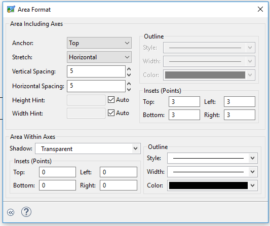
opens the window where you can modify both areas including axes and area within axes - set anchors, stretching, and spacings; add outlines, etc.:
|
Legend
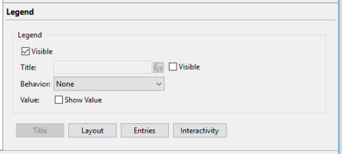
In the Legend pane of the Format chart tab, you can format the legend of the chart:
To add the legend, you
Step 1. Check the Visible checkbox.
Step 2 (optional). Check the second Visible checkbox and type-in the name in the Title field to add the legend title.
Step 3. Format your legend
Here is a description of buttons in the Legendpane.
|
|
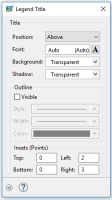
opens the window where you modify the title position as well as its font, shadow, background, outline, and insets: |
|
|
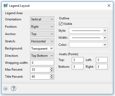
opens the window where you specify the properties for the legend area:
Here you can set the legend position, orientation, anchor, stretch, background, direction, wrapping width, outline properties, etc. |
|
|
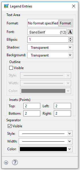
opens the window where you modify the properties of the entries text, position and outline:
|
|
|
opens the window where you add actions to the legend.
|
Series
In the Series pane of the Format chart tab, you can:
- style the bars,
- add labels to the bars,
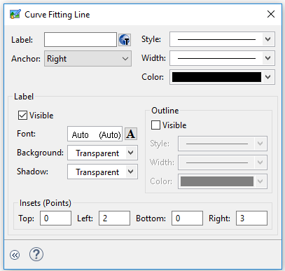
- add curve fitting lines for the bars, and
- make bars interactive.
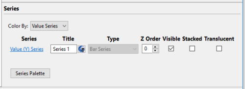
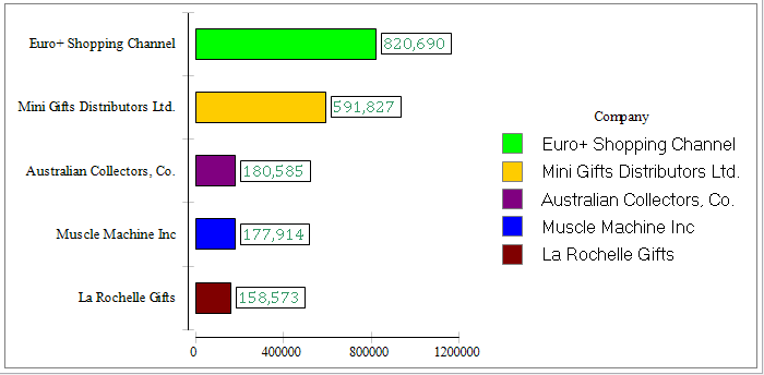
To change the color of the series, select the axis by which you want to add colors to your series (x, categories, or y, value series)and choose the color:
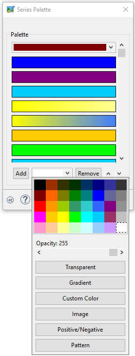
To add a label to the series, please follow these steps.
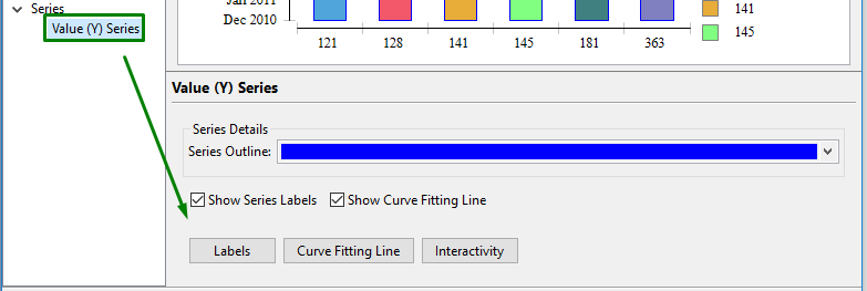
which brings up this window:
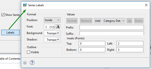
Besides, you can add curve fitting lines to the series:
