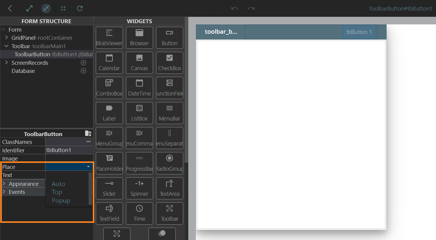
place
This property of a Toolbar Button controls its display (visible on the Toolbar or placed in the dropdown list).
You can configure this setting in form's .fm2 XML file or in the Form Builder:
Form XML code:
Theme property filter XML code:
<SetProperty>
<PropertyPath>
<PropertyName>Place</PropertyName>
</PropertyPath>
<PropertyValue>top</PropertyValue>
</SetProperty>
Possible values:
- top - the Toolbar Buttons will always be visible unless there's no space to contain all the buttons, then the extra will be wrapped under the More button (dropdown list). Only has effect when the Toolbar has enough space, so the top option is equivalent of auto.
- popup (the Toolbar Buttons will all be wrapped under the More button (dropdown list)
- auto
Default value:
top
Associated containers, widgets, and theme elements:
Associated UI methods:
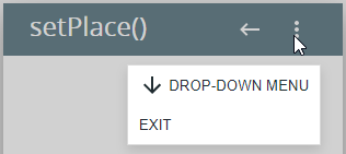
setPlace() ↓
getPlace() ↓
Influence and behavior:
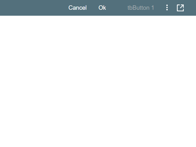
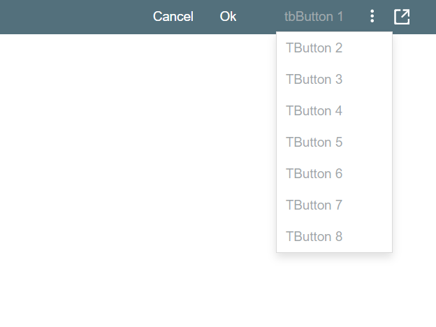
By default, the amount of buttons displayed in the Toolbar is defined by the available toolbar space and the space each of the buttons occupy, adjusting to the program window size:
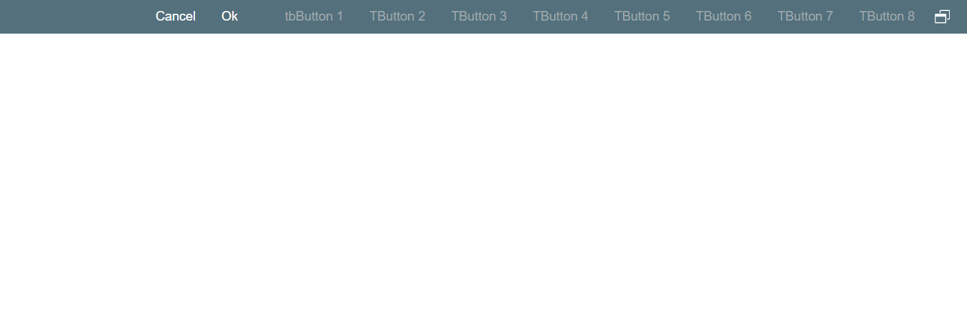
If the buttons exceed the available Toolbar space, the More button appears, containing the dropdown menu with the buttons that don't fit:
At runtime, you can use ui methods to specify the place of the toolbar button:
LET widget_var = ui.<widget>.ForName("widget_id")
 4gl code sample
DEFINE tbb_1 ui.ToolbarButton
...
LET tbb_1 = ui.ToolbarButton.ForName("tbb1")
...
DISPLAY "With tbb1, place =", tbb_1.getPlace()
...
CALL tbb_1.setPlace("top")
There is a special way to rearrange Toolbar Buttons. With the ClassName tbutton-default-place-popup specified for the application, the default is turned to popup instead of top / auto. All buttons that don’t have the place property set explicitly are placed in the dropdown list.