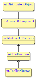
ToolbarButton
Form and theme XML code and CSS element selector
Most commonly used form and theme properties
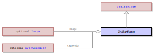
ToolbarButton is a button on a toolbar which is used to invoke actions.
ToolbarButton can include labels, icons, or tooltips.

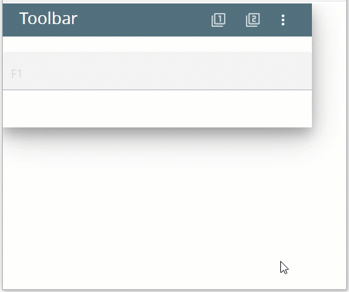
oolbar with 2 toolbar buttons inserted in a Grid panel as seen in Lycia Form Builder.

<ToolbarButton text="tbButton 1" visible="true" identifier="tbButton1">
<ToolbarButton.onInvoke>
<ActionEventHandler type="actioneventhandler" actionName="actTbButton"/>
</ToolbarButton.onInvoke>
</ToolbarButton>
Theme element filter XML code:
<ElementFilter ElementName="ToolbarButton">
...
</ElementFilter>
CSS element selector code:
|
|
|
Most commonly used form properties:
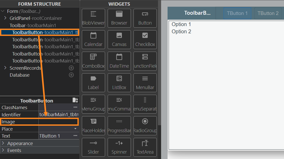
image
Most commonly used theme properties:
Image:
Image Url
Image Scaling
Image Position
Size
INPUT ↓
Associated functions:
Associated ui methods:
SetAllowNewLines →
GetAllowNewLines
SetIdentifier →
GetIdentifier →
SetText →
GetText
To add a ToolbarButton to your form, drag-and-drop the ToolbarButton widget from the Palette to the Design Area, into the previously placed Toolbar.
To make toolbar buttons active and trigger an event only when focus is a definite field,
4gl code sample:
MENU
COMMAND "input"
INPUT BY NAME f1
ON ACTION "show_yes" INFIELD f1
DISPLAY "yes"
ON ACTION "show_no" INFIELD f1
DISPLAY "no"
END INPUT
COMMAND "exit"
EXIT MENU
END MENU
runtime behavior:
At runtime, toolbar buttons can be manipulated with ui methods.
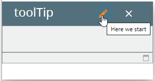
Here you can find out how to enable or disable tooltips at runtime using the setTooltip() method:
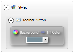
You can change appearance properties of a ToolbarButton in Lycia Form Builder. However, we recommend applying appearance properties via user themes and css.
To apply a property to a ToolbarButton, set its value in the user theme, directly or using filters.
In the example below, we specify the appearance of toolbar buttons by applying Fill Color property.
lycia theme designer
theme XML code
<?xml version="1.0" encoding="utf-8"?>
<StyleSheet xmlns="http://querix.com">
<ElementFilter ElementName="ToolbarButton">
<StyleSheet>
<DoStyleAction>
<SetProperty>
<PropertyPath>
<PropertyName>Background</PropertyName>
<PropertyName>FillColor</PropertyName>
</PropertyPath>
<PropertyValue type="CustomizedColor" RedColor="120" GreenColor="144" BlueColor="156" Alpha="255" />
</SetProperty>
</DoStyleAction>
</StyleSheet>
</ElementFilter>
</StyleSheet>
runtime appearance
Appearance and behavior of toolbar buttons depend on the Lycia version you use – jquery Lycia or Lycia with Material Design.
Here are the rules which are applied to toolbar buttons with MD Lycia:
-
The buttons that only have an icon are rendered as icon-only buttons (without text).
- The buttons that have no icon are rendered as text-only.
- The buttons that have an icon and a Text property filled are rendered as icon-only.
-
The actions triggered by the COMMAND and ON ACTION statements are rendered to text-only buttons in Lycia compatibility mode. In other modes, the behaviour may vary.
-
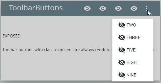
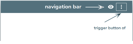
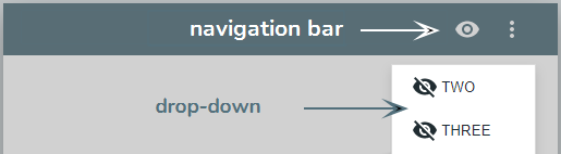
The position of the buttons (rendered to the navigation bar or rendered to the dropdown menu) is controlled by the place property.
-
 Toolbar buttons with the class expose are always rendered to the navigation bar.
You can read about setting class names here.
All these rules apply to both toolbar buttons created via the ToolbarButton widget, dynamically (by the corresponding UI methods), and by the MENU statement).
The difference between these two types of toolbar buttons (in relation to MD Lycia) lies in how you set their text and icon:
-
With toolbar buttons created dynamically, their text and icons can be set via ui methods.
LET tbr_bttn = ui.ToolbarButton.Create("f1")
CALL img.SetImageUrl("qx://application/cloud_full.svg")
CALL tbr_bttn.setImage(img)
CALL tbr_bttn.setText("ui")
More details are here and here.
-
With toolbar buttons created by ON ACTION and COMMAND clauses, their text and icons are set by fgl_setactionlabel().
CALL fgl_setactionlabel("input" ,"input" , "qx://application/calendar.svg")
For more details, refer to the Functions Used to Modify Actions and Action View (Toolbar) Functions pages.
By default, the placement of the toolbar buttons is controlled by the window size and the size of each of the buttons. If there's not enough place in the Toolbar at the current window size to fit all the buttons, some of them will be rendered to the dropdown menu (marked with a three-dot button in the right side of the Toolbar).
Additionally, there are several ways to force the placement of each of the buttons:
- via the form property, place,
- via the .qxtheme property, place,
- via the setPlace() method used on a variable of the ui.ToolbarButton datatype (<tbb_var>.setPlace("top") for the always visible placement of the button, and <tbb_var>.setPlace("popup") for the placement of the button in the dropdown menu.
At runtime, you can create and manipulate toolbar buttons with ui methods.
If your .fm2 form has a Toolbar widget, you can populate it via ui methods:
DEFINE tb_group ui.ToolbarGroup
DEFINE tb_button ui.ToolbarButton
...
LET tb_group = ui.ToolbarGroup.Create("tbg","toolbar")
LET tb_button = ui.ToolbarButton.Create("bt1","tbg")
CALL tb_button.SetText("form button")
To make this newly created toolbar button able to trigger any actions, you must set the event for it:
DEFINE buttonEvent ui.BackgroundServerEventHandler
...
LET buttonEvent = ui.BackgroundServerEventHandler.Create()
CALL buttonEvent.SetCallBackAction("display")
CALL tb_button.SetOnInvoke(buttonEvent)
So the simple algorithm for adding toolbar buttons by ui methods is this:
- Check that your form has a Toolbar widget.
- Define variables of ui.ToolbarGroup, ui.ToolbarButton, and ui.BackgroundServerEventHandler data types in your 4gl code.
- Use the create() method to create a toolbar group.
- Use the create() method to create a toolbar button. Make sure that you have specified the correct toolbar group.
- Set the event for this toolbar button.
All properties of a toolbar button can be changed at runtime by ui methods.
For example,
- text – by setText(),
- image – by setImageUrl() or setImage() with other methods,
- place – by setPlace(), or
- tooltip – by setTooltip().