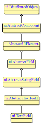
TextField
Form and theme XML code and CSS element selector
Most commonly used form and theme properties
TextField is used to input and display text data of different formats in a single line of text.

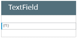
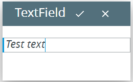
TextField inserted in a GridPanel as seen in Lycia Form Builder:
Theme element filter XML code:
<ElementFilter ElementName="TextField">
...
</ElementFilter>
CSS element selector code:
qx-aum-text-field
.qx-aum-text-field .qx-text ↓
Most commonly used form properties:
Most commonly used theme properties:
Font:
Associated ui methods:
SetText →
GetText
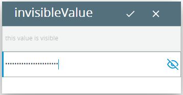
SetInvisibleValue →
GetInvisibleValue
SetIsPasswordMask →
SetIsPasswordMask
SetMaxLength →
GetMaxLength →
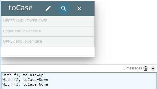
SetToCase →
GetToCase →
Create
ForName
To add a TextField to your form, drag-and-drop the TextField widget to a location of your choice in the Design Area. Note that the form must have a Root Container to contain all other widgets.
Here you can find out how to change the initial text displayed to the text field in the form:

Here you can find out how to change the text displayed to the text field at runtime using ui methods or DISPLAY ... TO statement.
Here you can find out how to input text to text fields using the INPUT statement, e.g.:
You can change appearance properties of a text field in Lycia Form Builder. However, we recommend applying appearance properties via user themes and css.
To apply a property to a text field, set its value in the user theme, directly or using filters.
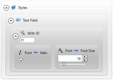
In the example below, we change the font used to display text to a definite text field by applying the New Font property with a With ID... filter.
property applied in the user theme:
theme XML code:
 Click here to see the theme XML code.
<?xml version="1.0" encoding="utf-8"?>
<StyleSheet xmlns="http://querix.com">
<ElementFilter ElementName="TextField">
<StyleSheet>
<ElementIdFilter Identifier="f1">
<StyleSheet>
<DoStyleAction>
<SetProperty>
<PropertyPath>
<PropertyName>Font</PropertyName>
<PropertyName>Italic</PropertyName>
</PropertyPath>
<PropertyValue />
</SetProperty>
</DoStyleAction>
<DoStyleAction>
<SetProperty>
<PropertyPath>
<PropertyName>Font</PropertyName>
<PropertyName>FontSize</PropertyName>
</PropertyPath>
<PropertyValue>16</PropertyValue>
</SetProperty>
</DoStyleAction>
</StyleSheet>
</ElementIdFilter>
</StyleSheet>
</ElementFilter>
</StyleSheet>
runtime behavior:
In the example below, we use css to change the text style of the button:
.qx-aum-text-field .qx-text {
padding: 2px;
padding: 5px 10px;
color: white !important;
font: bold 14px "Calibri","Helvetica Neue", Sans-Serif;
}
At runtime, text fields can be manipulated with ui methods.
Here you can find out how to change the case of the input text using the setToCase() method:
Here you can find out how to make the input values invisible by using the setInvisibleValue() method:
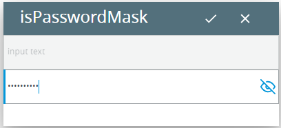
Here you can find out how to make the input values invisible by using the setIsPasswordMask() method: