CheckBox
 Check boxes are used for making binary choices and each check box relates to a single variable. Unlike radio buttons, it is possible to select all or any of the options.
The programmer can specify the value that should be written to the underlying variable when checking and unchecking this box.
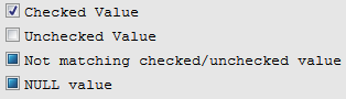
Besides the checked and unchecked states, the Checkbox widget has a Not Touched or NULL state which is indicated by the checkbox filled with blue. This mark is also used when a value displayed to the field does not match either checked or unchecked value:
During the input, you can use the Not Touched state to leave the initial value of the variable unchanged.
You can also use a check box to trigger events, instead of writing values to variables directly. This may be required if you want to execute some program logic straight after the user has clicked the check box.
Most commonly used Theme and Form Properties:
· CheckedValue
· UncheckedValue
· Events (onCheck, onUncheck)
· Title
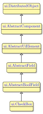
Inheritance diagram:
Form XML Code
<checkbox title="New check box" fieldType="FORM_ONLY" fieldTable="formonly" enable="true" visible="true" notNull="true" identifier="f1">
<datatype typeName="SmallInt"/>
<checkedvalue type="integerliteral" integerValue="1"/>
<uncheckedvalue type="integerliteral" integerValue="0"/>
<griditemlocation gridWidth="1" gridHeight="1" gridY="0" gridX="0"/>
</checkbox>
Applying Checkbox at Runtime:
The checkbox widget is used to make a choice between two options. Input from each checkbox is made to a single variable. A checkbox can pass one of the two values to this variable - one value for the checked state and another one for the unchecked state. If you place more than one checkbox in the manner the radio button options are situated, you can create a multi-choice selection. However, you must not forget that each check box belongs to a separate widget and passes its value to a separate variable, so a number of check boxes do not form a single group unlike the radio button options.
Checkboxes are declared in the ATTRIBUTES section of the form specification file using the following syntax:
Field_tag = field,
config="checked value unchecked value {label},
default = "default value"
widget="check",
[class="default"|"key"];
Here field_tag stands for the field tag in the Screen section of the form file and field - for the field identifier which includes the name of the database table or the "formonly" word if the form is not connected to any database, and the name declared for the field e.g. f01 = formonly.field_name.
The widget attribute with "check" value is required to set the type of widget to checkbox.
The class attribute is similar to that of the radio button widget; its specifics will be discussed later in this section.
Defining the Checked and Unchecked values
The config attribute sets two values separated by a space which the corresponding variable will receive when the user clicks on the box. The 4GL treats the values depending on their order in the config attribute: the first value is treated as the value passed to the variable when the widget is checked, the second is passed to the variable when the widget is unchecked. Here you can also specify a label for the checkbox within the curly braces - the label will be displayed to the right of the check box.
You should remember that if the checkbox widget is untouched during the input, the value sent to the variable depends on the default value. If there is no DEFAULT attribute, the unchecked value is sent to the variable. If the DEFAULT attribute is used in the widget declaration, the value specified as default is sent to the variable and the widget is displayed initially in the state specified by this attribute.
To specify the default value, include the "default" attribute in the form field specification:
default="checked_value"|"unchecked_value"
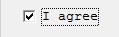
For example, when the program is run, the box labelled "I agree" in the code below will be checked at the beginning of the input. Otherwise it will be unchecked.
f1 = formonly.agreement,
config = "agree disagree {I agree}",
widget = "check",
default = "agree";
The line of code which follows will send the value "yes" to the corresponding variable if the user has checked the box, and "no" if the box is first checked and then unchecked or if it was left untouched, since no default value has been defined.
config = "yes no {I accept the conditions?}"
 When the box is checked, the value in the field changes. However, any logic related to it will be triggered only if complete the input. The widget can be checked or unchecked many times during the input, but the value assigned to the variable will be the value which was selected at the moment of completing the input.
Triggering actions
Apart from writing a value to a particular variable directly, a checkbox can be used to generate key and action events. This may be necessary if you want the program to perform some actions at the moment the user checks or unchecks a box without the Accept key being pressed.
For this purpose you can add the attribute "class" which can be set to "default" or to "key":
class="default" | "key"
The "default" value is applied even if no "class" attribute is specified. It causes the checkbox to behave like a normal data checkbox returning values to the variable and not triggering any events, so specifying this attribute is not actually required.
If you specify "key" value, the checkbox will act as a button with two key or action events. As with the radio button widget, you have to display "!" to the checkbox in order to activate it.
The syntax for the default checkbox configuration string has been described above. As for a checkbox with the class attribute specified as "key", the configuration string includes the event to be triggered when the box is checked, the event when the box is unchecked instead of the values to be sent to the variable.
config="checked_key|checked_action unchecked_key|unchecked_action
{label}"
The example below sends the key press F1 when the user ticks the box, and F2 if the box is not checked.
config = "F1 F2 {Do you agree?}",class = "key";
The following example assigns action "act_print_text" to be performed when the box is checked, otherwise the action "act_print_html" will be fired.
f01 = formonly.nextAction,
config="act_print_text act_print_html {Next Action}",
widget="check",
class="key";
Pay attention that you need to include the ON KEY and ON ACTION clauses into your 4GL source code file in the INPUT section to assign the behaviour for these keys or actions.
Adding a label to a form using the graphical form editor
Select the CheckBox widget from the widget palette and place it to the required location on the form.
Text: To modify the text, either double click the checkbox and type the text or choose the "title" property from the property Panel. To add multiple lines, use the key combination Ctrl-Enter to force a line break. While the CheckBox element is selected, apply properties via the property panel as required.
We strongly recommend our customers to apply appearance properties such as font, color and margin via Themes.
Applying theme options
To apply text based properties (i.e. font) to a number of objects, add the With class object to the styles view directly to the root of your theme. Then drag and drop the required properties from the Property group inside the 'With class ...' object.
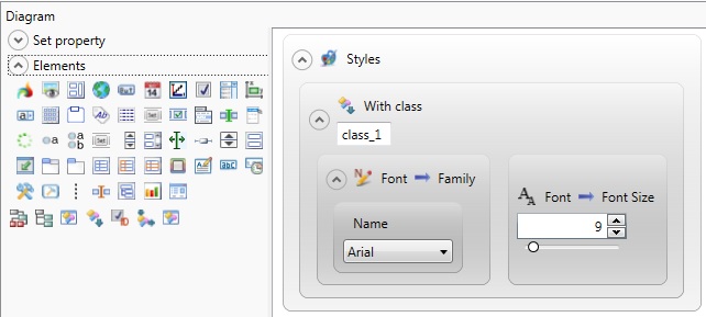
<WithClassFilter ClassName="class_1">
<StyleSheet>
<DoStyleAction>
<SetProperty>
<PropertyPath>
<PropertyName>Font</PropertyName>
<PropertyName>Family</PropertyName>
</PropertyPath>
<PropertyValue>
<Name>Arial</Name>
</PropertyValue>
</SetProperty>
</DoStyleAction>
<DoStyleAction>
<SetProperty>
<PropertyPath>
<PropertyName>Font</PropertyName>
<PropertyName>FontSize</PropertyName>
</PropertyPath>
<PropertyValue>9</PropertyValue>
</SetProperty>
</DoStyleAction>
</StyleSheet>
</WithClassFilter>
</StyleSheet>
Add the CheckBox element to the Styles view from the Elements group and then drag and drop the Apply class filter to the Styles view inside the CheckBox object. Specify the name of the class in the empty field.
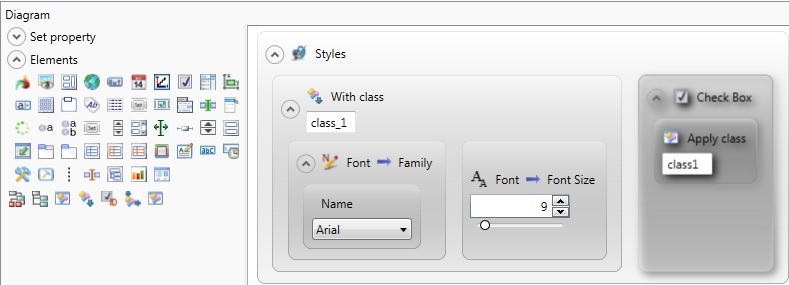
<ElementFilter ElementName="CheckBox">
<StyleSheet>
<DoStyleAction>
<ApplyClass Name="class1" />
</DoStyleAction>
</StyleSheet>
</ElementFilter>
</StyleSheet>
Example programs:
Project:
theme-demo3-2014
Program:
th_element_checkBox_01