ComboBox
 A ComboBox widget is a field with a down arrow button at the right hand end. Clicking the down arrow displays a drop down list of values from which users can choose. The list can be populated statically within the form definition using the ComboBoxItem widget. There is also the option to allow the user to enter data into the field which do not exist in the list. At runtime, the combo list values can be changed (removed, inserted, searched, etc…) by using the relevant fgl_list_xxx() functions. The user can select list entries either by using the mouse or by navigating through the list using the keyboard (cursor keys or alpha numerical keys to search for entries).
Most commonly used Theme and Form Properties:
Associated Functions:
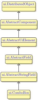
Inheritance diagram:
Form XML Code
<combobox fieldType="FORM_ONLY" fieldTable="formonly" enable="true" visible="true" identifier="f1" text="121">
<griditemlocation gridWidth="1" gridHeight="1" gridY="0" gridX="0"/>
<comboboxitems/>
</combobox>
Adding ComboBox to a form using the graphical form editor
Select the ComboBox button from the widget palette and place it to the required location on the form.
To add an ComboBox item, select it in the Palette view and then click on the target ComboBox widget in the form.
 We strongly advice to apply appearance properties such as font, color and margin via Themes.
PER syntax
To create a combo box you should stick to the following syntax in the ATTRIBUTES section of the form
specification file:
Field_tag = field,
widget=”combo”,
include = (list_item1, list_item2,... list_item_n),
[class=”combo”];
Here tag stands for the field tag in the Screen section of the form file and field - for the field identifier which
includes the name of the database table or the “formonly” word, if the form is not connected to any
database, e.g. f01 = formonly.field_name.
The class attribute is required only if you want to make the combo box editable: class = “combo”.
Without it the user will only be able to perform selection from the list. You should remember, however, that
when you specify the class = “combo” attribute, the data in the include list will no longer be validated by
the server.
For information on how to manipulate ComboBox widget see Functions for Modifying the Drop Down List at Runtime.