RadioButtonList
 RadioButtonList widget is a container that allows you to create a set of radio buttons grouped automatically under one identifier. Is filled with radioButtonListItem objects that create the set of the available values.
Most commonly used Theme and Form Properties:
Inheritance diagram:

Form XML Code
RadioButtonList of 3 items embedded in the GridPanel (orientated vertically, compare to the list of separate RadioButtons):
<radiobuttonlist orientation="Vertical" fieldType="FORM_ONLY" fieldTable="formonly" enable="true" visible="true" identifier="f1" horizontalAlignment="Center" verticalAlignment="Center">
<classnames>
<classname>classRadioButtonList</classname>
</classnames>
<griditemlocation gridWidth="1" gridHeight="1" gridY="1" gridX="1"/>
<radiobuttonlistitems>
<radiobuttonlistitem title="f1=1" identifier="f1_1">
<value type="integerliteral" integerValue="1"/>
</radiobuttonlistitem>
<radiobuttonlistitem title="f1=2" identifier="f1_2">
<value type="integerliteral" integerValue="2"/>
</radiobuttonlistitem>
<radiobuttonlistitem title="f1=3" identifier="f1_3">
<value type="integerliteral" integerValue="3"/>
</radiobuttonlistitem>
</radiobuttonlistitems>
<preferredsize width="100" height="100"/>
<ontouched type="actioneventhandler"/>
</radiobuttonlist>
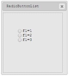
RadioButtonList of 3 vertically orientated items as seen in Window Builder
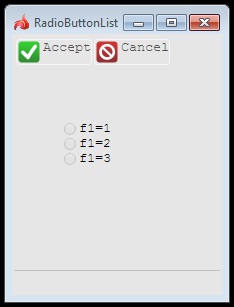
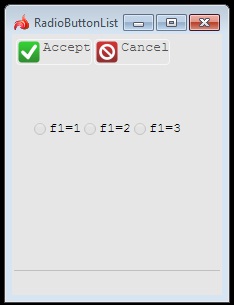
RadioButtonList of 3 items as seen in Lycia Desktop
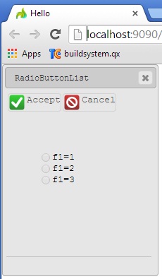
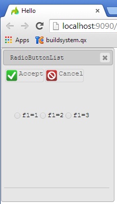
RadioButtonList of 3 items as seen in Lycia Web
RadioButtonList of 3 items embedded in the GridPanel (orientated horisontally):
<radiobuttonlist fieldType="FORM_ONLY" fieldTable="formonly" enable="true" visible="true" identifier="f1" horizontalAlignment="Center" verticalAlignment="Center">
<classnames>
<classname>classRadioButtonList</classname>
</classnames>
<griditemlocation gridWidth="1" gridHeight="1" gridY="1" gridX="1"/>
<radiobuttonlistitems>
<radiobuttonlistitem title="f1=1" identifier="f1_1">
<value type="integerliteral" integerValue="1"/>
</radiobuttonlistitem>
<radiobuttonlistitem title="f1=2" identifier="f1_2">
<value type="integerliteral" integerValue="2"/>
</radiobuttonlistitem>
<radiobuttonlistitem title="f1=3" identifier="f1_3">
<value type="integerliteral" integerValue="3"/>
</radiobuttonlistitem>
</radiobuttonlistitems>
<ontouched type="actioneventhandler"/>
<preferredsize width="150" height="100"/>
</radiobuttonlist>
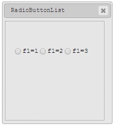
RadioButtonList of 3 horizontally orientated items as seen in Window Builder
RadioButtonList of 3 horizontally orientated items as seen in Lycia Desktop
RadioButtonList of 3 horizontally orientated items as seen in Lycia Web
Adding a RadioButtonList to a form using the graphical form editor
Select the RadioButtonList button from the widget palette and place it to the required location on the form.
Applying theme options.
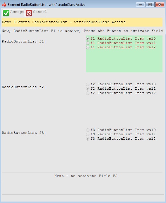
Example1. Changing the color of the active RadioButtonList
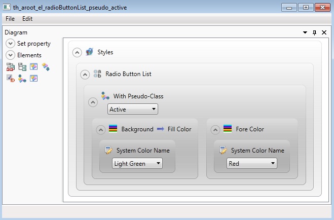
<StyleSheet xmlns="http://querix.com">
<ElementFilter ElementName="RadioButtonList">
<StyleSheet>
<WithPseudoClassFilter PseudoClassName="Active">
<StyleSheet>
<DoStyleAction>
<SetProperty>
<PropertyPath>
<PropertyName>Background</PropertyName>
<PropertyName>FillColor</PropertyName>
</PropertyPath>
<PropertyValue type="SystemColor" SystemColorName="LightGreen" />
</SetProperty>
</DoStyleAction>
<DoStyleAction>
<SetProperty>
<PropertyPath>
<PropertyName>ForeColor</PropertyName>
</PropertyPath>
<PropertyValue type="SystemColor" SystemColorName="Red" />
</SetProperty>
</DoStyleAction>
</StyleSheet>
</WithPseudoClassFilter>
</StyleSheet>
</ElementFilter>
</StyleSheet>
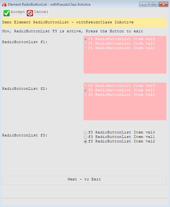
Example2. Changing the color of the inactive RadioButtonList
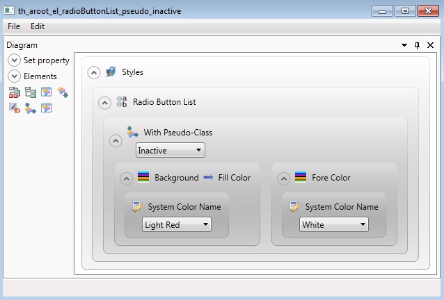
<StyleSheet xmlns="http://querix.com">
<ElementFilter ElementName="RadioButtonList">
<StyleSheet>
<WithPseudoClassFilter PseudoClassName="Inactive">
<StyleSheet>
<DoStyleAction>
<SetProperty>
<PropertyPath>
<PropertyName>Background</PropertyName>
<PropertyName>FillColor</PropertyName>
</PropertyPath>
<PropertyValue type="SystemColor" SystemColorName="LightRed" />
</SetProperty>
</DoStyleAction>
<DoStyleAction>
<SetProperty>
<PropertyPath>
<PropertyName>ForeColor</PropertyName>
</PropertyPath>
<PropertyValue type="SystemColor" SystemColorName="White" />
</SetProperty>
</DoStyleAction>
</StyleSheet>
</WithPseudoClassFilter>
</StyleSheet>
</ElementFilter>
</StyleSheet>
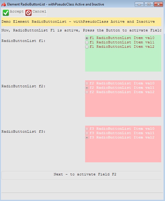
Example3. Changing colors of both active and inactive RadioButtonsLists
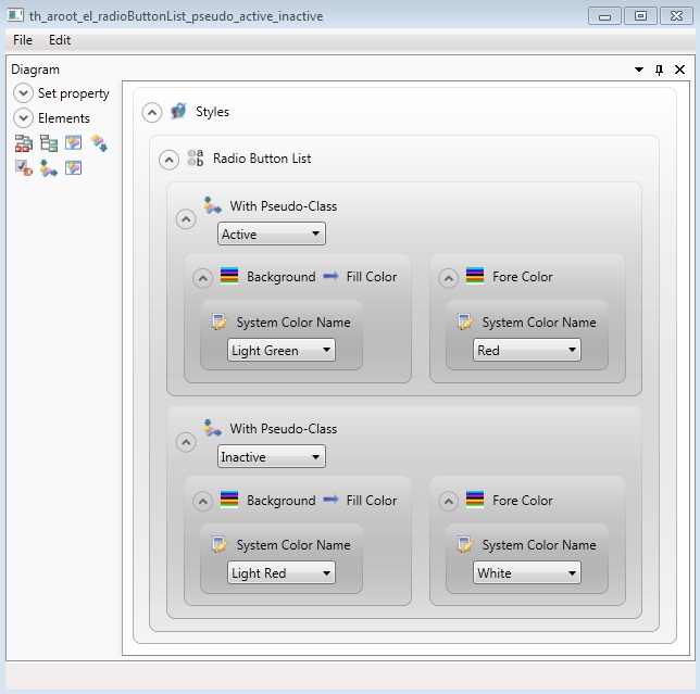
<StyleSheet xmlns="http://querix.com">
<ElementFilter ElementName="RadioButtonList">
<StyleSheet>
<WithPseudoClassFilter PseudoClassName="Active">
<StyleSheet>
<DoStyleAction>
<SetProperty>
<PropertyPath>
<PropertyName>Background</PropertyName>
<PropertyName>FillColor</PropertyName>
</PropertyPath>
<PropertyValue type="SystemColor" SystemColorName="LightGreen" />
</SetProperty>
</DoStyleAction>
<DoStyleAction>
<SetProperty>
<PropertyPath>
<PropertyName>ForeColor</PropertyName>
</PropertyPath>
<PropertyValue type="SystemColor" SystemColorName="Red" />
</SetProperty>
</DoStyleAction>
</StyleSheet>
</WithPseudoClassFilter>
<WithPseudoClassFilter PseudoClassName="Inactive">
<StyleSheet>
<DoStyleAction>
<SetProperty>
<PropertyPath>
<PropertyName>Background</PropertyName>
<PropertyName>FillColor</PropertyName>
</PropertyPath>
<PropertyValue type="SystemColor" SystemColorName="LightRed" />
</SetProperty>
</DoStyleAction>
<DoStyleAction>
<SetProperty>
<PropertyPath>
<PropertyName>ForeColor</PropertyName>
</PropertyPath>
<PropertyValue type="SystemColor" SystemColorName="White" />
</SetProperty>
</DoStyleAction>
</StyleSheet>
</WithPseudoClassFilter>
</StyleSheet>
</ElementFilter>
</StyleSheet>
Example programs:
Project: form-demo3
-
fd2_widget_e_radioButtonList_example_simple_01
-
fd2_widget_e_radioButtonList_property_defaultSize_01_horizontal
-
fd2_widget_e_radioButtonList_property_defaultSize_01_vertical
-
fd2_widget_radioButtonList_simple_03
-
fd2_widget_radioButtonList_various_01
-
fd2_widget_radioButtonList_various_02