Lycia with Material Design
Lycia is using Material Design.
This affects the look of your 4GL applications, the runtime behavior, and your development procedures.
 Some basic facts about Material Design.
Material Design is a visual language that incorporates classic design principles with technological innovations.
Material Design is an adaptable system of guidelines, tools, and resources aiming at creating the best possible design of user interfaces. Is backed by open-source code.
You can introduce yourself to Material Design at its website, material.io.
This page provides a brief overview of the most important features of Material Design Lycia.
Application Window
-
Window header, footer, and sidebar are always present with Material Design Lycia and cannot be removed by means of the 4GL code.
You can remove them via CSS style sheets or JS scripts.
For example,
a fragment of the JS script:
window.top.document.body.classList.add('hidden-header-footer-sidebar');a fragment of the CSS style sheet:
.hidden-header-footer-sidebar #qx-main-layout {
padding-top: 0 !important;
padding-bottom: 0 !important;
}
.hidden-header-footer-sidebar #qx-main-layout > header,
.hidden-header-footer-sidebar #qx-main-layout > aside,
.hidden-header-footer-sidebar #qx-main-layout > footer {
display: none !important;
}
-
By default, all applications created and run via Material Design Lycia have the topbar – the element containing title and Toolbar buttons.
This topbar cannot be removed.
You can hide the title displayed at the topbar with a CSS style sheet.
Menus
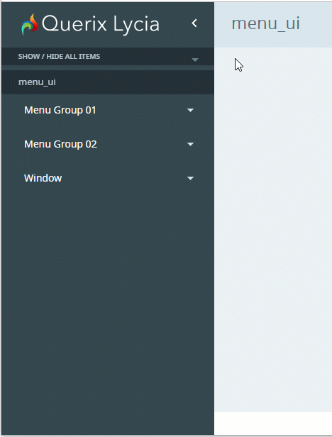
With Material Design, all the menus get a button Show / Hide All Items that allows collapsing and expanding all the menu groups at once.

This button appears for all the menus regardless of how they were created – by the corresponding widgets in Lycia Form Builder, by 4GL functions, or via UI methods.
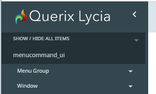
With Material Design, you can add a sidebar with the shortcuts of the top-level menu groups for the menus created dynamically (by FGL functions or UI methods).
For this, you have to add the class name, md-sidebar, after setting the menu type:
Menu without a sidebar:
Menu with a sidebar:
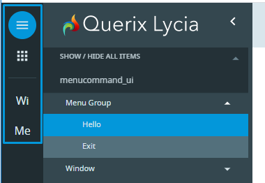
The shortcut displays the image set for the menu group (if any) or two first letters of its title (if the image is absent):
Containers
Tab and TabPage
Arrow buttons are used to scroll through the open tabs. The buttons are enabled when the area is scrollable and disabled if there are too few tabs to scroll:
Widgets
Toolbar Buttons
-
With Material Design Lycia, the Toolbar consists of two logical parts – navigation bar (= application bar) and drop-down menu (= overflow menu).
-
The buttons that only have an icon are rendered as icon-only buttons (without text).
- The buttons that have no icon are rendered as text-only.
- The buttons that have an icon and a Text property filled are rendered as icon-only.
- The actions triggered by the COMMAND and ON ACTION statements are rendered to text-only buttons in Lycia compatibility mode. In other modes, the behaviour may vary.
-
The position of the buttons (rendered to the navigation bar or rendered to the dropdown menu) is controlled by the place property.
-
Toolbar buttons with the class expose are always rendered to the navigation bar.
For more details, refer to the ToolbarButton page.
Buttons
- Image-only buttons in Material Design Lycia are always round.
-
Button text is capitalized by default. The case of the button text can be changed by the CSS style sheet with the style text-transform: none.
Properties
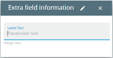
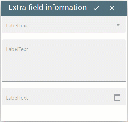
helperText, labelText, placeholderText
Some widgets have additional properties that allow setting their helper, label, and placeholder texts:
-
helperText is used to specify the helper text = additional information about the input field itself.
Associated widgets: Calendar, ComboBox, FunctionField, TextArea, TimeEditField, TextField
-
labelText sets the label text = additional information about what end-users must enter to the input field.
Associated widgets: Calendar, ComboBox, FunctionField, TextArea, TimeEditField, TextField
-
placeholderText sets the placeholder text = text displayed by default to a TextArea or TextField.
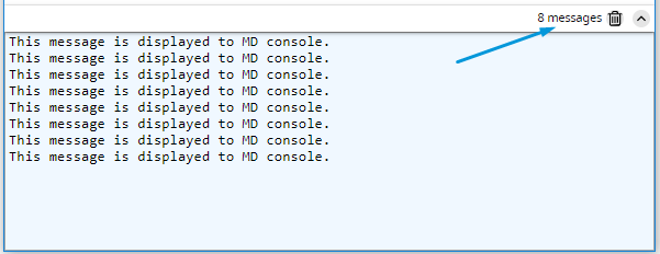
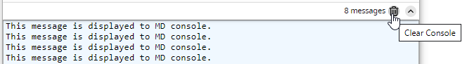
Display Console
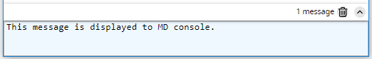
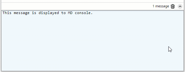
Material Design console displays the application output not redirected to other containers (like dialog boxes or form widgets):
- Material Design console is always located at the bottom of the application window.
-
Width of the Material Design console depends on the size of the application window.
Height of the Material Design console can be changed by the user. Minimum height of Material Design console is equal to three lines.
-
Material Design console can be expanded and collapsed by the user.
When the Material Design console is collapsed, the last message is displayed to its header:

See the video below to learn about the features of the Material Design console: