Calendar
Form and theme XML code and CSS element selector
Most commonly used form and theme properties
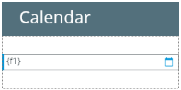
Calendar is used to display and input dates with a built-in calendar in order to facilitate input.
Calendar inserted in a GridPanel as seen in Lycia VS Code Extension's Form Builder:
Theme element filter XML code:
<ElementFilter ElementName="Calendar">
...
</ElementFilter>
CSS element selector code:
qx-aum-calendar
|
|
|
Most commonly used form properties:
dataType
Most commonly used theme properties:
Associated ui methods:
create ↓
forName
To add a Calendar to your form, drag-and-drop the Calendar widget from the Palette to the Design Area. Note that the form must have a Root Container prior to you placing a widget to it.
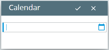
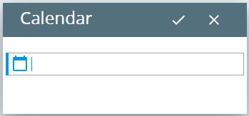
There are two ways to enter date to the calendar at runtime:
- To type in the date from the keyboard.
-
To choose a date from a built-in calendar:

Here you can find out how to input data to a calendar using the INPUT statement, e.g.:
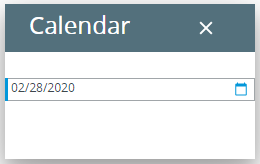
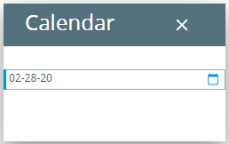
Date is input and displayed in the format specified in the DBDATE environment variable:
|
DBDATE value |
MDY4/ (default) |
MDY2- |
DMY4. |
|
runtime appearance |
|
|

|
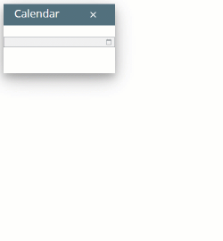
If you need text displayed to the calendar, use the text property in the Properties view:

Here you can find out how to change the text displayed to the calendar at runtime using ui methods or DISPLAY ... TO statement.
To apply a property to a calendar, set its value in the master or user theme, directly or using filters:
property applied in the user theme:
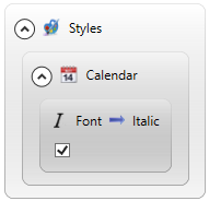
theme XML code:
<?xml version="1.0" encoding="utf-8"?>
<StyleSheet xmlns="http://querix.com">
<ElementFilter ElementName="Calendar">
<StyleSheet>
<DoStyleAction>
<SetProperty>
<PropertyPath>
<PropertyName>Font</PropertyName>
<PropertyName>Italic</PropertyName>
</PropertyPath>
<PropertyValue />
</SetProperty>
</DoStyleAction>
</StyleSheet>
</ElementFilter>
</StyleSheet>
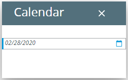
runtime appearance:
In the example below, we use css to change the font characteristics for the calendar text:
.qx-aum-calendar .qx-text {
padding: 2px;
padding: 5px 10px;
color: white !important;
font: bold 14px "Calibri","Helvetica Neue", Sans-Serif;
}
You can use ui methods to manipulate calendars at runtime:
<var>.create() is used to create calendar:
LET c1= ui.Calendar.create("f1","rootContainer")
<var.>setFormat() is used to set the calendar format - is analogous to the format property (see the example program, calendar_ui):
CALL c1.setFormat("dd yy mm")
You can use the methods of the ui.Locale object - <var>.setCountry(), <var>.setDirection(), <var>.setLanguage(), and/or <var>.setVariant() - to set the locale for the calendar (see the example program, locale_ui):
DEFINE loc ui.Locale
...
CALL loc.SetCountry("US")
CALL loc.SetDirection("RTL")
CALL loc.SetLanguage("EN")
CALL loc.SetVariant("cp1251")
...
CALL c1.SetLocale(loc)
You can also use ui methods to change the appearance of a calendar at runtime:
- <var>.SetBackground() for the element's background,
- <var>.SetFont() for the element's font, and
- <var>.setForeColor() for the element's font color.
You can specify the default appearance of a Calendar by setting different classes to the classNames property.
For example, the class leading-button changes the position of the picker button (for MD Lycia):
default (= trailing):
leading:
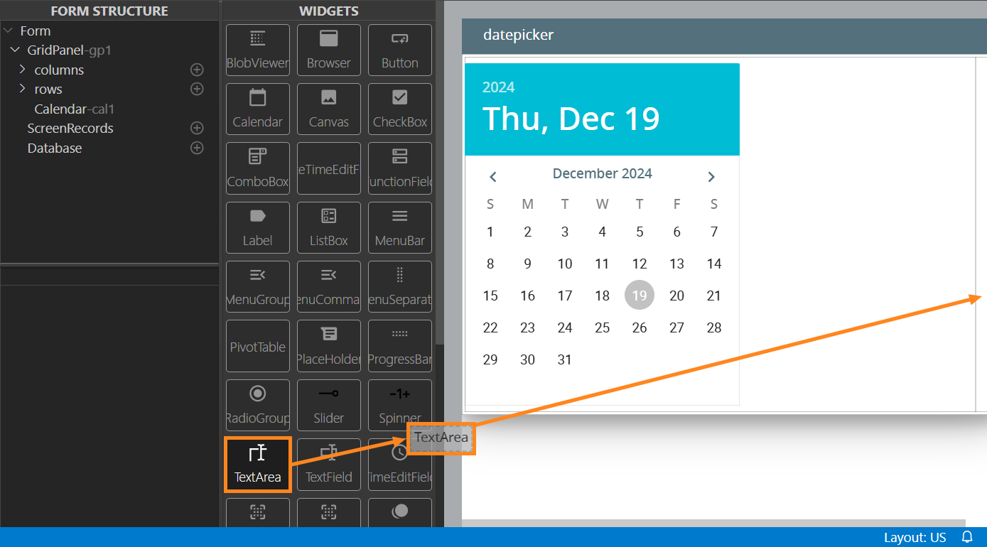
A Date Picker is a modification of the Calendar widget that represents a full-size monthly calendar and can be used to display events associated with the selected date in a separate field of the form.
Example:
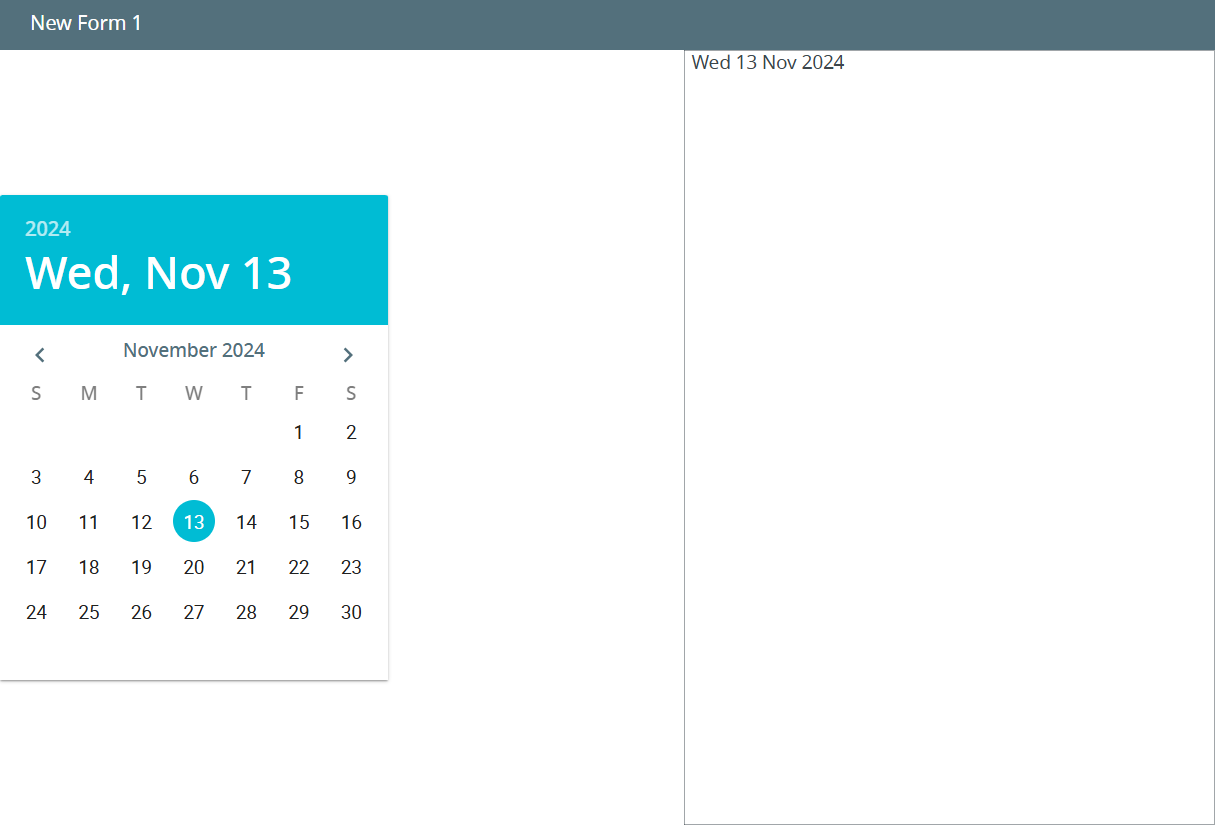
Using this widget, you can select a day of the month, switch between months by clicking the arrow buttons, and pick a year by clicking the year inscription.
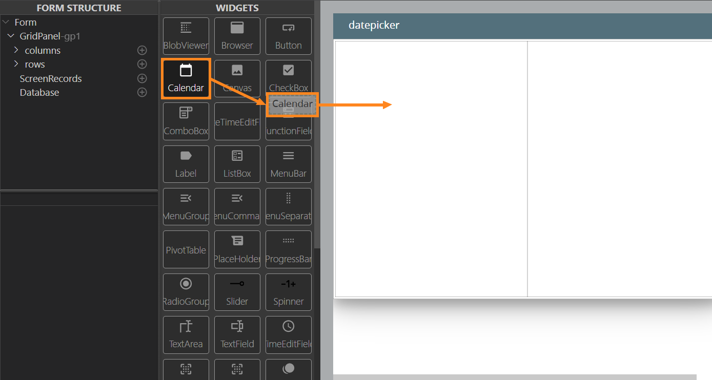
Creating the Date Picker
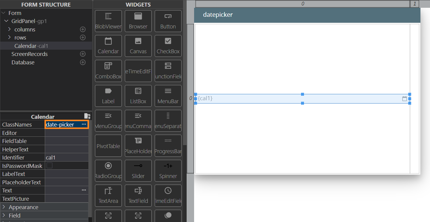
Step 1. Add a Calendar widget to your form by drag-and-dropping it from the Palette:
Step 2. In the Properties view, add the class date-picker as the classNames property value:
Step 3. Add a TextArea to the form:
Step 4. In your .4gl file, assign the data to display in the TextArea.
 Related articles