Table
Form XML Code and CSS Element Selector
Most Commonly Used Form Properties
Overview
Table container allows creating tables for data input and display.
Form tables have a hierarchical structure, in which the Table container is the parent one. Example:
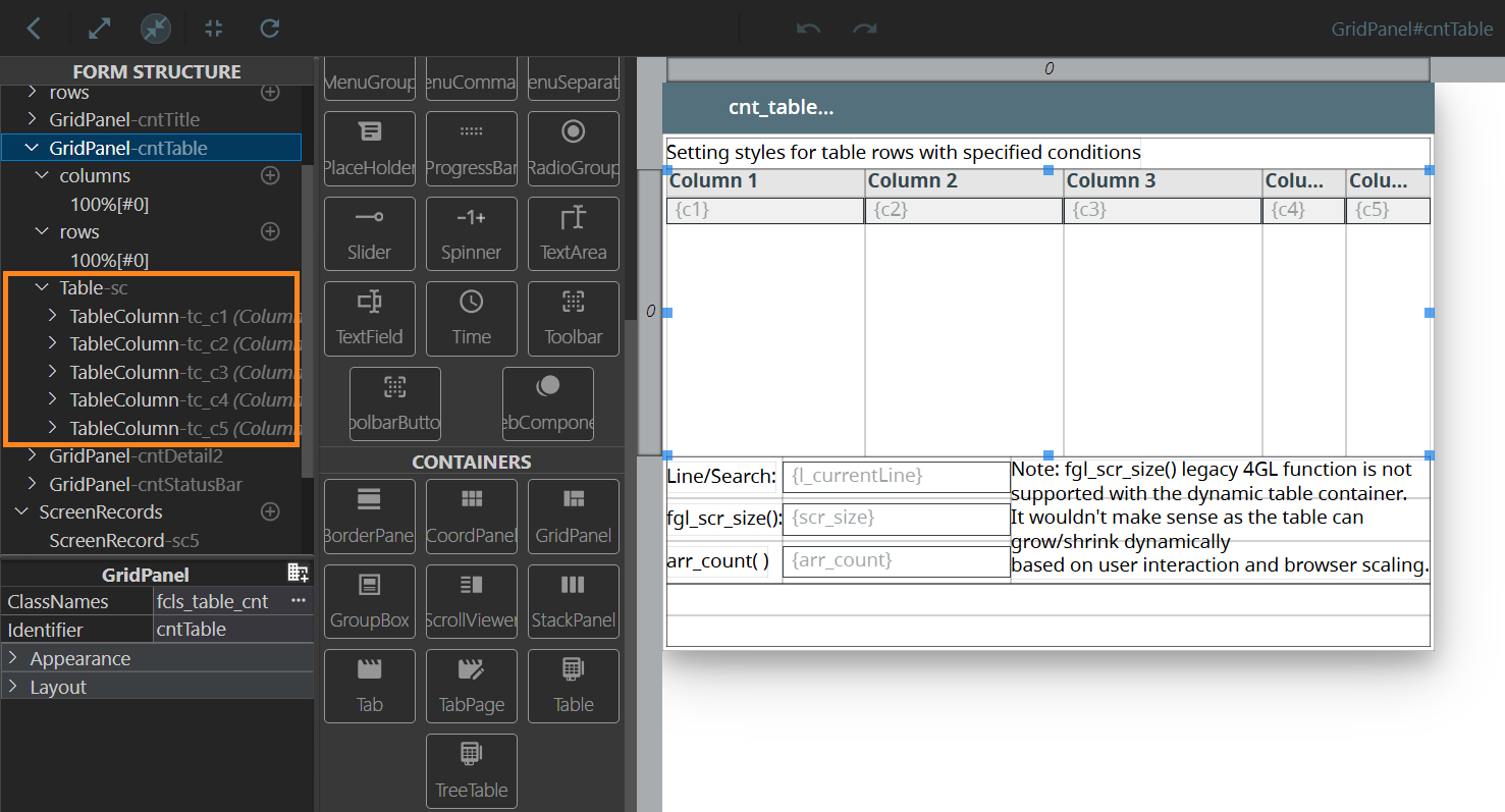
Table container with two columns:
<Table identifier="c1" visible="true">
<TableColumn text="column" resizable="true" visible="true">
<TableColumn.columnLength>
<GridLength/>
</TableColumn.columnLength>
</TableColumn>
</Table>
CSS element filter:
.qx-aum-table
Most Commonly Used Form Properties:
Associated ui.Table Methods:
Create
ForName
Associated ui.TableColumn Methods:
Create
ForName
SetColumnLength
GetColumnLength
SetColumnNum
GetColumnNum
SetControl
GetControl
SetEditControl
GetEditControl
SetFooter
GetFooter
SetReadOnly
GetReadOnly
SetResizable
GetResizable
SetSorted
GetSorted
SetText
GetText
SetUnsortable
GetUnsortable
Influence and Behaviour:
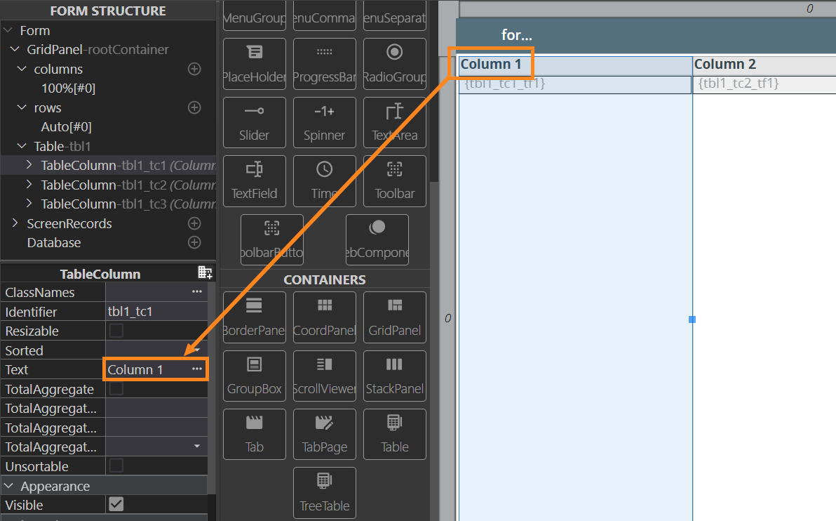
To add a table to your form, find a Table container in the Palette view, then drag-and-drop it into the parent container in the Editor area:
Table identifier is linked to the identifier of the screen record nesting the table column fields. Therefore, editing one of these IDs automatically changes the other.
Each widget placed into the Table appears in a separate table column. When you add other columns, they automatically fill the table width.
To specify a column header, set the necessary name in the column Text property:
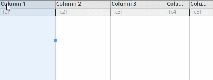
To rearrange the order of columns, drag a column and drop it at the necessary place (between two columns or onto an existing column; in the latter case, the dropped column will be placed before the column that was under):
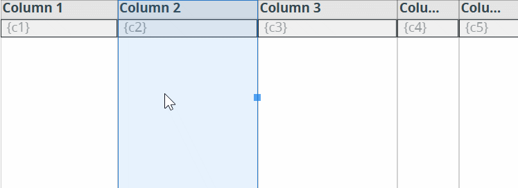
You can change the width of columns by dragging theresizing mark on its right edge if the column width is specified in pixels (see gridLength):
Tables and TableColumns comply with these layout rules:
- Table body occupies the full height of the table, except header and footer.
- By default, the height of the Table header and / or footer (if any) is equal to rowHeight.
- Header and footer height can be customized with the CSS.
- Horizontal alignment of the header of a TableColumn depends on its data type (e.g., numeric values are right-aligned).
- Text alignment set for the header of a TableColumn defines only the alignment of this header. It has no effect on the text alignment of the data in this TableColumn.
- Text alignment of data in a TableColumn is controlled by the text alignment of the column widget.
A screen record where all fields from the table are added is created automatically:
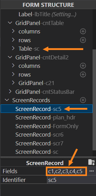
It is the screen record name that is to be referenced in 4GL to display or input arrays. When you change the order of the table columns in the Design Area, the order of the column field names is not changed in the corresponding screen record.
Therefore, after the columns are arranged,
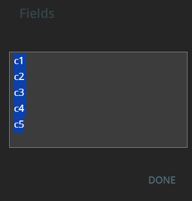
it may be necessary to rearrange the screen record list. To do it, click
the More ( ) button to the right of the fields list.
This will call the dialog window, where the fields can be moved or deleted:
) button to the right of the fields list.
This will call the dialog window, where the fields can be moved or deleted:
The Table container shares some unique properties with the TreeTable:
- Grid Color specifies the color of a screen grid;
- Image Collapsed specifies the path to the image that will be displayed next to a collapsed tree wrapper item. The property has effect when a tree view wrapper property is applied to a screen grid;
- Image Expanded specifies the path to the image that will be displayed next to an expanded tree wrapper item. The property has effect, when a tree view wrapper property is applied to a screen grid.
Table Features
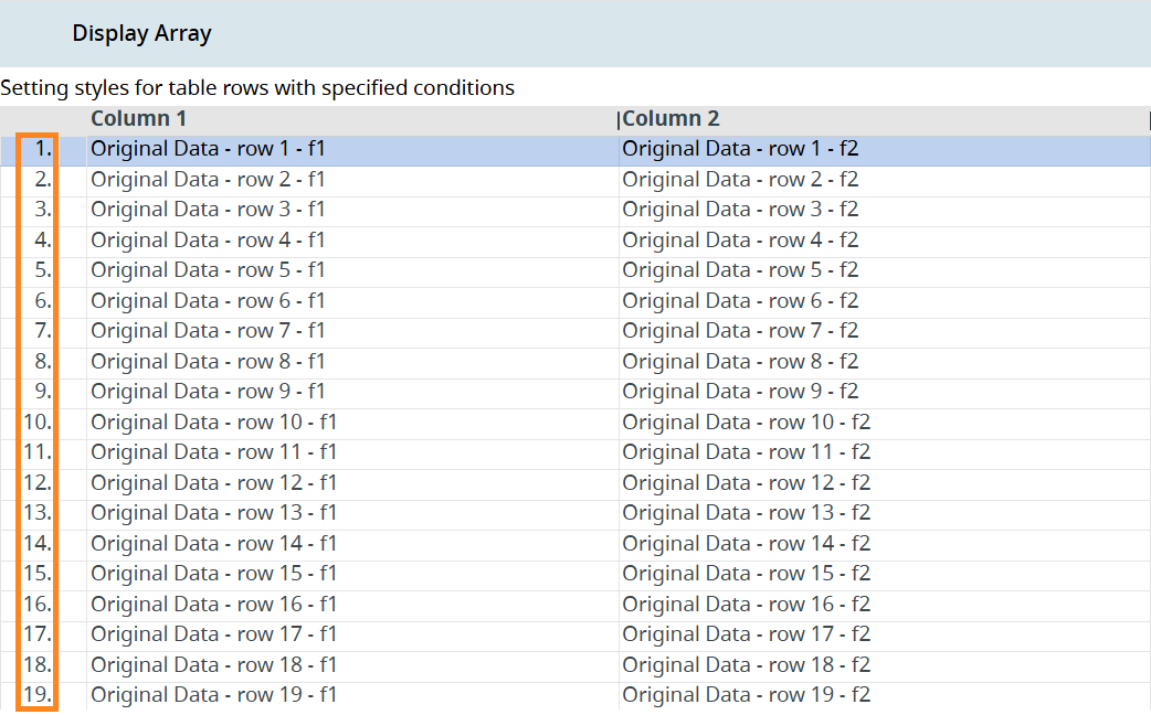
Row Numbering
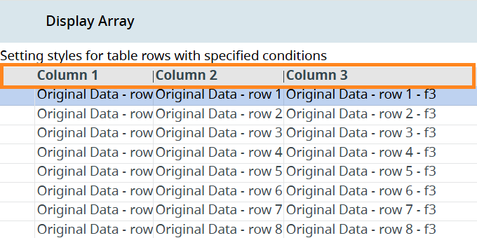
By default, the rows in the table don't have any numbering visible to the end user:
You can assign ordinal numbers to the table rows (except for the header row). To do that, open the Form Builder, select the Table in the Design Area or the Form Structure, and add the row-numbering class in the ClassNames property. Rebuild your application, deploy it, and run. At runtime, it will display the row numbering:
Checkboxes and Multi-Selecting in Tables
You can add checkboxes to your tables for the user to select specific rows (or all of them at once by clicking the checkbox in the header row if the multi-selecting is enabled):
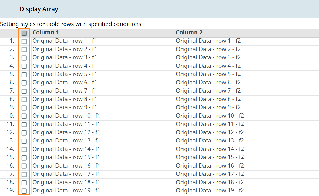
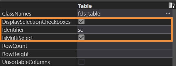
To add those checkboxes, open the Form Builder, select the Table in the Design Area or the Form Structure, and find the following properties in the Properties view:
- DisplaySelectionCheckboxes (you can use this one separately if you want to enable the single row selection only);
- IsMultiSelect (this enables multi-selection of the rows).
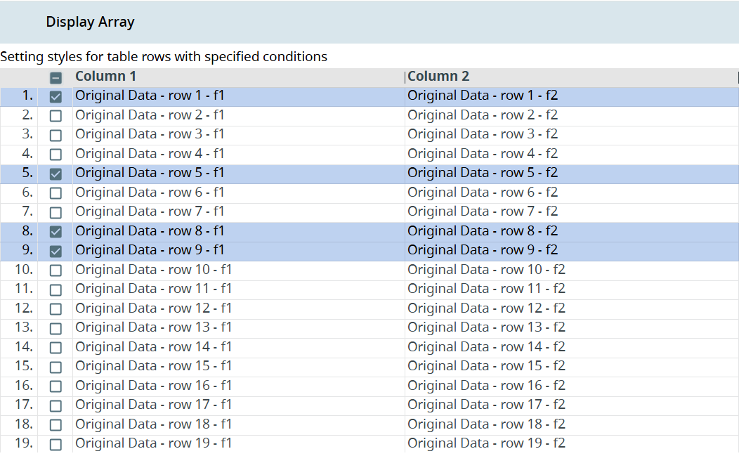
Build, deploy, and run your application. As a result, the selection column will appear in the left part of the table, ready for multi-selection. Click the checkboxes to select rows:
Context Menus
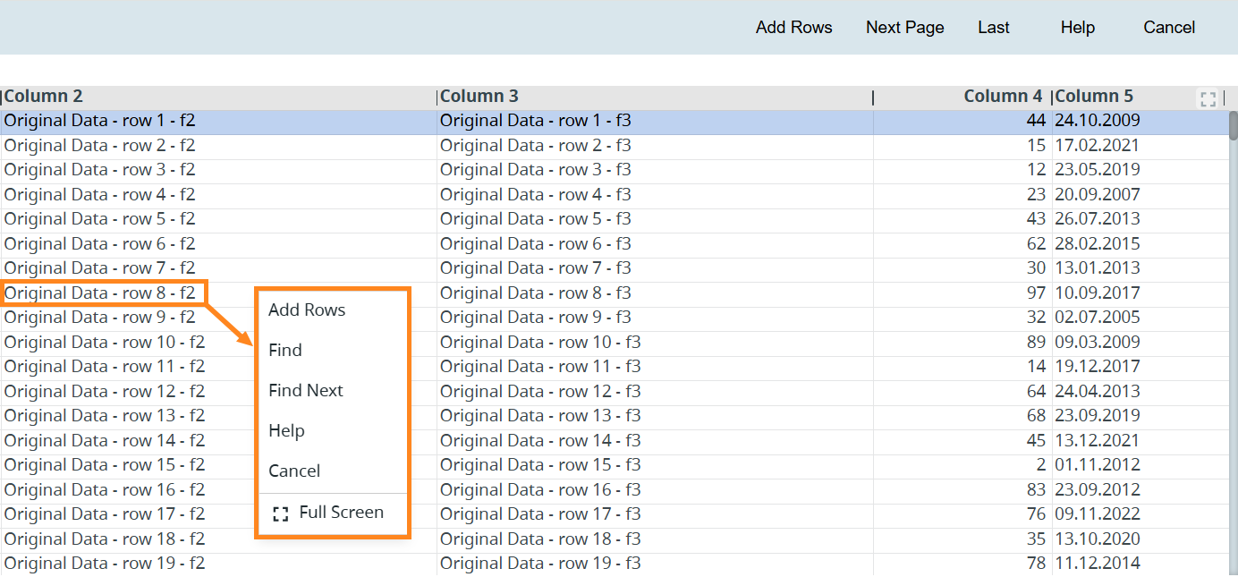
The tables have two types of context menus:
- Table Control Context Menu: Invoked by right-clicking a row or a table header. The Table Control Context Menu is available for every table by default, and it reflects the actions available in the Toolbar along with the Full Screen option for this table.
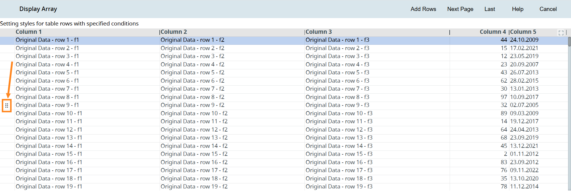
- Popup Menu: An additional menu, invoked by right-clicking the six-dot icon that appears to the left of the table data on hovering over the row:
To add the Popup Menu, do the following:
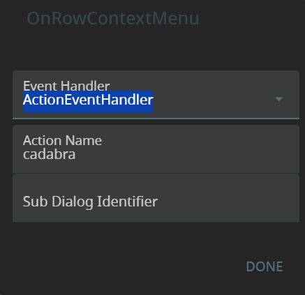
Step 1. In the Properties view, find the property named OnRowContextMenu, and double-click its value to open the dialog. In the Event Handler, select the ActionEventHandler option, and assign a name for your action:
Alternatively, add it in the .fm2 form file:
<Table.onRowContextMenu>
<ActionEventHandler actionName="cadabra" />
</Table.onRowContextMenu>
Step 2. Specify the actions you need as the options of your Popup Menu in your .4gl file:
FUNCTION mytablePopupContextMenu(idx INT)
MENU ATTRIBUTE (style="popup")
ON ACTION ("ACTION1")
DISPLAY "Action 1 selected for row ", idx
ON ACTION ("ACTION2")
DISPLAY "Action 2 selected for row ", idx
ON ACTION ("ACTION3")
DISPLAY "Action 3 selected for row ", idx
ON ACTION ("ACTION4")
DISPLAY "Action 4 selected for row ", idx
END MENU
END FUNCTION
Step 3. In your .4gl file, create the action for your ActionEventHandler:
ON ACTION 'cadabra'
CALL mytablePopupContextMenu(fgl_geteventrownum())
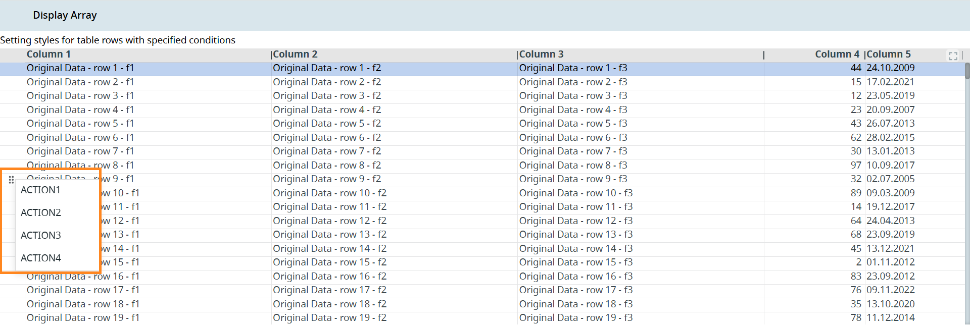
Build, deploy, and run your program. Hover over a row and right-click the icon that appears to the left of the table data display:
Full-Screen Mode
The table can be opened in a full-screen mode by clicking the Full Screen button in the upper-right corner of the table, or right-clicking the table and selecting the Full Screen option, in that popup menu:
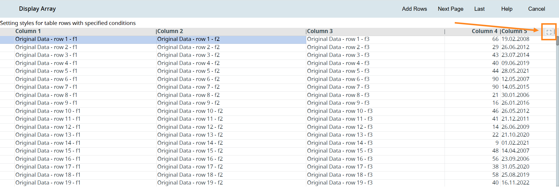
Clicking that button hides the Toolbar. The right-click-invoked Table Control Context Menu (containing the actions from the Toolbar) remains available.
Header Row Hiding
You can hide the header row by adding the no-header class to the Table element in the Properties view of Form Builder. As a result, the header row will not be disaplyed both in the Form Builder and at runtime:
 Related articles