RadioButton
 Radio buttons allow you to create a group of items from which only one option can be chosen. You can have one single or several radio button items in one radio button group but all items in the group will write to the same variable.
Radio Button widget allows adding radio buttons to the custom location on the form, unlike the RadioButtonList widget, where all the items are grouped in one place and definite order.
Most commonly used Theme and Form Properties:
 Title property specifies which label will be displayed to the radio button object. The Value property identifies which value will be actually passed to the variable or may be received by the radio button.
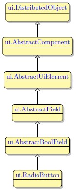
Inheritance diagram:
Form XML Code
RadioButton embedded in the GridPanel:
<radiobutton title="New Radio Button" groupIdentifier="rb_group" fieldType="FORM_ONLY" fieldTable="formonly" enable="true" visible="true" identifier="f1">
<griditemlocation gridWidth="1" gridHeight="1" gridY="0" gridX="0"/>
<value type="stringliteral" stringValue="rb1"/>
</radiobutton>
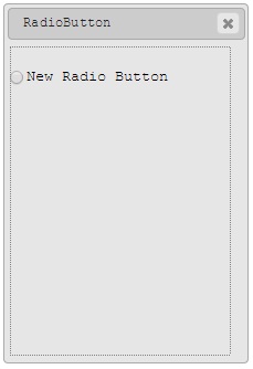
RadioButton as seen in Lycia Form Designer
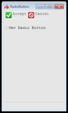
RadioButton as seen in Lycia Desktop
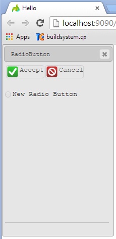
RadioButton as seen in Lycia Web
List of separate RadioButtons embedded in the GridPanel (compare to RadioButtonList):
<radiobutton title="1st Radio Button" groupIdentifier="rb_group" fieldType="FORM_ONLY" fieldTable="formonly" enable="true" visible="true" identifier="f1">
<griditemlocation gridWidth="1" gridHeight="1" gridY="0" gridX="0"/>
<value type="stringliteral" stringValue="rb1"/>
</radiobutton>
<radiobutton fieldType="FORM_ONLY" fieldTable="formonly" enable="true" visible="true" identifier="f2" groupIdentifier="rb_group" title="2nd Radio Button">
<griditemlocation gridWidth="1" gridHeight="1" gridY="1" gridX="0"/>
<value type="stringliteral" stringValue="rb2"/>
</radiobutton>
<radiobutton fieldType="FORM_ONLY" fieldTable="formonly" enable="true" visible="true" identifier="f3" groupIdentifier="rb_group" title="3rd Radio Button">
<griditemlocation gridWidth="1" gridHeight="1" gridY="2" gridX="0"/>
<value type="stringliteral" stringValue="rb3"/>
</radiobutton>
<radiobutton fieldType="FORM_ONLY" fieldTable="formonly" enable="true" visible="true" identifier="f4" groupIdentifier="rb_group" title="4th Radio Button">
<griditemlocation gridWidth="1" gridHeight="1" gridY="3" gridX="0"/>
<value type="stringliteral" stringValue="rb4"/>
</radiobutton>
<radiobutton fieldType="FORM_ONLY" fieldTable="formonly" enable="true" visible="true" identifier="f5" groupIdentifier="rb_group" title="5th Radio Button">
<griditemlocation gridWidth="1" gridHeight="1" gridY="4" gridX="0"/>
<value type="stringliteral" stringValue="rb5"/>
</radiobutton>
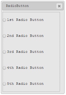
List of separate RadioButtons as seen in Window Builder
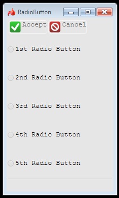
List of separate RadioButtons as seen in Lycia Desktop
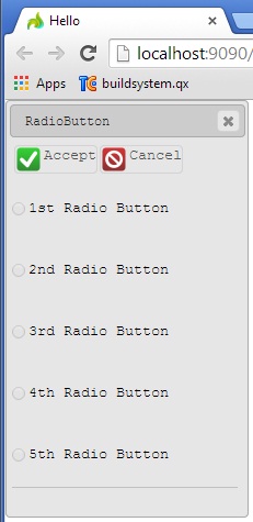
List of separate RadioButtons as seen in Lycia Web
Adding a label to a form using the graphical form editor
RadioButtons may prove useful when it is necessary to create a field for restricted input, where the user is able only to select among available variants. To create a RadioButton group, perform the following steps:
1. Add a RadioButtonList widget and set its identifier, width and height. For normal display, the height in rows should correspond to the number of radio button list items you want to add. To have two radio buttons, we create a RadioButtonList with two rows:
The RadioButtonList widget is empty and transparent by default. It should be filled with RadioButtonListItems that are also selected from the Palette:
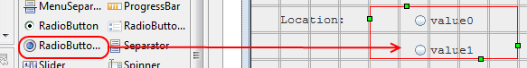
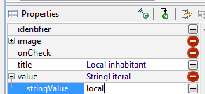
2. Select RadioButtonList items in the Structure view one after another and set up their properties:
· Title - The text of the label that will be displayed to the item.
· Value - The value that will be passed to the corresponding variable when the item is selected during the input. The Value property consists of the data type and value sub-properties:
Applying theme options.
Radio Button

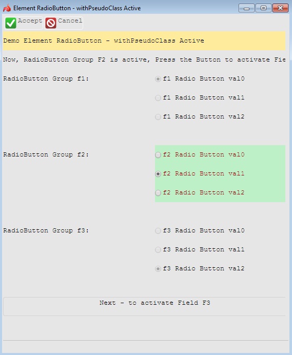
A radio button widget, including each option available in it. Properties applied to a button group filter affect the area where the radio button options are grouped, but not the options themselves. For example, setting the background for the button group will apply the background to the area beneath the radio buttons and their labels whereas setting the font colour will have no effect, because the labels belong to the radio button options.
Button Group

A single option of a radio button group. Properties applied to a radio button filter will affect the radio buttons themselves and their labels and not the area in between and beneath the labels. For example the foreground colour property will change the colour of the labels and the background colour property will change the shade of the radio buttons but not the colour of the area beneath the labels.
Example 1: Changing the color of the active RadioButton.
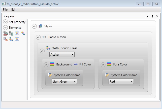
<StyleSheet xmlns="http://querix.com">
<ElementFilter ElementName="RadioButton">
<StyleSheet>
<WithPseudoClassFilter PseudoClassName="Active">
<StyleSheet>
<DoStyleAction>
<SetProperty>
<PropertyPath>
<PropertyName>Background</PropertyName>
<PropertyName>FillColor</PropertyName>
</PropertyPath>
<PropertyValue type="SystemColor" SystemColorName="LightGreen" />
</SetProperty>
</DoStyleAction>
<DoStyleAction>
<SetProperty>
<PropertyPath>
<PropertyName>ForeColor</PropertyName>
</PropertyPath>
<PropertyValue type="SystemColor" SystemColorName="Red" />
</SetProperty>
</DoStyleAction>
</StyleSheet>
</WithPseudoClassFilter>
</StyleSheet>
</ElementFilter>
</StyleSheet>
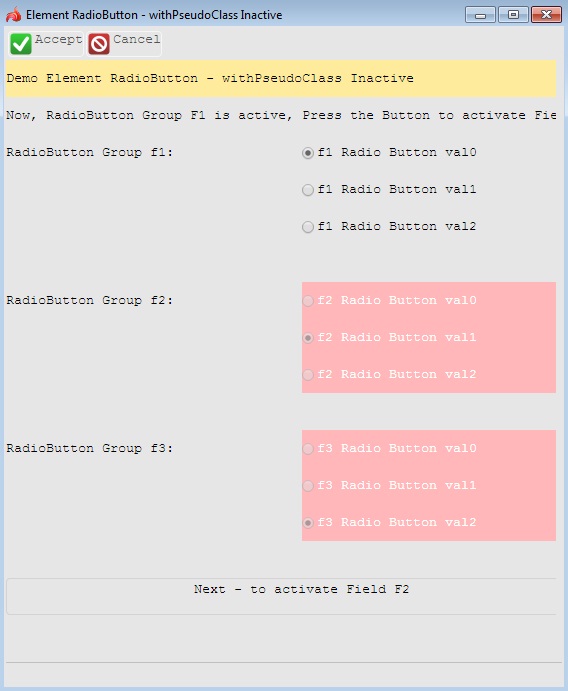
Example 2: Changing the color of the inactive RadioButton.
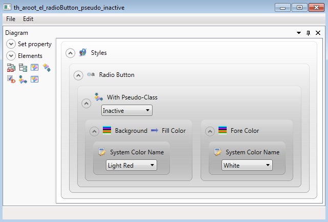
<StyleSheet xmlns="http://querix.com">
<ElementFilter ElementName="RadioButton">
<StyleSheet>
<WithPseudoClassFilter PseudoClassName="Inactive">
<StyleSheet>
<DoStyleAction>
<SetProperty>
<PropertyPath>
<PropertyName>Background</PropertyName>
<PropertyName>FillColor</PropertyName>
</PropertyPath>
<PropertyValue type="SystemColor" SystemColorName="LightRed" />
</SetProperty>
</DoStyleAction>
<DoStyleAction>
<SetProperty>
<PropertyPath>
<PropertyName>ForeColor</PropertyName>
</PropertyPath>
<PropertyValue type="SystemColor" SystemColorName="White" />
</SetProperty>
</DoStyleAction>
</StyleSheet>
</WithPseudoClassFilter>
</StyleSheet>
</ElementFilter>
</StyleSheet>
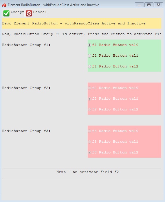
Example 3: Changing colors of both active and inactive RadioButtons.
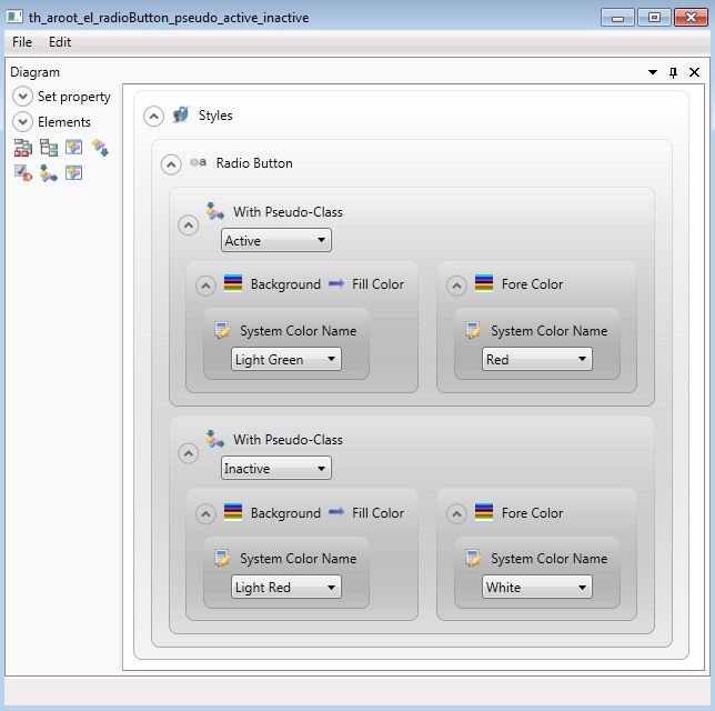
<StyleSheet xmlns="http://querix.com">
<ElementFilter ElementName="RadioButton">
<StyleSheet>
<WithPseudoClassFilter PseudoClassName="Active">
<StyleSheet>
<DoStyleAction>
<SetProperty>
<PropertyPath>
<PropertyName>Background</PropertyName>
<PropertyName>FillColor</PropertyName>
</PropertyPath>
<PropertyValue type="SystemColor" SystemColorName="LightGreen" />
</SetProperty>
</DoStyleAction>
<DoStyleAction>
<SetProperty>
<PropertyPath>
<PropertyName>ForeColor</PropertyName>
</PropertyPath>
<PropertyValue type="SystemColor" SystemColorName="Red" />
</SetProperty>
</DoStyleAction>
</StyleSheet>
</WithPseudoClassFilter>
<WithPseudoClassFilter PseudoClassName="Inactive">
<StyleSheet>
<DoStyleAction>
<SetProperty>
<PropertyPath>
<PropertyName>Background</PropertyName>
<PropertyName>FillColor</PropertyName>
</PropertyPath>
<PropertyValue type="SystemColor" SystemColorName="LightRed" />
</SetProperty>
</DoStyleAction>
<DoStyleAction>
<SetProperty>
<PropertyPath>
<PropertyName>ForeColor</PropertyName>
</PropertyPath>
<PropertyValue type="SystemColor" SystemColorName="White" />
</SetProperty>
</DoStyleAction>
</StyleSheet>
</WithPseudoClassFilter>
</StyleSheet>
</ElementFilter>
</StyleSheet>
Example programs:
Project: form-demo3
-
fd2_radio_button_3
-
fd2_widget_e_radioButton_example_simple_01
-
fd2_widget_e_radioButton_property_defaultSize_01
-
fd2_widget_radioButton_simple
-
fd2_widget_radioButton_various
-
fd2_widget_radio_01
PER syntax and additional information
Handling RadioButton is a form widget for restricted input
The purpose of the radio button widget is to provide a selection group from which only one option can be chosen. Each option has its own value. When the input is performed from a radio button widget, the variable receives the value depending on the choice.
A radio button must be added to the SCREEN section and declared in the ATTRIBUTE section of the form specification file by following this syntax:
Field_tag = database.field_name,
config = "option1_value {option1 label}
[option2_value {option2 label}...]",
widget="radio",
[class="key"],
[default="default value"];
Here field_tag represents the corresponding field tag in the Screen section of the form specification file, and field_name stands for the name of the field which follows the table name or the "formonly" keyword, e.g. f01 = formonly.mar_status.
The widget attribute sets the widget type to "radio" converting a normal field into a radio button widget.
The class attribute is an optional attribute which specifies the way the program treats the user input. The absence of this attribute makes the program return a character value from the radio button widget. If this attribute is specified, the program regards the user’s choice as an action or a keypress.
The default attribute specifies the default value of the widget.
Here is a simple example of a radio button widget declaration.
DATABASE formonly
Screen {
What is your marital status? [f01 ]
}
ATTRIBUTES
f01 = formonly.mar_status TYPE CHAR,
config = "married {Married} single {Single}",
widget="radio";
INSTRUCTIONS
DELIMITERS "[]"
This will create a radio button group which includes two options: "married" and "single". When the user picks one of these options, its value will be passed to the corresponding variable in the source file.
Defining the Options and Their Values
The "config" attribute includes a number of strings separated by spaces. These are the option labels and values assigned to them.
· The string without the braces sets the value for the first option. This value will be assigned to the variable, if this option is selected by the user during the input.
· The string in the braces assigns a label that will be displayed next to the first option of the radio button. The curly braces are optional.
The second set of strings will assign a value with an accompanying label to the second option, and so on. There can be as many strings as many items you want your radio button group to include. The succession of strings must be enclosed in quotes.
For example, in the following source code a CHAR variable "occupation" is declared.
DEFINE occupation CHAR (20)
INPUT BY NAME occupation
In the ATTRIBUTES section of the form specification file we create a radio button group which includes two options.
f1 = formonly.occupation,
config = "Student {Student} Worker {Worker} Teacher {Teacher}",
widget = "radio";
If the user selects the button "Worker", the corresponding value "Worker" will be sent to the variable "occupation" defined in the source file. The same variable will receive the value "Teacher" if this option is picked.
In the next example, the value "30" will be sent to the INT data type variable "age" if the user selects the first option, and correspondingly "40" or "50" if these options are picked. If the user does not select anything and presses the Accept key, "30" will be assigned to the variable, because it is the default value and it is already selected when the input begins.
#4GL file:
MAIN
DEFINE age INT
OPEN WINDOW win1 AT 2, 2 WITH FORM "pers_info"
INPUT BY NAME age
DISPLAY age at 2,2
END MAIN
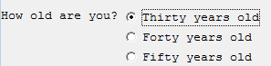
Here is the "pers_info" form:
DATABASE formonly
Screen {
How old are you? [f01 ]
}
ATTRIBUTES
f01 = formonly.age TYPE INT,
config = "30 {Thirty years old} 40 {Forty years old} 50 {Fifty years old}",
widget= "radio",
default="30";
INSTRUCTIONS
DELIMITERS "[]"
When you run the application, you will see the following in the screen:
It is advisable that you leave some blank lines below the radio button widget specification. The number of the blank lines should at least correspond to the number of the widget options. Otherwise, the options will probably not fit the screen or overlap/be overlapped with other form objects.
Triggering Actions
Instead of sending values directly to variables in a source file, a radio button can trigger a key or action event. A different key or action event will be triggered depending on the option selected, if you choose this method. In this case the class attribute should be added to the specification of the corresponding radio button: class = "key". At the same time the config option should include the key names rather than values for each option. In the example below the configuration string comprises several keys that will generate certain events or actions when the user selects the corresponding buttons.
f01 = formonly.answer TYPE CHAR,
config = "F1 {Accept} F2 {Decline}",
widget = "radio",
class= "key";
This code will invoke either the ON KEY (F1) or ON KEY (F2) clause of the input depending on which option the user chooses.
The radio button widget is deactivated by default. If you do not activate it in the source code, the user won’t be able to choose from the widget options. You can activate the radio button set by displaying "!" to this field (you can also disable it by displaying "*" to it, just the same as with the Button widget). The DISPLAY statement should be placed in the BEFORE INPUT clause of the IMPUT ... FROM radio_button statement:
MAIN
DEFINE answer CHAR (30), num INT
OPEN WINDOW win1 AT 2,2 WITH FORM "pers_info"
INPUT BY NAME answer
BEFORE INPUT
DISPLAY "!" TO formonly.answer
ON KEY (F1)
DISPLAY "The offer has been accepted" AT 2, 2
ON KEY (F2)
DISPLAY "The offer has been declined" AT 2, 2
END INPUT
END MAIN
The same attribute class option "key" is used to define some actions performed when a certain item in a radio button group is selected without the Accept button being pressed:
f01 = formonly.answer TYPE CHAR,
config = "Send_mail {Send mail} No_mail {Don’t send mail}",
widget = "radio",
class = "key";
If the user clicks on one of the options in the radio button group declared above, the corresponding ON ACTION ("Send_mail") or ON ACTION ("No_mail") clause will be executed.
MAIN
DEFINE answer CHAR (30)
OPTIONS
PROMPT LINE FIRST
OPEN WINDOW win1 AT 2,2 WITH FORM "111"
INPUT BY NAME answer
BEFORE INPUT
DISPLAY "!" TO formonly.answer
ON ACTION (Send_mail)
DISPLAY "Type your message in the text area" AT 2, 2
ON ACTION (No_mail)
PROMPT "Choose another way to contact us" FOR answer
END INPUT
END MAIN