Step 1: Adding the element

Chart is a graphic representation of data. Charts allow data visualization and thus help users to better understand and predict current and future data.
To add the Chart object to your report, you drag it from the Palette and drop to you report.

After you have added the chart object to your report, the New Chart wizard opens.
New Chart wizard
The wizard has 3 tabs where each tab is a separate step in the process of creating the chart.
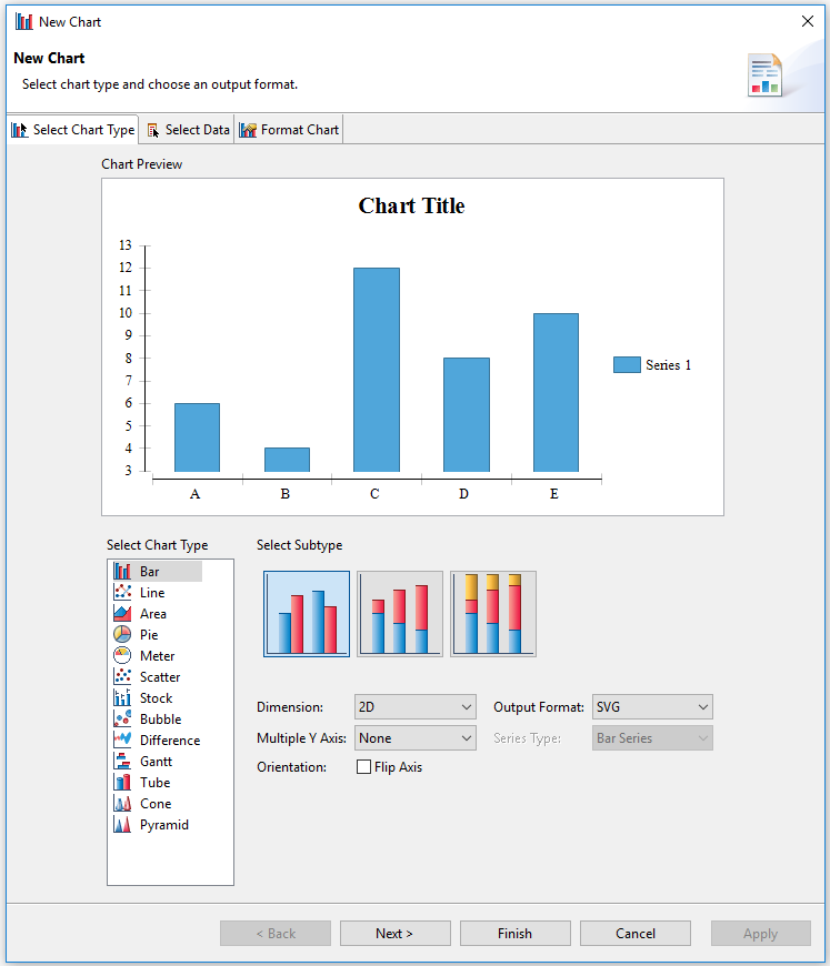
In the Select Chart Type tab, you specify the type of the chart (see Step 2):
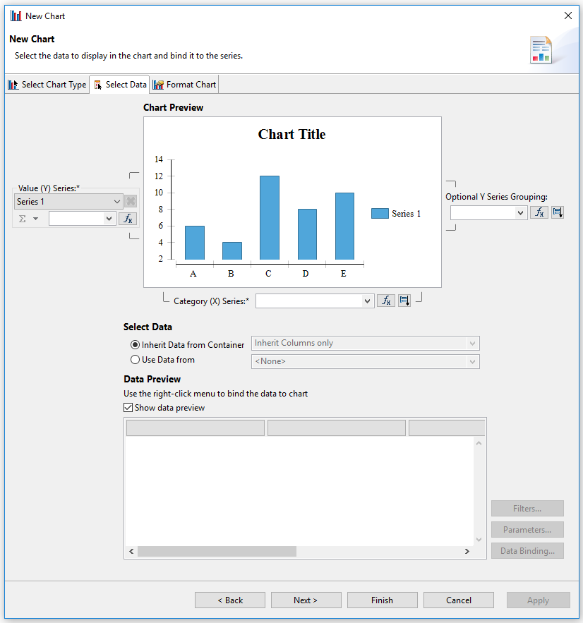
In the Select Data tab, you select the data on which you want to build your chart (see Step 3):
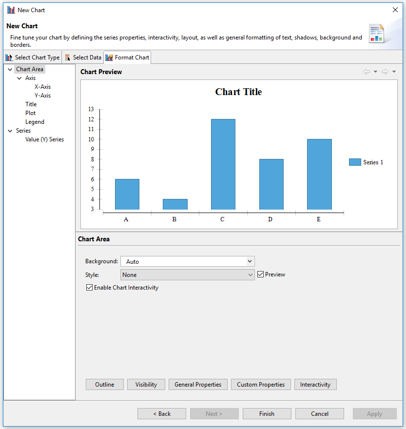
In the Format chart tab, you format the chart including its title, series, plot, legend and axis (see Step 4):