Calendar is used to display and input dates with a built-in calendar in order to facilitate input.
|
|
Calendar is used to display and input dates with a built-in calendar in order to facilitate input. |
|
|
|
Calendar inserted in a GridPanel as seen in Lycia Form Designer: |
|
|
Form XML code:
<Calendar dataType="Date,,,," visible="true" identifier="f1">
Theme element filter XML code:
<ElementFilter ElementName="Calendar">
...
</ElementFilter>
CSS element selector code:
qx-aum-calendar
.qx-aum-calendar .qx-text ↓
Associated 4gl syntax:
Most commonly used form properties:
comment
required
reverse
toolTip
Inheritance diagram:
|
|
|
Associated ui methods:
SetDateValue
GetDateValue
SetOnSelectDate
GetOnSelectDate
SetSystemDate
GetSystemDate
Influence and behavior:
To add a calendar to your form,
|
Step 1 |
Choose a calendar from the widgets palette by left-clicking its icon:
|
|
Step 2 |
Select the place in the form where you want to put a calendar (in the screenshot below, we choose a cell in a Grid panel):
|
|
Step 3 |
Left-click the selected spot (cell or sector) to place a calendar there:
|
|
|
The calendar is now added to your form, and you can see it in the Structure view.
|
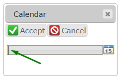
There are two ways to enter date to the calendar at runtime:
→ to choose a date from a built-in drop-down calendar:
|
|
|
|
|
|
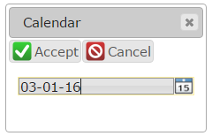
→ to type in the date from the keyboard:
|
|
|
|
|
Here you can find out how to input data to a calendar using the INPUT statement, e.g.:
INPUT BY NAME f1 WITHOUT DEFAULTS
Date is input and displayed in the format specified in the DBDATE environment variable:
|
DBDATE value |
MDY4/ (default)
|
MDY2-
|
DMY4.
|
|
runtime appearance |
|
|
|
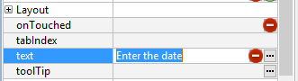
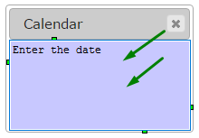
Here you can find out how to change the initial text displayed to the calendar in the form:
|
|
|
Here you can find out how to change the text displayed to the calendar at runtime using ui methods or DISPLAY ... TO statement.
You can change appearance properties of a calendar in Lycia Form Designer. However, we recommend applying appearance properties via user themes and css.
To apply a property to a calendar, set its value in the user theme, directly or using filters.
In the example below, we change the calendar's background color depending on whether it is active or inactive by applying Fill Color property with a Pseudo-Class filter.
|
property applied in the user theme |
|
|
|
theme XML code |
<StyleSheet xmlns="http://querix.com"> <ElementFilter ElementName="Calendar"> <StyleSheet> <WithPseudoClassFilter PseudoClassName="Active"> <StyleSheet> <DoStyleAction> <SetProperty> <PropertyPath> <PropertyName>Background</PropertyName> <PropertyName>FillColor</PropertyName> </PropertyPath> <PropertyValue type="CustomizedColor" RedColor="144" GreenColor="238" BlueColor="144" Alpha="255" /> </SetProperty> </DoStyleAction> </StyleSheet> </WithPseudoClassFilter> <WithPseudoClassFilter PseudoClassName="Inactive"> <StyleSheet> <DoStyleAction> <SetProperty> <PropertyPath> <PropertyName>Background</PropertyName> <PropertyName>FillColor</PropertyName> </PropertyPath> <PropertyValue type="CustomizedColor" RedColor="238" GreenColor="232" BlueColor="170" Alpha="255" /> </SetProperty> </DoStyleAction> </StyleSheet> </WithPseudoClassFilter> </StyleSheet> </ElementFilter> </StyleSheet> |
|
|
runtime appearance |
|
|
In the example below, we use css to change the text style of the button:
.qx-aum-calendar .qx-text {
padding: 2px;
padding: 5px 10px;
color: white !important;
font: bold 14px "Calibri","Helvetica Neue", Sans-Serif;
}
Related articles:
DBDATE


