Toolbar separators are thin vertical lines used to separate toolbar buttons.
|
|
Toolbar separators are thin vertical lines used to separate toolbar buttons. |
|
|
|
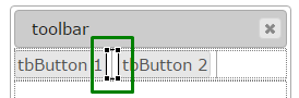
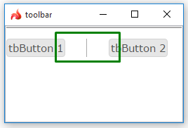
Toolbar with 2 toolbar buttons and a separator inserted in a Grid panel as seen in Lycia Form Designer |
|
|
Form XML code:
<ToolbarSeparator visible="true" identifier="tbSeparator1"/>
Theme element filter XML code:
<ElementFilter ElementName="ToolbarSeparator">
...
</ElementFilter>
CSS element selector code:
qx-aum-toolbar-separator
Associated theme properties:
Cursor
Element Border
Margin - left and right
Max Size
Min Size
Preferred Size
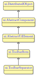
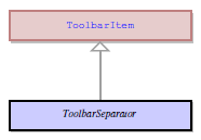
Inheritance diagram:
|
|
|
Associated functions:
Influence and behavior:
This page describes the behavior of all toolbar separators regardless of how they were created. However, it focuses on the statically created toolbar separators in some aspects.
Refer here to find details about dynamically generated toolbar separators.
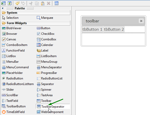
To add a toolbar separator to your form,
|
Step 1 |
Choose a ToolbarSeparator widget from the widgets palette by left-clicking its icon:
|
|
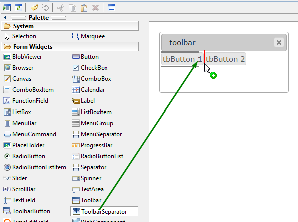
Step 2 |
Select a place between a pair of toolbar buttons where you want to place a toolbar separator:
|
|
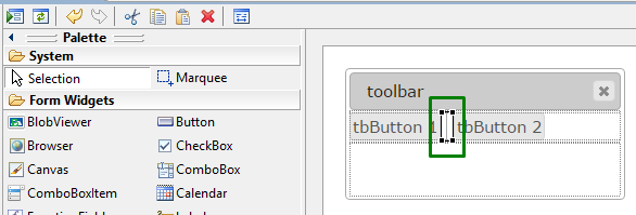
Step 3 |
Left-click to add a toolbar separator to the form:
|
|
|
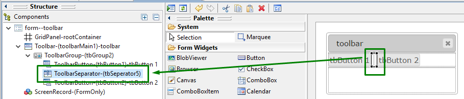
The toolbar separator is now added to your form, and you can see it in the Structure view.
|
Properties of a toolbar separator can be changed via user themes and css.
To apply a property to a toolbar separator, set its value in the user theme, directly or using filters.
In the example below, we increase the distance between toolbar buttons by applying the Margin property to a toolbar separator directly.
|
initial runtime appearance |
|
|
property applied in the user theme |
|
|
theme XML code |
<StyleSheet xmlns="http://querix.com"> <ElementFilter ElementName="ToolbarSeparator"> <StyleSheet> <DoStyleAction> <SetProperty> <PropertyPath> <PropertyName>Margin</PropertyName> </PropertyPath> <PropertyValue type="Thickness" Left="25" Top="0" Right="25" Bottom="0" /> </SetProperty> </DoStyleAction> </StyleSheet> </ElementFilter> </StyleSheet> |
|
changed runtime appearance |
|
At runtime, toolbar separators can be manipulated with ui methods.
Here you can read how to make a toolbar separator not visible using the setVisible method:
|
|
|
|
Related articles:
Dynamically Generated Toolbar Separators


