Toolbar contains a number of buttons which are used to invoke actions.
|
|
Toolbar contains a number of buttons which are used to invoke actions. |
|
|
|
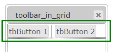
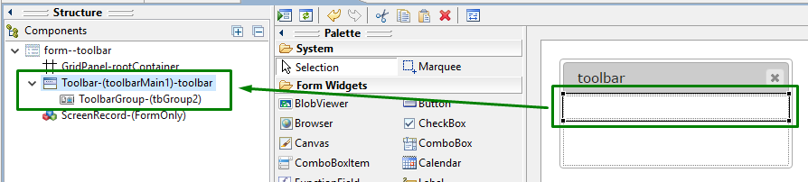
Toolbar with 2 toolbar buttons and a separator inserted in a Grid panel as seen in Lycia Form Designer |
|
|
Form XML code:
<Toolbar visible="true" identifier="toolbarMain1">
<ToolbarGroup visible="true" identifier="tbGroup2"/>
</Toolbar>
Theme element filter XML code:
<ElementFilter ElementName="Toolbar">
...
</ElementFilter>
CSS element selector code:
qx-aum-toolbar
.qx-aum-toolbar .qx-text
.qx-aum-toolbar .qx-image
Most commonly used form properties:
Most commonly used theme properties:
Location
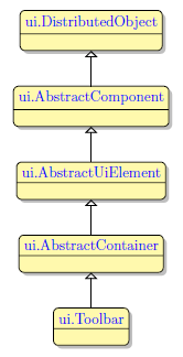
Inheritance diagram:
|
|
|
Associated functions:
Associated ui methods:
SetHideLabels →
GetHideLabels →
SetToolbarLocation
GetToolbarLocation
Influence and behavior:
This page describes the behavior of all toolbars regardless of how they were created. However, it focuses on the statically created toolbars in some aspects.
Refer here to find details about dynamically generated toolbars.
To add a toolbar to your form,
|
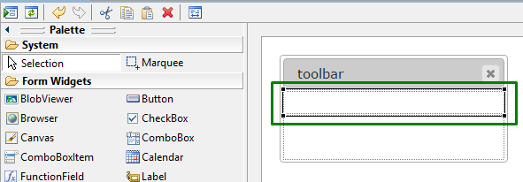
Step 1 |
Choose a Toolbar widget from the widgets palette by left-clicking its icon:
|
|
Step 2 |
Move the cursor to the form (toolbars can be added to the only place of the form - the toolbar line below the title bar):
|
|
Step 3 |
Left-click to add a toolbar to the form:
|
|
|
The toolbar is now added to your form, and you can see it in the Structure view.
|
Toolbars can be stored in form files and then applied to other forms and windows.
To create a toolbar from a file:
→ create a form which contains only a toolbar (and no other objects besides the default ones):

→ save it in the .fm2 format:

 Third-party files which are used to define toolbars are also converted to the .fm2 format.
→ use the loadToolbar() method to load the specified ui object:
CALL ui.Interface.LoadToolbar("mytoolbar_form")
or
CALL MyForm.LoadToolbar("mytoolbar_form")
Toolbar specification must include the file name and its relative path (for the files stored not in the current directory).
We recommend omitting the file extension when specifying the toolbar so that it will be added automatically at runtime.
|
form without a toolbar |
|
|
form with the loaded toolbar |
|
Toolbars added in such a way can be used in MDI containers.
By default, toolbars are 30px high in Lycia. In cases when you need a toolbar of a certain size (usually, the height), you need to specify it explicitly.
Toobar is NOT sized or resized depending on the height of its items.
There are four ways to specify the size of a toolbar:
→ in Lycia Form Designer - by specifying the value of the preferredSize property:

→ in Lycia Theme Designer - by specifying the value of the preferredSize property:

→ via css styles:
.qx-top-toolbar-cell .qx-aum-toolbar,
#qx-container-toolbars .qx-aum-toolbar
{ height: 50px; }
→ by means of the fgl_setproperty function:
CALL fgl_getproperty("gui", "html5.nonContentWidth", 50)
Regardless of the way you use, you get this result at runtime:
|
|
|
|
You can change toolbar properties in the form designer. However, we recommend applying appearance properties via user themes and css.
To apply a property to a toolbar, set its value in the user theme, directly or using filters.
Properties applied to the Toolbar will affect only the area where toolbar buttons are situated but not the buttons themselves.
In the example below, we change the toolbar color by applying Fill Color property directly to the corresponding element.
|
property applied in the user theme |
|
|
theme XML code |
<StyleSheet xmlns="http://querix.com"> <ElementFilter ElementName="Toolbar"> <StyleSheet> <DoStyleAction> <SetProperty> <PropertyPath> <PropertyName>Background</PropertyName> <PropertyName>FillColor</PropertyName> </PropertyPath> <PropertyValue type="CustomizedColor" RedColor="0" GreenColor="128" BlueColor="0" Alpha="255" /> </SetProperty> </DoStyleAction> </StyleSheet> </ElementFilter> </StyleSheet> |
|
runtime appearance |
|
In the example below, we use css to change the color of the toolbar:
.qx-aum-toolbar {
padding: 2px;
padding: 5px 10px;
color: green;
}
At runtime, toolbars can be manipulated with ui methods.
Here you can find out how to make labels of toolbar buttons invisible at runtime using the setHideLabels method:
|
|
|
|
Example programs:
CVS server: client.querix.com
CVS repository: /lycia_doc_examples
User: client
Project: user_interface/widgets
Program: toolbar_from_file
Related articles:
Dynamically-generated Toolbars


