Toolbar button is a button on a toolbar which is used to invoke actions.
As a graphical object, toolbar buttons often include labels, icons, or tooltips.
|
|
Toolbar button is a button on a toolbar which is used to invoke actions. As a graphical object, toolbar buttons often include labels, icons, or tooltips. |
|
|
|
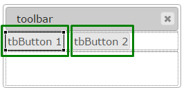
Toolbar with 2 toolbar buttons and a separator inserted in a Grid panel as seen in Lycia Form Designer |
|
|
Form XML code:
<ToolbarButton text="tbButton 1" visible="true" identifier="tbButton1">
<ToolbarButton.onInvoke>
<ActionEventHandler type="actioneventhandler" actionName="actTbButton"/>
</ToolbarButton.onInvoke>
</ToolbarButton>
Theme element filter XML code:
<ElementFilter ElementName="ToolbarButton">
...
</ElementFilter>
CSS element selector code:
qx-aum-toolbar-button
Associated 4gl syntax:
INPUT ↓
Most commonly used form properties:
Most commonly used theme properties:
Inheritance diagram:
|
|
|
Associated functions:
Associated ui methods:
SetAllowNewLines →
GetAllowNewLines →
SetIdentifier →
GetIdentifier →
SetText →
GetText
Influence and behavior:
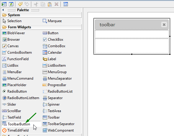
To add a toolbar button to your form,
|
Step 1 |
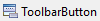
Choose a ToolbarButton widget from the widgets palette by left-clicking its icon:
|
|
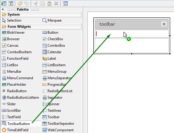
Step 2 |
Move the cursor to the toolbar (toolbar buttons are added to the left-most empty area of the toolbar):
|
|
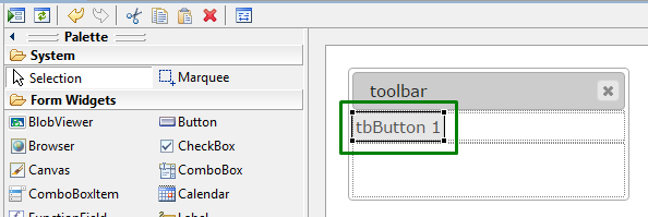
Step 3 |
Left-click to add a toolbar button to the form:
|
|
|
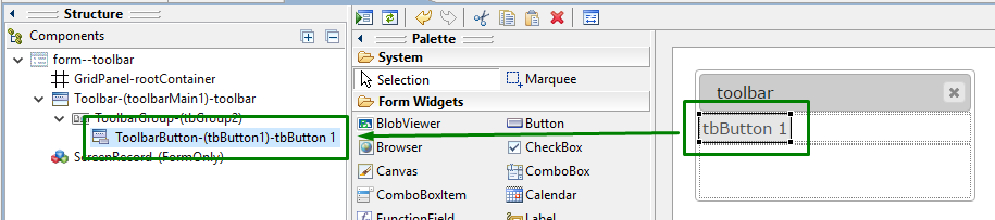
The toolbar button is now added to your form, and you can see it in the Structure view.
|
To make a toolbar button trigger actions, you:
|
Step 1 |
Add an OnInvoke event to the toolbar button in Lycia Form Designer:
|
||
|
Step 2 |
Specify the action name - you can use both default and custom ones:
|
||
|
|
|
||
|
Step 3 |
Assign a specific action to the toolbar button by the action name in 4gl source code:
MENU ON ACTION "display_text" DISPLAY "Hello, world!" TO f1 ON ACTION "clear_text" CLEAR f1 END MENU
|
||
|
|
The toolbar will trigger the assigned action:
|
||
|
|
|
|
|
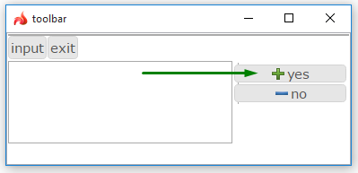
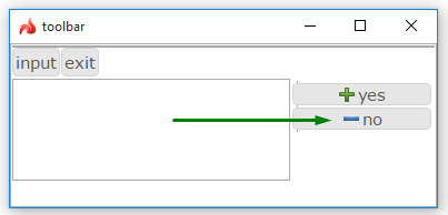
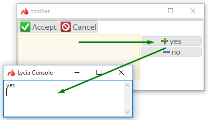
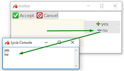
To make toolbar buttons active and trigger an event only when focus is a definite field,
|
4gl code sample |
MENU COMMAND "input" INPUT BY NAME f1 ON ACTION "show_yes" INFIELD f1 DISPLAY "yes" ON ACTION "show_no" INFIELD f1 DISPLAY "no" END INPUT COMMAND "exit" EXIT MENU END MENU
|
|
|
runtime behavior when the focus is out of the necessary field |
|
|
|
runtime behavior when the focus is in the necessary field |
|
|
You can change toolbar button properties in the form designer. However, we recommend applying appearance properties via user themes and css.
To apply a property to a toolbar button, set its value in the user theme, directly or using filters.
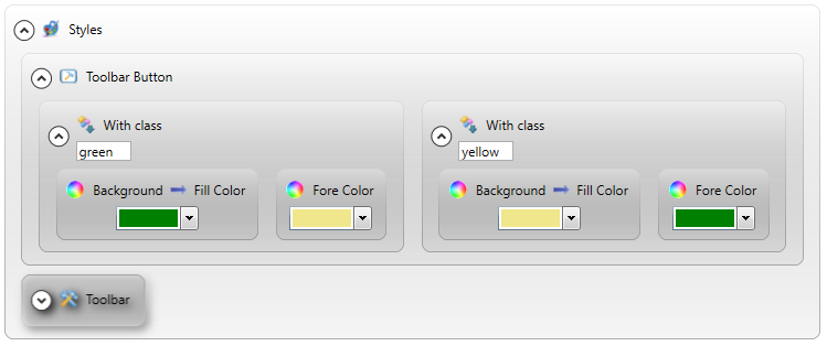
In the example below, we specify the appearance of toolbar buttons by applying Fill Color and Fore Color properties with a With class filter.
|
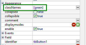
class names set in lycia form designer |
|
|
|
property applied in the user theme |
|
|
|
theme XML code |
... <ElementFilter ElementName="ToolbarButton"> <StyleSheet> <WithClassFilter ClassName="green"> <StyleSheet> <DoStyleAction> <SetProperty> <PropertyPath> <PropertyName>Background</PropertyName> <PropertyName>FillColor</PropertyName> </PropertyPath> <PropertyValue type="CustomizedColor" RedColor="0" GreenColor="128" BlueColor="0" Alpha="255" /> </SetProperty> </DoStyleAction> <DoStyleAction> <SetProperty> <PropertyPath> <PropertyName>ForeColor</PropertyName> </PropertyPath> <PropertyValue type="CustomizedColor" RedColor="240" GreenColor="230" BlueColor="140" Alpha="255" /> </SetProperty> </DoStyleAction> </StyleSheet> </WithClassFilter> <WithClassFilter ClassName="yellow"> <StyleSheet> <DoStyleAction> <SetProperty> <PropertyPath> <PropertyName>Background</PropertyName> <PropertyName>FillColor</PropertyName> </PropertyPath> <PropertyValue type="CustomizedColor" RedColor="240" GreenColor="230" BlueColor="140" Alpha="255" /> </SetProperty> </DoStyleAction> <DoStyleAction> <SetProperty> <PropertyPath> <PropertyName>ForeColor</PropertyName> </PropertyPath> <PropertyValue type="CustomizedColor" RedColor="0" GreenColor="128" BlueColor="0" Alpha="255" /> </SetProperty> </DoStyleAction> </StyleSheet> </WithClassFilter> </StyleSheet> </ElementFilter>
|
|
|
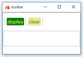
runtime appearance |
|
|
At runtime, toolbar buttons can be manipulated with ui methods.
Here you can find out how to enable or disable tooltips at runtime using the setTooltip method:

Example programs:
CVS server: client.querix.com
CVS repository: /lycia_doc_examples
User: client
Project: form_properties
Program: toolbarbutton


 -
-


