actions
Is used to add action triggers to the form and modify their attributes.
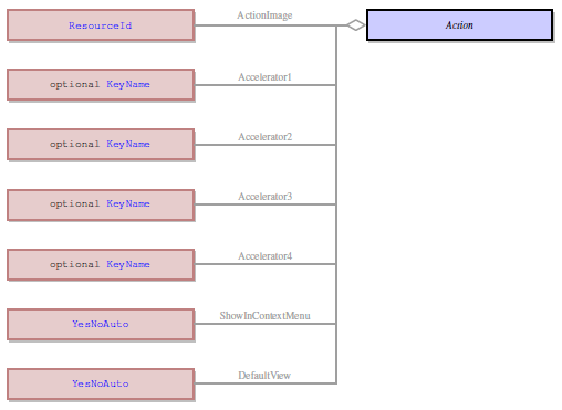
It is a complex property that includes 1 mandatory and 13 optional sub-properties.
 in Lycia Form Builder
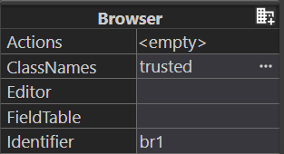

Form XML code:
empty value:
<form.actions>
<Action/>
</form.actions>
sub-values are set:
<form.actions>
<Action accelerator1="A,true,false,true" actionImage="qx://application/gavel.svg" comment="This is an action." defaultView="Yes" identifier="act1" place="top" showInContextMenu="Yes" statical="true" text="Act One" validate="false"/>
</form.actions>
Possible values:
differ for different sub-properties
Default value:
differ for different sub-properties
Associated form elements:
form
Inheritance diagram:
Associated 4gl syntax:
COMMAND
ON ACTION
ON KEY
Associated functions:
Influence and behavior:
actions is a complex property of the form that is used to add and modify triggers for application actions.
If you set the property actions in the .fm2 form, then at runtime, Lycia adds a trigger in the form of the toolbar button to your application so that end users can perform the available application actions.
You can read more about application actions here and learn about this and other ways of creating triggers for application actions here.
The property actions includes 1 mandatory and 13 optional sub-properties:
- accelerator
- actionImage
- actionStyle
- comment
- defaultView
- identifier (mandatory)
- order
- place
- showInContextMenu
- statical
- text
- validate
These sub-properties are set independently and have their own values (not related to the values of other sub-properties.
All the examples below have this 4gl code:
MAIN
OPEN WINDOW w WITH FORM "actions" ATTRIBUTE(BORDER)
MENU
ON ACTION act1
DISPLAY "one"
ON ACTION act2
EXIT MENU
END MENU
END MAIN
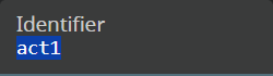
Identifies (= names) the trigger. Is used to associate the trigger with an action.
Possible values: any, if meets the requirements
Specific requirements:
- Identifier must be unique.
- Identifier can include only letters, digits, and the underscore symbol (_). Blank spaces, punctuation marks, and other symbols (not letters or digits) are not allowed.
- Identifier should begin with a letter (A-Z, a-z).
- Identifiers are not case-sensitive.
In Lycia Form Builder,
At runtime,

Defines the accelerator key(s) that will trigger the action at runtime.
Possible values: keys or their combinations with CTRL, ALT, and/or SHIFT.
Accelerators are specified in a separate area where you type in the key name and tick the suggested keys – CTRL, ALT, SHIFT:
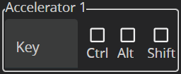
When saved, the key or the combination with CTRL, ALT, or SHIFT is displayed in the code in the following way: the key and the accelerator key boolean value (Ctrl, Alt, Shift respectively).
<form.actions>
<Action identifier="act1" accelerator1="K,true,false,false" />
</form.actions>
You can choose up to 4 accelerator keys for one action.
Specifies the image which is displayed to the trigger.
The value of the sub-property is a relative path to the image file:

With MD Lycia, buttons in the toolbar are image-only. So, if you don't specify an image, you will see the default one:

Specifies which button is shown in the action view (for example, toolbar button):
Possible values:
- Button Icon - stands for the name of a file containing a picture you want to become a button icon. (default value)
- Button Label – stands for a character string which will be displayed on the button.
- Button IconLabel stands for the name of a file containing a picture and for a character string.
In Lycia Form Builder, the possible values are in the dropdown menu of the Style sub-property:

Specifies the text that is displayed on hover and usually describes the action.
Is analogous to the property tooltip.
If the sub-property comment is not set (default), the value of the sub-property text is displayed on hover:

If the sub-property comment is set, its value is displayed at hover (navigation bar and drop-down menu):

Determines whether the trigger is visible on the toolbar:

Possible values:
- auto (default) – the trigger is visible on the toolbar provided that this action is visible and no other triggers are defined,
- yes – the trigger is visible on the toolbar provided that this action is visible, and
- no – the trigger is NOT visible on the toolbar.
In Lycia Form Builder,
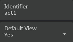
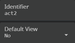
At runtime,

Indicates in what order triggers appear on the toolbar.
By default, the order is not defined and triggers are added in the order they are defined in the 4gl code.

At runtime,

Pins triggers in the form of a toolbar button to the navigation bar in Lycia with Material Design.
Possible values:
- auto – trigger is rendered according to the usual place property behaviour (the toolbar items that don't fit into the window are rendered to the drop-down menu);
- top – trigger is always rendered to be always visible in the toolbar;
- popup – trigger is always rendered to the drop-down menu.
With MD Lycia, toolbar consists of two logical parts – navigation bar (= application bar) and drop-down menu (= overflow menu).
If you want to display some actions to the navigation bar, and others to the drop-down menu, you must set the place argument to top for the actions you want to appear in the navigation bar.
In Lycia Form Builder,
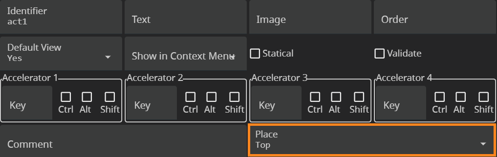
At runtime,


Determines whether the action can be triggered from the context menu:
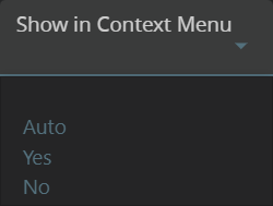
Possible values:
- auto – the action can be triggered from the context menu provided that this action is visible and no other triggers are defined,
- yes – the action can be triggered from the context menu provided that this action is visible, and
- no – the action cannot be triggered from the context menu.
In the .fm2 file code, this will be displayed as follows:
<form.actions>
<Action identifier="act1" actionImage="qx://application/filter_1.svg" showInContextMenu="Yes"/>
<Action identifier="act2" actionImage="qx://application/filter_2.svg" showInContextMenu="No"/>
</form.actions>
At runtime,

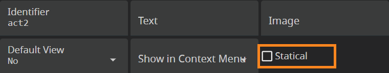
Determines whether triggers are visible even if they are not defined.
If statical set to false (default), non-defined actions are not visible on the toolbar.
If statical is set to true, even non-defined actions are visible on the toolbar.
4gl code:
MAIN
OPEN WINDOW w WITH FORM "actions" ATTRIBUTE(BORDER)
MENU
ON ACTION act3
EXIT MENU
END MENU
END MAIN
In Lycia Form Builder,

At runtime,

Specifies the text displayed to the trigger:
If the text is not set, the action name is displayed at runtime:
<form.actions>
<Action identifier="act1" actionImage="qx://application/filter_1.svg" text="Act One"/>
<Action identifier="act2" actionImage="qx://application/filter_2.svg"/>
</form.actions>
The buttons in the navigation bar of the toolbar are image-only, text is displayed on hover (if comment is not set):

For the buttons in the drop-down menu bar of the toolbar, text is displayed (and on hover if comment is not set):

If neither actionImage nor text are set, then the action gets the default image and the name of the action is displayed at hover and in the drop-down menu:

Determines whether data validation is required for the action.
Possible values:
- true – data validation is required
- false (default) – data validation is not required