Setting Trigger Attributes
This page describes how to set different attributes for a trigger depending on the ways in which this trigger was created.
For the sake of easier reading, we use these conventions:
- automatically created triggers are the triggers created by Lycia if an action defined in 4GL code is not associated with any trigger;
- widget triggers are widgets added to the .fm2 form and used to trigger any defined actions (usually, Button, MenuCommand, and ToolbarButton);
- ui.<Widget> triggers are elements of ui.<Widget> data type (for example, ui.Button or ui.MenuCommand) created and manipulated at runtime by ui methods; and
- triggers created by the actions property can be added to the .fm2 form directly, or to the Master or User Action Defaults files.
Identifier
Identifier is the only mandatory attribute of any action trigger, so it can and must be set for any trigger regardless of how it was created.
Is the same as the action name.
Corresponds to the 1st argument of fgl_setactionlabel() and other similar functions:
CALL fgl_setactionlabel("identifier", "text", "image", order, isStatic, "tooltip", "place")
CALL fgl_setactionlabel("act_one", "one", "qx://application/filter_1.svg")
Is set by the property, identifier:
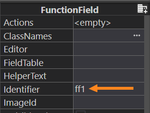
Do not mix up the property identifier and the sub-property actionName of Events:
- identifier sets the name to the action trigger,
- actionName specifies the name of the action.
To associate the widget trigger with the action, you must use actionName.
actionName and identifier do not need to be the same. Even if the identifier of the trigger is the same as the name of the action, it will not automatically associate them.
Is set as the parameter of the create() method:
LET menucommand = ui.MenuCommand.create("id")
Can be changed by the setIdentifier() method:
CALL menucommand.setIdentifier("new_id")
Any of these UI methods does not associate the trigger with any actions. To associate triggers with actions, you need these UI methods: ui.BackgroundServerEventHandler.Create(), setCallBackAction(), and setOnInvoke():
LET mcEvent = ui.BackgroundServerEventHandler.Create()
CALL mcEvent.SetCallBackAction("display")
CALL menucommand.SetOnInvoke(mcEvent)
The property actions has the sub-property, identifier, that specifies the identifier of the trigger:
If the value of the sub-property, identifier, is the same as the name of the action defined in the 4GL code, this automatically associates this trigger with this action.
.fm2 or .ad2 file:
<form.actions>
<Action identifier="my_act"/>
</form.actions>
4GL source code:
ON ACTION my_act
Text
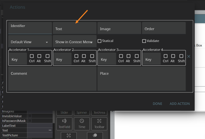
Text specifies the text displayed to the trigger.
If the trigger has no text but has an image, then it is image-only at runtime.
If the trigger has neither text nor image, then at runtime it is invisible and the action can be triggered only by the accelerator, if any has been assigned.
Is set by the 2nd argument of fgl_setactionlabel() and other similar functions:
CALL fgl_setactionlabel("<identifier>", "<text>", "<image>", <order>, <isStatic>, "<tooltip>", "<place>")
CALL fgl_setactionlabel("act_one", "one", "qx://application/filter_1.svg")
Are set by the property Text:
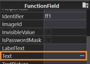
Is set by the setText() method:
CALL menucommand.setText("Menu command #1")
Action Image
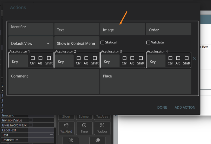
Action Image specifies the image which is displayed to the trigger.
If the trigger has neither text nor image, then at runtime it is invisible and the action can be triggered only by the accelerator, if any.
The path to the image file can be
- absolute: C:/my_user/images/lycia_images/image.png
- relative: qx://application/image.png
Is set by the 3rd argument of fgl_setactionlabel() and other similar functions:
CALL fgl_setactionlabel("<identifier>", "<text>", "<image>", <order>, <isStatic>, "<tooltip>", "<place>")
CALL fgl_setactionlabel("act_one", "one", "qx://application/filter_1.svg")
Is specified by the complex property, Image, that can be set directly in Form Builder or in the .qxtheme file in LTD:
Lycia Form Builder:
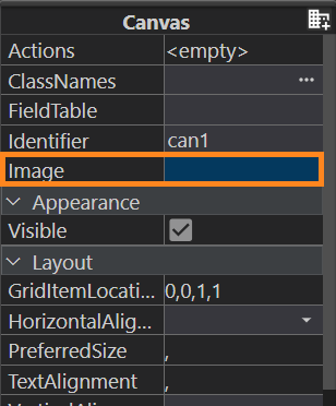

In Lycia Theme Designer:
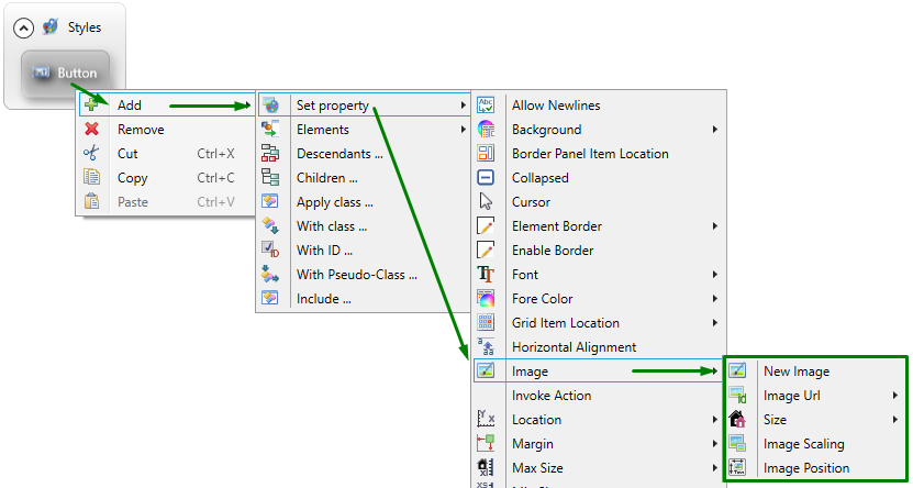
Trigger images are manipulated as the elements of ui.Image data type by the methods setImage() and setImageUrl(), setImagePosition(), setImageScaling()/setSize():
DEFINE img ui.Image
...
CALL img.setImageUrl("qx://application/middle_lycia.png")
CALL img.setImagePosition("Top")
CALL img.setImageScaling("Both")
CALL btn.SetImage(img)
Comment
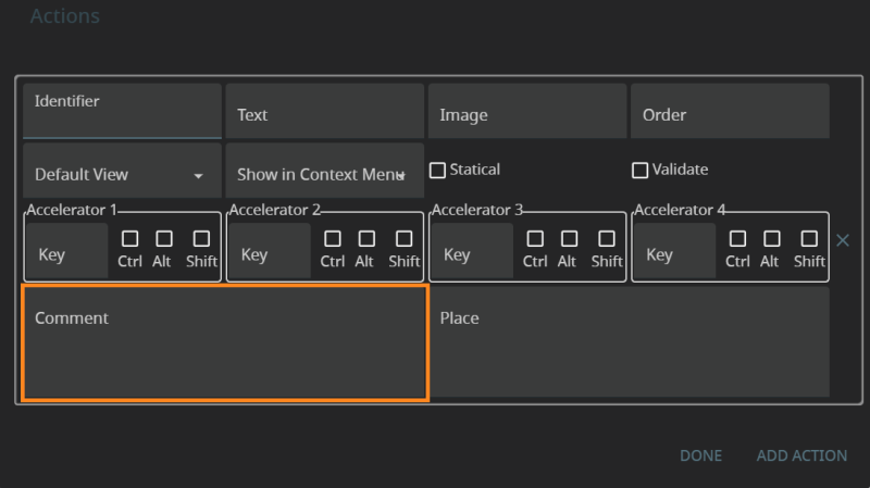
Comment specifies the text that is displayed on hover and usually describes the action.
In modern applications this text is called a tooltip, so from the point of view of 4GL-based application actions, comment and tooltip can be considered synonyms.
Is set by the 6th argument of fgl_setactionlabel() and other similar functions:
CALL fgl_setactionlabel("<identifier>", "<text>", "<image>", <order>, <isStatic>, "<tooltip>", "<place>")
CALL fgl_setactionlabel("act_one", "one", "qx://application/filter_1.svg", "", "", "This is a toolbar button #1")
Is specified by the property Tooltip that can be set directly in the Form Builder or in the .qxtheme file in LTD):
Lycia Theme Designer:
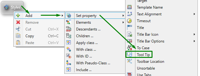
Is set by the setTooltip() method:
CALL tb.setTooltip("My new tooltip")
Accelerators
Accelerators defines the accelerator key(s) that will trigger the action at runtime.
You can choose up to four accelerator keys.
For the actions defined by ON KEY and COMMAND KEY statements, a key can be used to trigger this action if this key as set as identifier for fgl_setkeylabel() and fgl_dialog_setkeylabel():
CALL fgl_setkeylabel("F2", "one")
...
MENU
COMMAND KEY (F2)
DISPLAY "one"
...
Cannot be set or changed.
Cannot be set or changed.
Is set by the sub-property Accelerator of the Actions property:
Statical
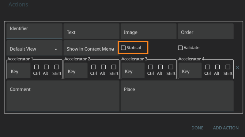
Statical determines whether triggers are visible even if they are not defined.
Is set by the 5th argument of fgl_setactionlabel() and other similar functions:
CALL fgl_setactionlabel("<identifier>", "<text>", "<image>", <order>, <isStatic>, "<tooltip>", "<place>")
CALL fgl_setactionlabel("act_one", "one", "qx://application/filter_1.svg", "", TRUE, "This is a toolbar button #1")
Cannot be set or changed.
Cannot be set or changed.
Validate
Validate determines whether data validation is required for the action.
Cannot be set or changed.
Cannot be set or changed.
Cannot be set or changed.
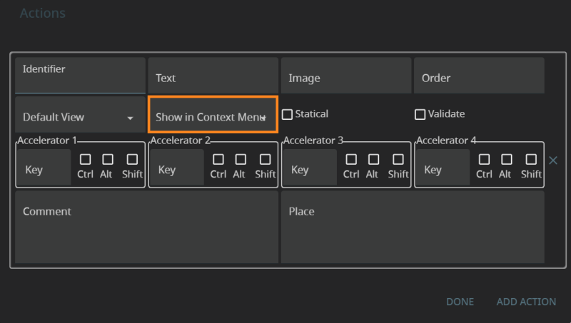
Show in Context Menu
Show in Context Menu determines whether the action can be triggered from the context menu.
Cannot be set or changed.
Cannot be set or changed.
Cannot be set or changed.
Is set by the sub-property, Show In Context Menu, of the Actions property:
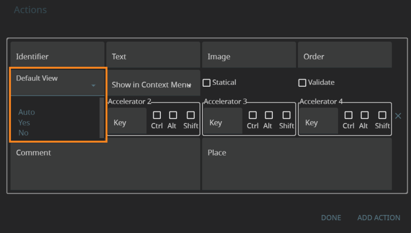
Default View
Default view determines whether the trigger is visible on the toolbar.
You can hide the trigger by setting both text and image to NULL in fgl_setactionlabel() and other similar functions:
CALL fgl_setactionlabel("<identifier>", "<text>", "<image>", <order>, <isStatic>, "<tooltip>", "<place>")
CALL fgl_setactionlabel("act_two" ,"")
You can hide any widget in the .fm2 form (including those used as action triggers) by setting the property, visible, to FALSE (in the Lycia Theme Designer) or deselect it in the Form Builder:
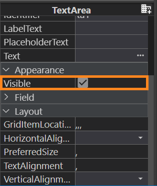
Any ui.<Widget> element can be hidden by the setVisible() method:
CALL bt.setVisible(0)
The method, setActionHidden(), available for variables of ui.Dialog data type, can be used to modify the action's default view:
CALL dlg_var.SetActionHidden("action", TRUE)
Is set by the sub-property Default View of the Actions property:
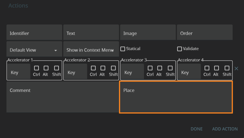
Place
Place allows pining triggers in the form of a toolbar button to the navigation bar in Lycia with Material Design.
Is set by the 7th argument of fgl_setactionlabel() and other similar functions:
CALL fgl_setactionlabel("<identifier>", "<text>", "<image>", <order>, <isStatic>, "<tooltip>", "<place>")
CALL fgl_setactionlabel("act_one" ,"one", "qx://application/filter_1.svg", 1, FALSE, "This is the action #1", "top")
Only for ToolbarButton – is set by the property Place in Form Builder or by the .qxtheme file in LTD:
Lycia Form Builder:
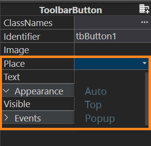
Lycia Theme Designer:
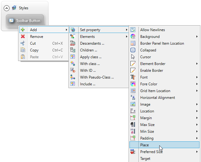
Only for ui.ToolbarButton – is set by the setPlace() method:
CALL tb.setPlace("top")
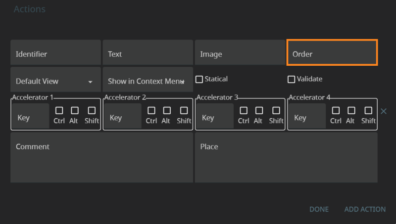
Order
Order indicates in what order triggers appear on the toolbar.
Is set by the 4th argument of fgl_setactionlabel() and other similar functions:
CALL fgl_setactionlabel("<identifier>", "<text>", "<image>", <order>, <isStatic>, "<tooltip>", "<place>")
CALL fgl_setactionlabel("act_two" ,"two", "qx://application/filter_2.svg", 2, FALSE, "This is the action #2", "top")
Depends on the widget's location in the .fm2 form.
Depends on the widget's location specified in the 4GL code.
For example, for .fm2 forms with a GridPanel used as a root container, widget location is specified in this way:
-
Define the objects of ui.GridPanel, ui.GridItemLocation, and ui.<Widget> types:
DEFINE grid ui.GridPanel
DEFINE rLocation ui.GridItemLocation
DEFINE bt ui.Button
-
Bind your ui.GridPanel variable with the GridPanel of the necessary form:
LET grid = ui.GridPanel.ForName("rootContainer")
-
Set values for GridX, GridY, GridHeight, and GridWidth (all of them) for your ui.GridItemLocation variable via the LET statement:
LET rLocation.GridX = 0
LET rLocation.GridY = 0
LET rLocation.GridHeight = 1
LET rLocation.GridWidth = 1
-
Create your widget via the create() method:
LET bt = ui.Button.Create("l1", "rootContainer")
-
Specify the location of your widget by passing your ui.GridItemLocation variable as the parameter for the setGridItemLocation() method:
CALL lb.SetGridItemLocation(rLocation)
This table can be used both as a summary and for reference:
|
|
Automatically Created Triggers |
Widget Triggers |
ui.<Widget> Triggers |
Triggers Created by the Actions Property |
|
identifier |
||||
|
text |
||||
|
image |
image |
setImage() |
||
|
tooltip |
||||
|
fgl_setkeylabel() and fgl_dialog_setkeylabel() for actions created by COMMAND KEY or ON KEY |
— |
— |
||
|
isStatic |
— |
— |
||
|
— |
— |
— |
||
|
— |
— |
— |
||
|
place |
(only for ToolbarButton) |
(only for ui.ToolbarButton) |
||
|
order |
depends on the widget's location in the form |
depends on the widget's location specified in the 44GL code |

