Button
Form and theme XML code and CSS element selector
Most commonly used form and theme properties
|
|
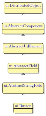
Button is a control element which triggers an event. It can show a text label, image, or both. |
<Button text="Button"identifier="bt1">
<Button.onInvoke>
<ActionEventHandler type="actioneventhandler"actionName="actDisplay"/>
</Button.onInvoke>
</Button>
Theme element filter XML code:
<ElementFilter ElementName="Button">
...
</ElementFilter>
CSS element selector code:
Most commonly used form properties:
Most commonly used theme properties:
Image:
Image Url
Image Scaling
Image Position
Size
Background:
Size
ON KEY ↓
ON ACTION ↓
Associated ui methods:
SetEnable
GetEnable
SetIdentifier
GetIdentifier
SetOnInvoke
GetOnInvoke
SetImage ↓
GetImage
SetIsToggleButton →
GetIsToggleButton
SetIsPressed
GetIsPressed
SetAllowNewlines →
GetAllowNewlines
Create
ForName
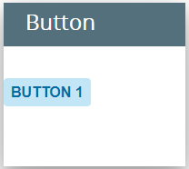
To add a Button to your form, drag-and-drop the Button widget from the Palette to the Design Area. Note that the form must have a Root Container prior to you placing a widget to it.
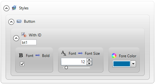
Here you can find out how to change the text of the button in the form:

Here you can find out how to change the text of the button at runtime using ui methods or DISPLAY ... TO statement.
You can change appearance properties of a Button in Lycia Form Builder. However, we recommend applying appearance properties via user themes and css.
To apply a property to a Button, set its value in the user theme, directly or using filters.
property applied in the user theme
theme XML code
 Click here to see the theme XML code.
<?xml version="1.0" encoding="utf-8"?>
<StyleSheet xmlns="http://querix.com">
<ElementFilter ElementName="Button">
<StyleSheet>
<ElementIdFilter Identifier="bt1">
<StyleSheet>
<DoStyleAction>
<SetProperty>
<PropertyPath>
<PropertyName>Font</PropertyName>
<PropertyName>Bold</PropertyName>
</PropertyPath>
<PropertyValue />
</SetProperty>
</DoStyleAction>
<DoStyleAction>
<SetProperty>
<PropertyPath>
<PropertyName>Font</PropertyName>
<PropertyName>FontSize</PropertyName>
</PropertyPath>
<PropertyValue>12</PropertyValue>
</SetProperty>
</DoStyleAction>
<DoStyleAction>
<SetProperty>
<PropertyPath>
<PropertyName>ForeColor</PropertyName>
</PropertyPath>
<PropertyValue type="CustomizedColor" RedColor="0" GreenColor="109" BlueColor="165" Alpha="255" />
</SetProperty>
</DoStyleAction>
</StyleSheet>
</ElementIdFilter>
</StyleSheet>
</ElementFilter>
</StyleSheet>
runtime behavior
In the example below, we use css to change the text style of the button as above:
.qx-aum-button .qx-text {
padding: 2px;
padding: 5px 10px;
color: white !important;
font: bold 14px "Calibri","Helvetica Neue", Sans-Serif;
}
Buttons are active by default if their associated event exists in the current runtime scope. Otherwise, they will be inactive . However, this behavior can be disabled using the enable property.
At runtime, buttons can also be enabled/disabled.
To activate/deactivate buttons at runtime:
-
display provided symbols to them using DISPLAY ... TO:
DISPLAY "!" TO buttonIdentifier - to activate an inactive button;
DISPLAY "*" TObuttonIdentifier - to deactivate an active button;
DISPLAY"?"TO buttonIdentifier - to return to the automatic activation mode.
To change the button appearance at runtime;
-
DISPLAY <string> TO buttonIdentifier - changes the button label:
DISPLAY "Submit" TObt1
-
DISPLAY <imageUri> TO buttonIdentifier - changes the image IF the button has NO text property tag:
DISPLAY "C:\Program Files\Querix\Lycia\images\submit.jpg" TO bt1
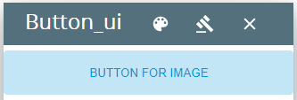
At runtime, Button can be manipulated with ui methods.
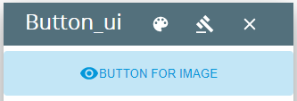
Below you can find out how to use ui methods to display an image to the button.
4gl code sample
MAIN
DEFINE bt_ui1,
bt_ui2 ui.Button,
image_ui ui.Image,
isImageSet SMALLINT
OPEN WINDOW w1 WITH FORM "button_ui_setimage" ATTRIBUTE(BORDER)
LET bt_ui1 = ui.Button.forName("bt1")
CALL image_ui.setImageUrl("qx://application/ok.png")
CALL bt_ui1.setText("Button for image")
CALL bt_ui1.SetEnable(TRUE)
MENU
ON ACTION "Image"
IF isImageSet THEN
LET isImageSet = 0
CALL bt_ui1.SetImage("")
ELSE
LET isImageSet = 1
CALL bt_ui1.SetImage(image_ui)
END IF
ON ACTION exit
EXIT MENU
END MENU
END MAIN
runtime behavior
isImageSet = 0
isImageSet = 1
In the example here, we use ui methods to create a toggle button.