![]()
GridPanel is a form container where the objects are placed within grid cells. Each element must occupy at least one grid cell. Two elements cannot occupy the same grid cell.
Grid lines are only visible during panel manipulations in the Form Designer, and are not visible at runtime. You can define the number of rows, columns, and their size (pixel, auto, percent) in the Structure View.
Form XML code:
GridPanel XML code:
<GridPanel identifier="rootContainer" visible="true" preferredSize="400,180">
<GridPanel.gridColumnDefinitions>
<GridColumnDefinition>
<GridColumnDefinition.gridLength>
<GridLength gridLengthType="Pixels" gridLengthValue="50"/>
</GridColumnDefinition.gridLength>
</GridColumnDefinition>
<!-- more column definitions... -->
</GridPanel.gridColumnDefinitions>
</GridPanel>
GridPanel with columns and rows: (first column uses 50% of the total container width and the rowHeight will be automatically set to fit its children)
<GridPanel identifier="g1" visible="true" preferredSize="400,180">
<GridPanel.gridColumnDefinitions>
<GridColumnDefinition>
<GridColumnDefinition.gridLength>
<GridLength gridLengthValue="1.0"/>
</GridColumnDefinition.gridLength>
</GridColumnDefinition>
<GridColumnDefinition>
<GridColumnDefinition.gridLength>
<GridLength gridLengthType="Percent" gridLengthValue="50"/>
</GridColumnDefinition.gridLength>
</GridColumnDefinition>
</GridPanel.gridColumnDefinitions>
<GridPanel.gridRowDefinitions>
<GridRowDefinition>
<GridRowDefinition.gridLength>
<GridLength/>
</GridRowDefinition.gridLength>
</GridRowDefinition>
</GridPanel.gridRowDefinitions>
<Label text="Label" isDynamic="true" visible="true" identifier="lb1" gridItemLocation="0,0,1,1"/>
</GridPanel>
Common form properties:
gridLength (GridLengthType, GridLengthValue, GridMaxLength, GridMinLength)
Common properties for child elements:
Common Theme properties:
Element Border
CSS element filter:
.qx-aum-grid-panel
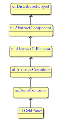
Inheritance diagram:
Associated ui methods:
SetGridColumnDenitions
GetGridColumnDenitions
SetGridRowDenitions
GetGridRowDefinitions
SetGridLength
GetGridLength
SetGridLengthType
GetGridLengthType
SetGridLengthValue
GetGridLengthValue
SetGridMaxLength
GetGridMaxLength
SetGridMinLength
GetGridMinLength
Main features:
Select the ![]() GridPanel button from the Form Containers palette and place it on the form.
GridPanel button from the Form Containers palette and place it on the form.
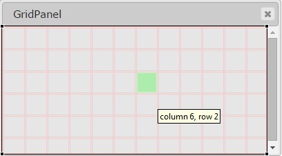
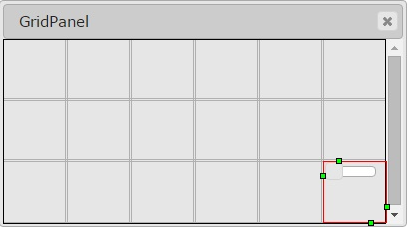
Initially, a GridPanel has no rows and columns. When you add the first object, a grid appears. The target location of a new element is highlighted in green. When the first object is placed to the grid, is appears in the lower-right corner:
 |
 |
When the focus is on the GridPanel or its child elements, rows and column numbering lines are displayed along the edge of the Form Editor area. You can manipulate rows and columns by right-clicking an element within the numbering line and selecting the required option:
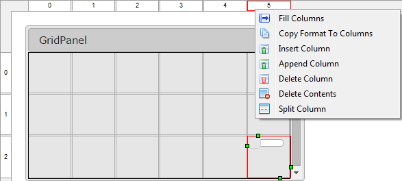
Fill Rows/Columns: fills an empty grid with rows or columns.
Copy Format to Columns/Rows: copies the GridLength format to all other columns/rows.
Insert Column/Row: inserts a new column or row before the selected one.
Append Column/Row: adds a column to the right of the selected column, or a row to the bottom of the selected row.
Delete Column/Row: deletes the currently selected column or row with its contents.
Delete Contents: deletes the contents of the currently selected column or row.
Split Column/Row: splits a column or row in two and stretches the widgets in the selected column or row over them.
When moving or adding an element, open cells are highlighted green, populated cells are highlighted red, and insertion points are highlighted in yellow:
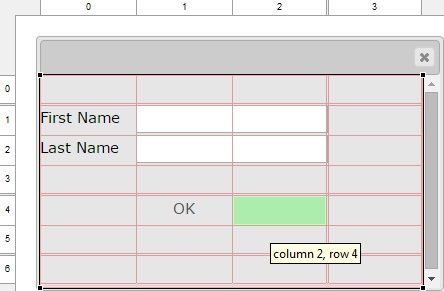
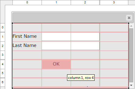
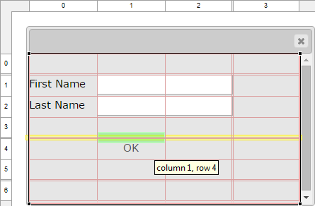
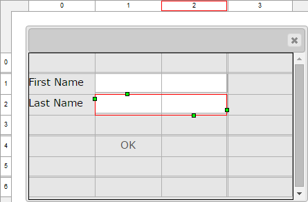
The currently selected cell shows its column and row spanning handles, and sizing handles:
Reorder columns and rows by dragging and placing them required positions:
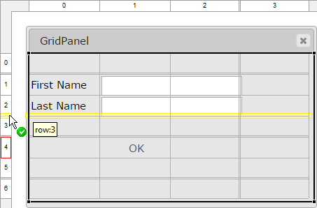
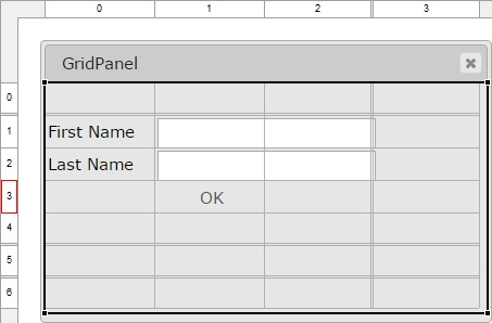
For information on how to specify the location, and space occupied by the object within a GridPanel using theme, see GridPanel Layout Properties.
Conflicting configurations:
|
|
For all widgets: setting the widget alignment property to Stretch or Default and specifying a preferredSize, results in an unexpected runtime behavior because of the layout conflict: Alignment=Stretch + preferedSize → ??? |
|
|
For all widgets: the combination of widget alignment set to Stretch or Default, and gridLengthType set to Auto results in an unexpected runtime behavior: Alignment=Stretch + gridLengthType=Auto → ??? auto = size the parent space to fit the child space |
CVS server: client.querix.com
CVS repository: /presentation
User: client
Project: form-demo3-2014
Programs:
fd2_panel_cnt_gridPanel_different_child_elements_01
fd2_panel_cnt_gridPanel_example_01
fd2_panel_cnt_gridPanel_example_02
fd2_panel_cnt_gridPanel_example_03
fd2_panel_cnt_gridPanel_example_04
xfd2_panel_grid_various_01
xfd2_panel_grid_various_02
Converting Classic Lycia Forms
GridPanel Layout Properties