ProgressBar
Overview
The ProgressBar is typically used to graphically display the level of progression of a certain process or indicate that the process is happening. You can also use it to display a level of fulfillment e.g. to show the relative number of the fields filled and left to fill in a form.

Form XML code:
<ProgressBar minValue="0" maxValue="100" visible="true" step="1" identifier="pb1" gridItemLocation="0,0,1,1"/>
Most commonly used theme and form properties:
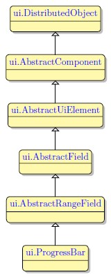
Inheritance diagram:
Influence and behavior:
To add a ProgressBar to your form, do the following:
Step 1. Decide on a place in your form for the ProgressBar widget. Mind that the form must have at least one container (a Root Container) to be able to contain widgets.
Step 2. In the Form Builder's Palette, find the ProgressBar widget.
Step 3. Select the ProgressBar, then drag-and-drop it into the defined place in your form.
After that, the ProgressBar will be added to your form. You will also see it appear in the Form Structure view.
To find an Identifier for referencing that ProgressBar in your .4gl file, select the ProgressBar in the Form Structure (on that, the Properties view will be activated). Next, find that ProgressBar's Identifier in the list of its properties.
By default, the ProgressBar will be displayed as linear. It will show the progress in units based on its minValue and maxValue set in the ProgressBar's properties:

To make ProgressBar show the progress in percent, you must set the ClassName show-percent to it in the .fm2 form file:
Alternatively, you can use the UI method ui.ProgressBar:
DEFINE pb_ui ui.ProgressBar
...
LET pb_ui = ui.ProgressBar.Forname("pb1")
CALL pb_ui.SetClassNames(["show-percent"])
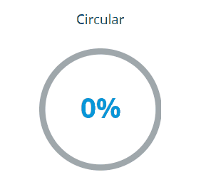
After that, your ProgressBar will have a percentage indication in its center:

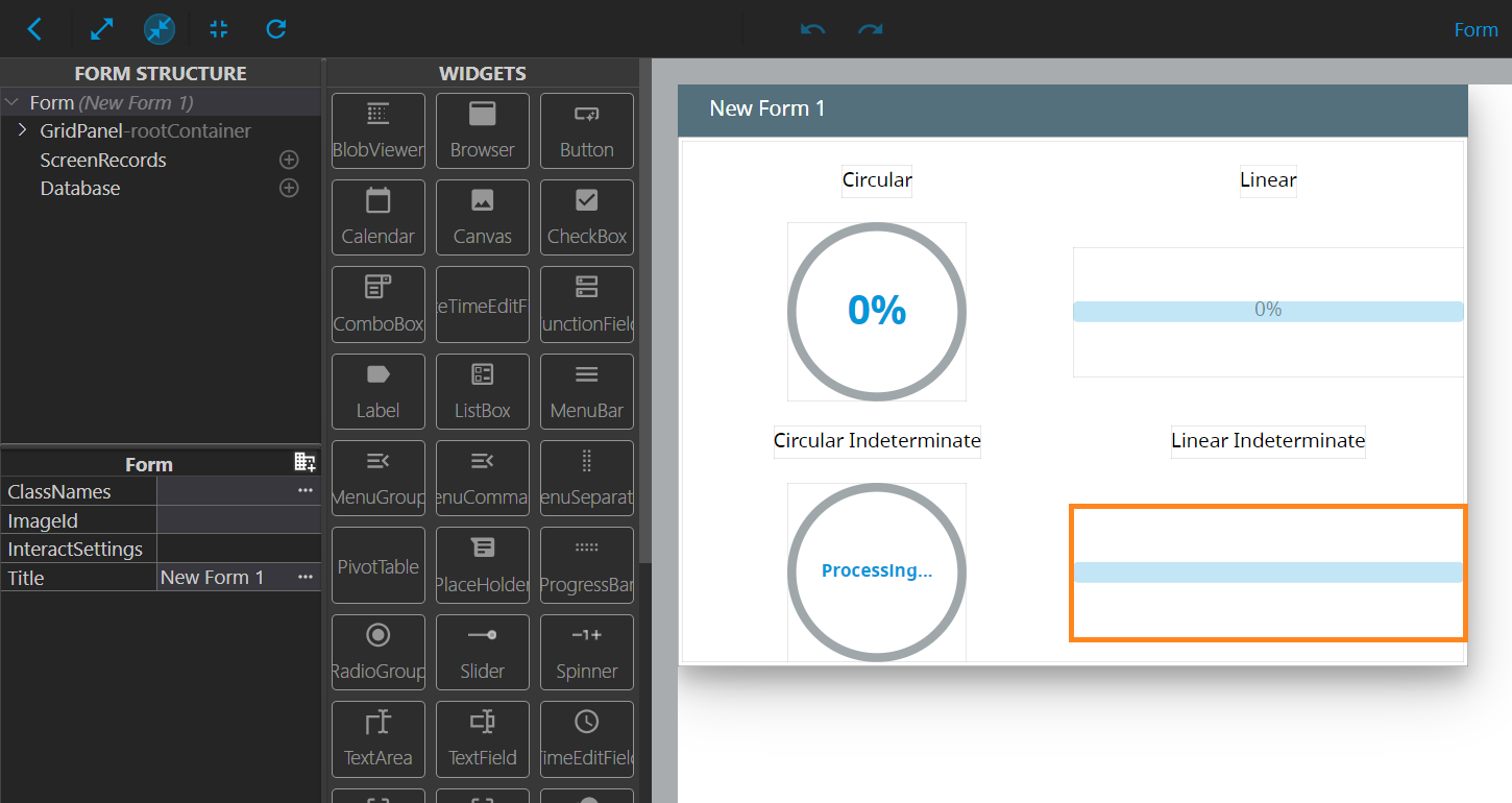
ProgressBar Types
There are four types of ProgressBars you can add to your form:
- Circular ProgressBar: A circle-based ProgressBar with progress displayed as percentage in the middle of the circle:
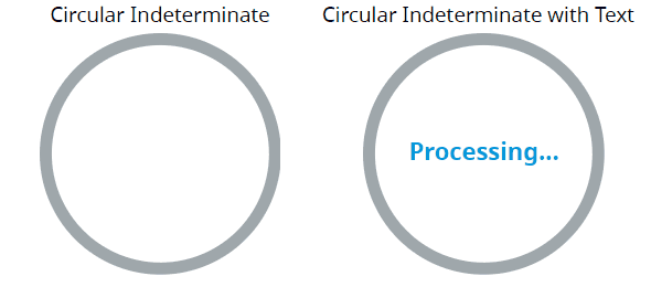
- Circular Indeterminate ProgressBar: A ProgressBar that displays the active process without indicating a certain progress stage (with an optional ability to display any text in the middle):
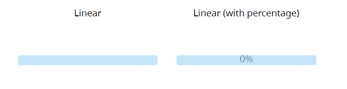
- Linear ProgressBar: A ProgressBar that displays current progress (with an optional ability to display the percentage within the bar):
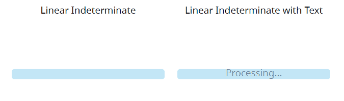
- Linear Indeterminate ProgressBar: A ProgressBar that displays the active process without indicating the progress stage (with an optional ability to display any text within the bar):
To learn how to configure your ProgressBar towards a certain type, proceed to the Configuration and Examples part of this page.
Configuration and Examples
First, we create a .4gl file with the following contents:
MAIN
DEFINE i INT
OPEN WINDOW w WITH FORM "progressbar_03_circular" ATTRIBUTE(BORDER)
LET i=25
MENU
ON ACTION Move
DISPLAY i TO pbar1
DISPLAY i TO pbar2
DISPLAY i TO pbar3
DISPLAY i TO pbar4
IF i=100 THEN LET i = 0
ELSE LET i=i+25 END IF
ON ACTION Exit
EXIT MENU
END MENU
END MAIN
Here, identifiers like pbar1 refer to the standard identifiers that the ProgressBars will receive upon adding them to the form.
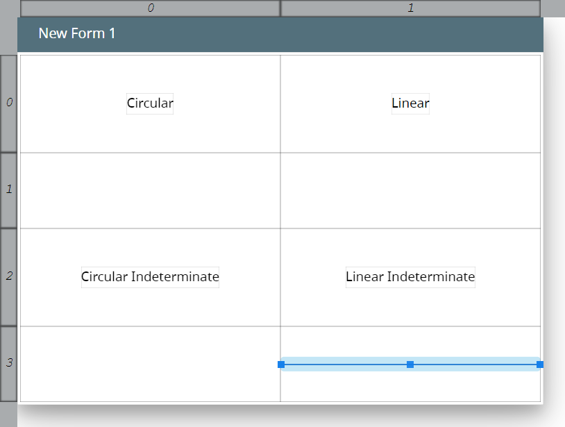
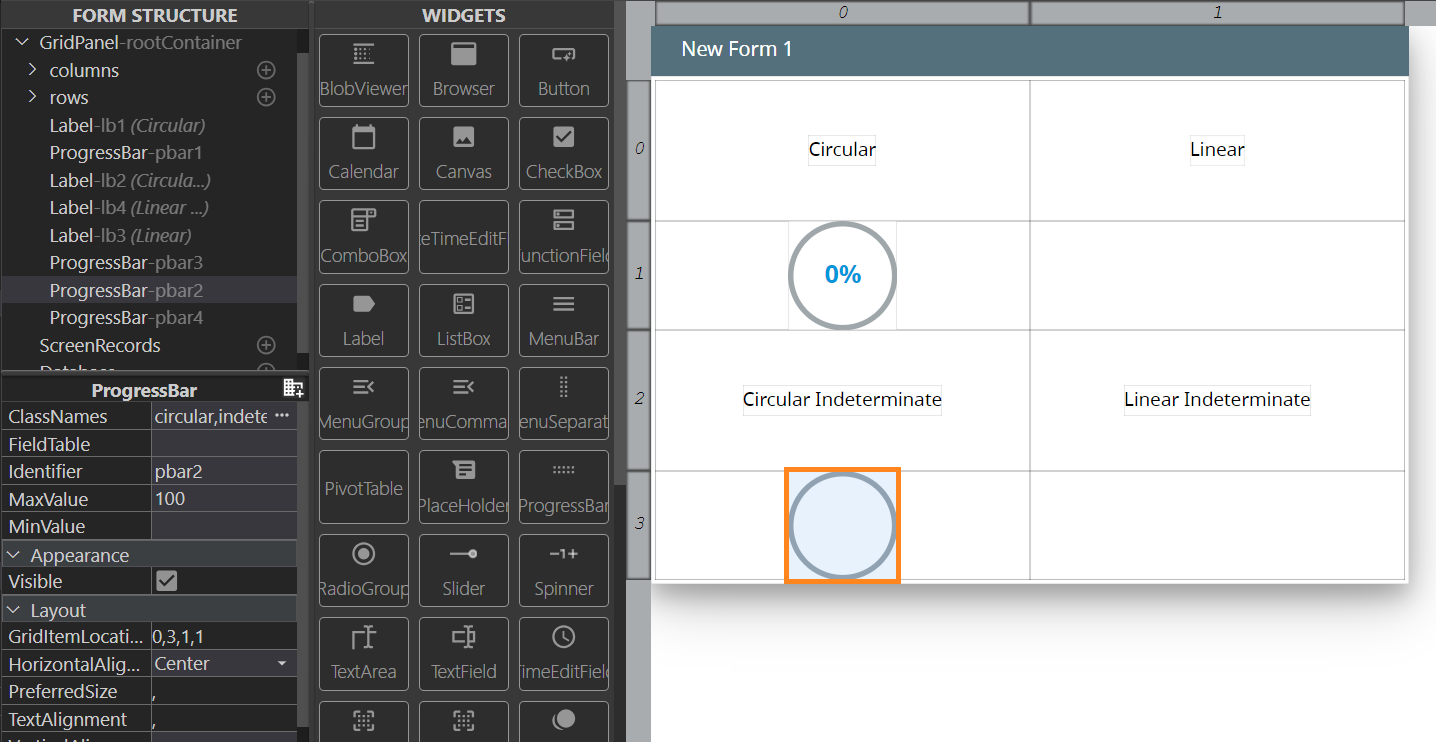
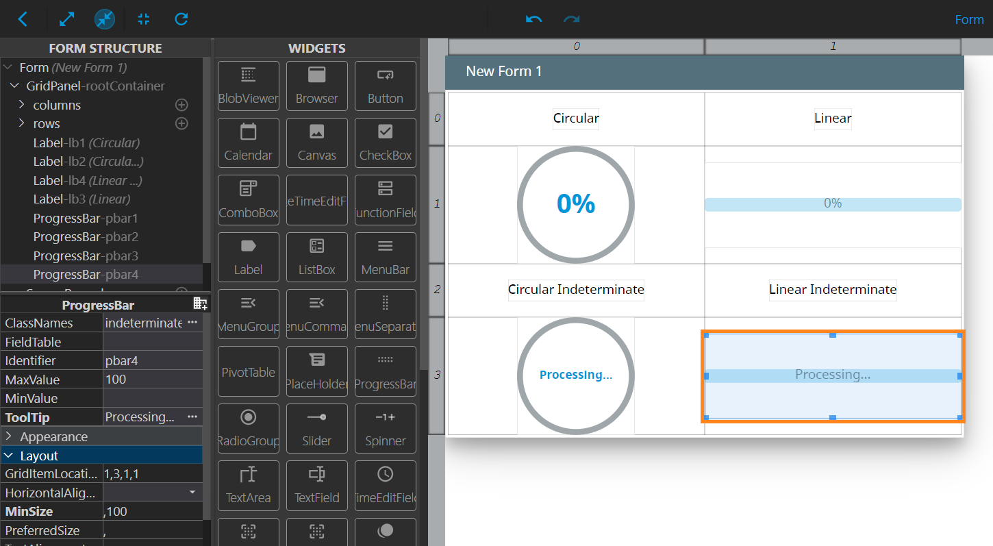
Next, we create a .fm2 form file and open it in the Form Builder, then add columns and rows to create a certain layout, and then place Labels and ProgressBars into the following layout:
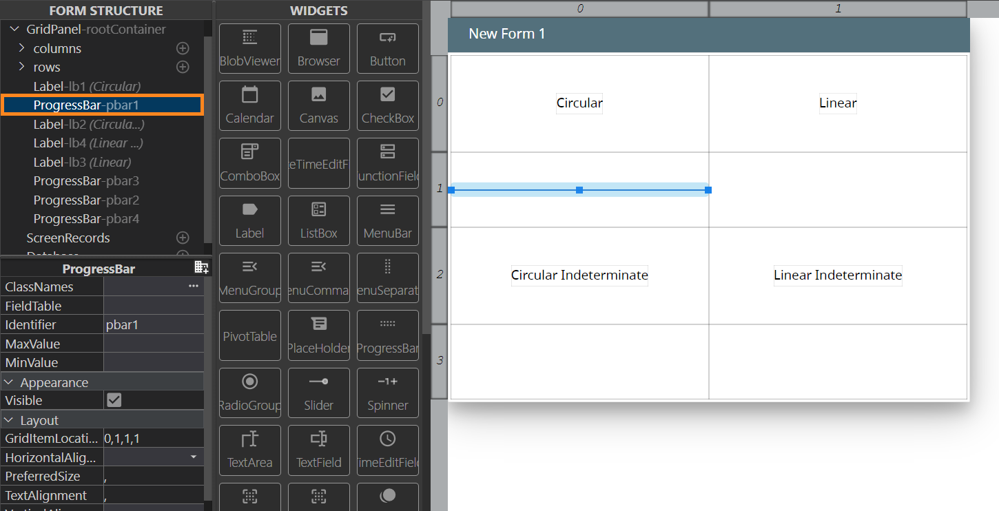
We will modify the default ProgressBar into a Circular one. To do that, we select the upper-left ProgressBar in the Form Structure:
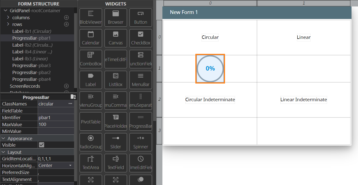
Then, we edit its properties using the Properties view:
| Property | Value |
| ClassNames | circular |
| MaxValue | 100 |
| HorizontalAlignment | Center |
As a result, the pbar1 ProgressBar will become circular, with the percentage of progress displayed at its center:
Next, we will edit the lower-left ProgressBar (pbar2) into a Circular Indeterminate one. For this one, we use the following parameters:
| Property | Value |
| ClassNames |
circular indeterminate |
| MaxValue | 100 |
| HorizontalAlignment | Center |
As a result, the pbar2 will now be circular, and at runtime it will only indicate the process:
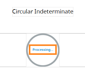
Optionally, you can add some text that will be displayed in the middle of that ProgressBar. To do that, invoke the Advanced Properties Mode, and fill in the value for the Tooltip property. We will use the following text for the value: Processing.... The result will be displayed in the form right after we set the value:
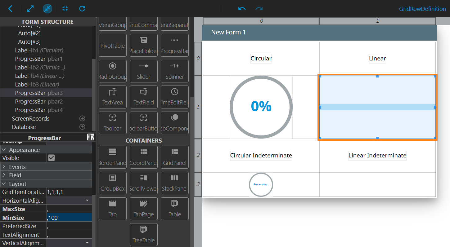
As a next step, we will move to the upper-right ProgressBar (pbar3), which will serve as a Linear ProgressBar. For this one, we will set the following properties:
| Property | Value |
| MaxValue | 100 |
| MinSize | ,100 |
After that, the pbar3 will have the following look:
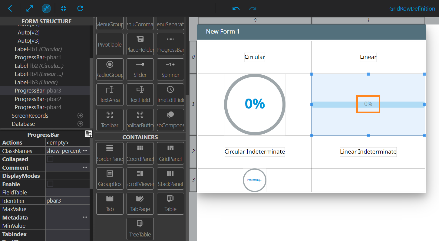
If you need the percentage of the job done also displayed in that ProgressBar, fill in the following property:
| Property | Value |
| ClassNames | show-percent |
This will result in the percentage displayed in the middle of the ProgressBar:
Note: For this type of the ProgressBar, you can also set the Tooltip property. The text that you set as its value will be displayed at hovering over the ProgressBar:
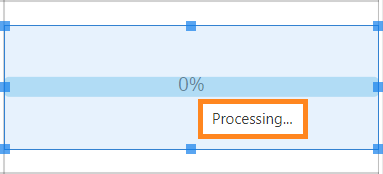
Lastly, we will edit the lower-right ProgressBar (pbar4), configuring the following properties:
| Property | Value |
| ClassNames | indeterminate |
|
MaxValue |
100 |
| MinSize | ,100 |
As a result, the lower-right ProgressBar is now a Linear Indeterminate ProgressBar:
Optionally, you can add some text that will be displayed in the middle of that ProgressBar. To do that, invoke the Advanced Properties Mode, and fill in the value for the Tooltip property. We will use the following text: Processing.... The result will be displayed in the form right after we set the value:
Now, we have examples for every type of ProgressBars. As a final step, we will compile and run the program. At runtime, when we press the Move button in the program’s Toolbar, the Circular and Linear ProgressBars will show the progress in percentage, and the Indeterminate ProgressBars will have the animation of a process going on:
After that, you can use CSS to customize the look of your ProgressBars.