
GroupBox container stores only one element (a widget or any container with its own children) inside a visible border with an optional titled frame at the top. Although GroupBox can have a widget as a child element, typically a GroupBox includes a container first.
GroupBox does not automatically fit its size to its contents. You can set GroupBox size using minSize or preferredSize properties, or set its horizontal and vertical Alignment to Stretch if you place a GroupBox into a Grid.
Form XML Code
GroupBox XML Code:
<GroupBox title="Group" identifier="id" visible="true"/>
<!-- child element -->
</GroupBox>
A GroupBox with an embedded GridPanel with a Label and a TextField:
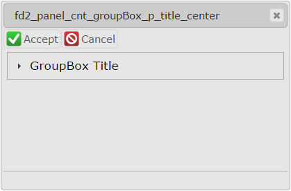
<GroupBox title="GroupBox" titleJustification="Center" preferredSize="400.0," visible="true" enable="true" fieldTable="formonly" identifier="">
<GridPanel verticalAlignment="Top" fieldTable="formonly" identifier="c1">
<GridPanel.gridRowDefinitions>
<GridRowDefinition>
<GridRowDefinition.gridLength>
<GridLength/>
</GridRowDefinition.gridLength>
</GridRowDefinition>
<!-- more row definitions -->
</GridPanel.gridRowDefinitions>
<GridPanel.gridColumnDefinitions>
<GridColumnDefinition>
<GridColumnDefinition.gridLength>
<GridLength gridLengthType="Percent" gridLengthValue="50"/>
</GridColumnDefinition.gridLength>
</GridColumnDefinition>
<!-- more column definitions -->
</GridPanel.gridColumnDefinitions>
<Label isDynamic="true" text="Label 1" visible="true" enable="true" gridItemLocation="0,0,1,1" fieldTable="formonly" identifier="f5"/>
<TextField text="" visible="true" enable="true" gridItemLocation="1,0,1,1" fieldTable="formonly" identifier="f1"/>
</GridPanel>
</GroupBox>
Common Form Properties
CSS Element Filter
.qx-aum-group-box
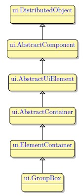
Inheritance diagram
Associated ui methods:
SetTitle
GetTitle
SetTitleJustification
GetTitleJustification
Main Features:
Select the GroupBox button from the Form Containers palette and place it on the form.
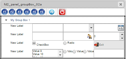
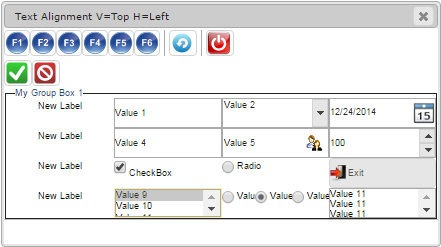
GroupBox has two appearance options: modern and classic. The modern GroupBox is enabled by default.
To enable the classic GroupBox appearance, add "classic" to GroupBox classNames property. Below are the examples of modern and classic GroupBox with various widgets:
|
Modern GroupBox. |
|
Classic GroupBox. |
 |
 |
At runtime, the contents of the modern GropBox can be collapsed and expanded by clicking on its title. To disable this option, apply the no-toggle class to GroupBox.
|
GroupBox with expanded content. |
|
GroupBox with collapsed content. |
 |
 |
CVS server: client.querix.com
CVS repository: /presentation
User: client
Project: form-demo3-2014
Programs:
fd2_panel_cnt_groupBox_example_01
fd2_panel_cnt_groupBox_example_02
fd2_panel_cnt_groupBox_example_03
fd2_panel_cnt_groupBox_example_04
fd2_panel_cnt_groupBox_p_padding_margin_01
fd2_panel_cnt_groupBox_p_text_align_01
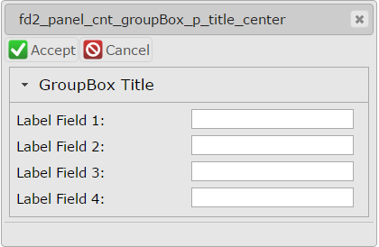
fd2_panel_cnt_groupBox_p_title