BorderPanel
BorderPanel incorporates up to 5 elements (containers or widgets), placed along the panel borders and in the center.
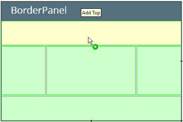
When placed in a BorderPanel, an element takes all available space along the selected border.
![]()
Form XML code:
BorderPanel XML code:
<BorderPanel identifier="rootContainer" visible="true"/>
<!-- child elements -->
</BorderPanel>
Label and TextField inside BorderPanel:
<BorderPanel identifier="id" visible="true"preferredSize="400.0,180.0">
<Label text="Label" isDynamic="true" visible="true" identifier="lb1" borderPanelItemLocation="Bottom"/>
<TextField visible="true"identifier="f2" borderPanelItemLocation="Top" preferredSize="250.0,30.0"/>
</BorderPanel>
Most commonly used form properties:
preferredSize (required)
Most commonly used theme properties:
CSS element filter:
Inheritance diagram:
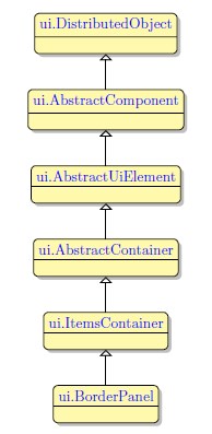
Associated ui methods:
SetBorderPanelItemLocation
GetBorderPanelItemLocation
Influence and behavior:
To add a BorderPanel to your form, you
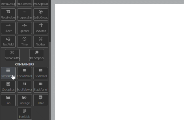
Step 1. Choose a BorderPanel from the form containers in Palette.
Step 2. Place it inside the BorderPanel container.
To set the position of an element inside the BorderPaneluse the borderPanelItemLocation property.
The size of an element placed into a BorderPanel can be defined in MasterTheme or in user theme.
|
|
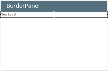
|
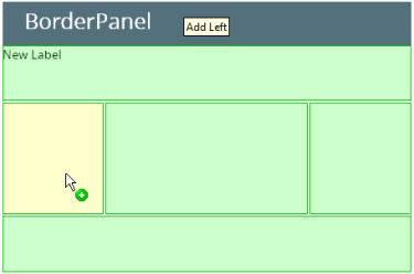
If there is already an element, placed in a border, the edge of the widget placed to the neighboring border is defined by the edge of the previously placed one:
|
|
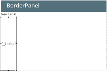
|
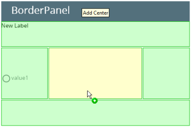
When an element is placed in a central part of the border panel, it fills all available space of the container:
|
|

|
Placing an element along a border, which is already occupied with a widget, will replace the existing widget. To replace a container, placed along a border, delete the required container in the Structure view and place the required element instead.
Simple rules for organizing the content of BorderPanel:
- The content added to the Top and Bottom sections of the BorderPanel is stretched horizontally but keeps its height.
- The content added to the Left and Right sections of the BorderPanel is stretched vertically but keeps its width.
- The content added to the Center section of the BorderPanel is stretched in both directions.
