GroupBox
|
|
GroupBox container stores only one element (a widget or any container with its own children) inside a visible border with an optional titled frame at the top. |
Groupox can have a widget as a child element, though typically it includes a container first.
GroupBox does not automatically fit its size to its contents. You can set GroupBox sizes using minSize or preferredSize properties, or set its horizontal and vertical alignment to Stretch if you place a GroupBox into a Grid.
Form XML Code
<GroupBox title="Group" identifier="id" visible="true"/>
<!-- child element -->
</GroupBox>
Most commonly used form properties:
CSS element selector code:
.qx-aum-group-box
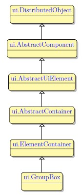
Inheritance diagram
Associated ui methods:
SetTitle
GetTitle
SetTitleJustification
GetTitleJustification
Influence and behavior:
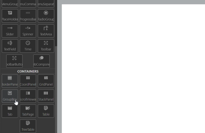
To add a GroupBox to your form, you
Step 1. Choose a GroupBox from the form containers in Palette.
Step 2. Left-click the form to place the GroupBox there.
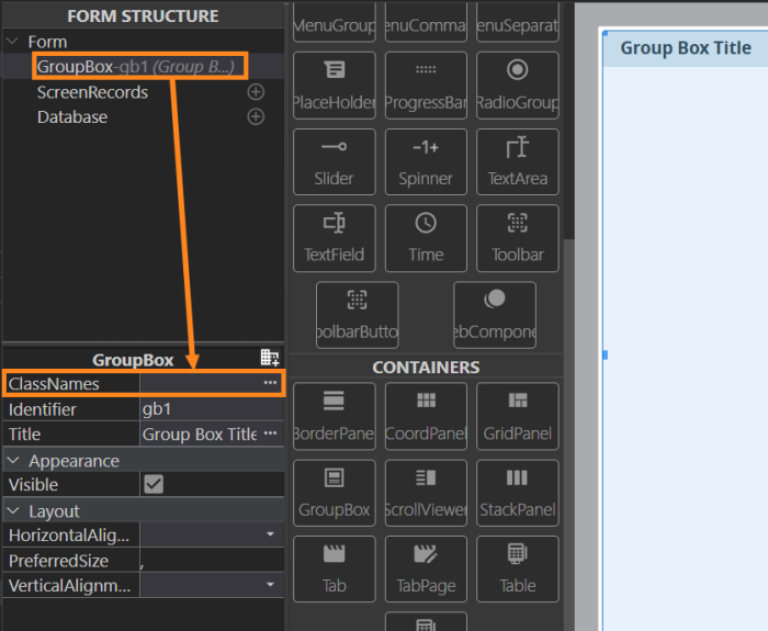
You can specify the default appearance and behavior by setting different classes to the classNames property.
<GroupBox ... classNames="<your_class>"/>
Hides the toggle button for a GroupBox and disables toggle:
<GroupBox ... classNames="disable-accordion"/>
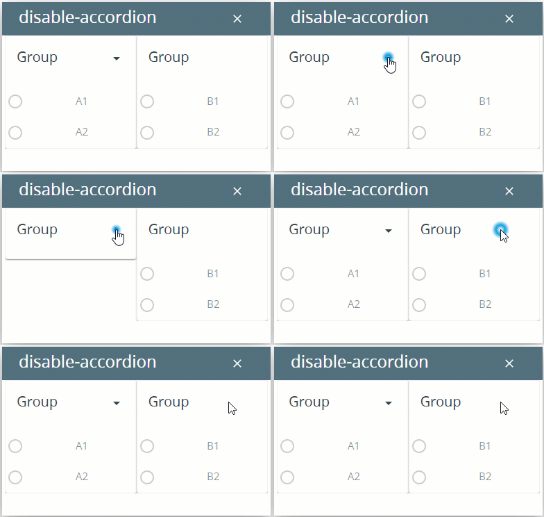
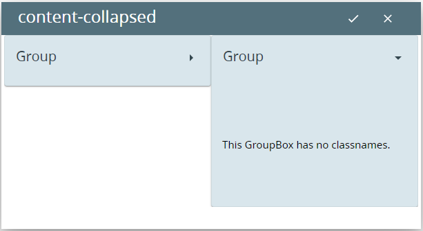
By default, GroupBoxes are expanded.
To make them collapsed by default, apply the class, content-collapsed :
<GroupBox ... classNames="content-collapsed"/>
