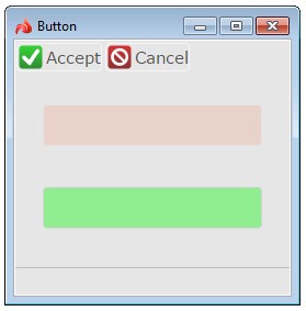
Button is a control element which triggers an event. It can show a text label, image, or both.
|
|
Button is a control element which triggers an event. It can show a text label, image, or both. |
|
|
|
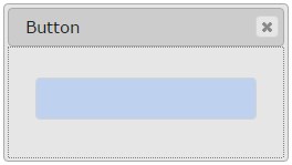
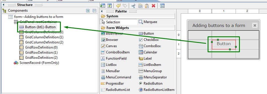
Button inserted in a Grid panel as seen in Lycia Form Designer (for better visibility, the button is painted blue by setting the fillColor property) |
|
|
Form XML code:
<Button text="Button" identifier="bt1">
<Button.onInvoke>
<ActionEventHandler type="actioneventhandler" actionName="actDisplay"/>
</Button.onInvoke>
</Button>
Theme element filter XML code:
<ElementFilter ElementName="Button">
...
</ElementFilter>
CSS element selector code:
qx-aum-button
.qx-aum-button .qx-text ↓
.qx-aum-button .qx-image
Associated 4gl syntax:
ON KEY ↓
ON ACTION ↓
Most commonly used form properties:
Most commonly used theme properties:
Location
Inheritance diagram:

Associated ui methods:
SetEnable
GetEnable
SetOnInvoke
GetOnInvoke
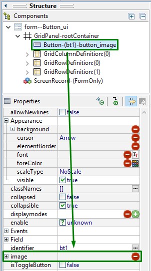
SetImage ↓
GetImage
SetIsToggleButton →
GetIsToggleButton
SetIsPressed
GetIsPressed
SetAllowNewlines →
GetAllowNewlines →
Create
ForName
Influence and behavior:
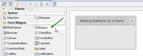
To add a button to your form,
|
Step 1 |
Choose a Button widget from the widgets palette by left-clicking its icon:
|
|
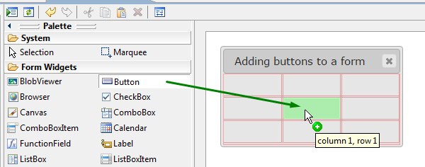
Step 2 |
Select the place in the form where you want to put the button (in the screenshot below, we choose a cell in a Grid panel):
|
|
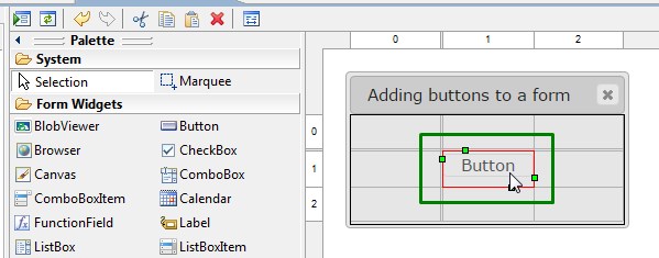
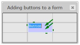
Step 3 |
Left-click the selected spot (cell or sector) to place the button there:
In a Grid panel, you can put a button between two columns and/or rows.
|
|
|
The button is now added to your form, and you can see it in the Structure view.
|
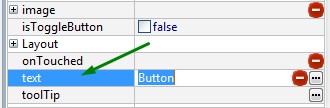
Here you can find out how to change the text of the button in the form:
|
|
|
Here you can find out how to change the text of the button at runtime using ui methods or DISPLAY ... TO statement.
You can change appearance properties of a button in Lycia Form Designer. However, we recommend applying appearance properties via user themes and css.
To apply a property to a button, set its value in the user theme, directly or using filters.
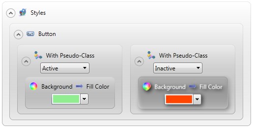
In the example below, we make a button look different depending on whether it is active or inactive by applying Fill Color property with a Pseudo-Class filter.
|
property applied in the user theme |
|
|
theme XML code |
<StyleSheet xmlns="http://querix.com"> <ElementFilter ElementName="Button"> <StyleSheet> <WithPseudoClassFilter PseudoClassName="Active"> <StyleSheet> <DoStyleAction> <SetProperty> <PropertyPath> <PropertyName>Background</PropertyName> <PropertyName>FillColor</PropertyName> </PropertyPath> <PropertyValue type="CustomizedColor" RedColor="144" GreenColor="238" BlueColor="144" Alpha="255" /> </SetProperty> </DoStyleAction> </StyleSheet> </WithPseudoClassFilter> <WithPseudoClassFilter PseudoClassName="Inactive"> <StyleSheet> <DoStyleAction> <SetProperty> <PropertyPath> <PropertyName>Background</PropertyName> <PropertyName>FillColor</PropertyName> </PropertyPath> <PropertyValue type="CustomizedColor" RedColor="255" GreenColor="69" BlueColor="0" Alpha="255" /> </SetProperty> </DoStyleAction> </StyleSheet> </WithPseudoClassFilter> </StyleSheet> </ElementFilter> </StyleSheet> |
|
runtime appearance |
|
In the example below, we use css to change the text style of the button:
.qx-aum-button .qx-text {
padding: 2px;
padding: 5px 10px;
color: white !important;
font: bold 14px "Calibri","Helvetica Neue", Sans-Serif;
}
Buttons are active by default if their associated event exists in the current runtime scope. Otherwise, they will be inactive . However, this behavior can be disabled using the enable property.
At runtime, buttons can also be enabled/disabled.
To activate/deactivate buttons at runtime,
→ assign them with actions with ON KEY / ON ACTION events,
→ display provided symbols to them using DISPLAY ... TO:
DISPLAY "!" TO buttonIdentifier - to activate an inactive button;
DISPLAY "*" TO buttonIdentifier - to deactivate an active button;
DISPLAY "?" TO buttonIdentifier - to return to the automatic activation mode.
To change the button appearance at runtime,
→ DISPLAY <string> TO buttonIdentifier - changes the button label
DISPLAY "Submit" TO bt1
→ DISPLAY <imageUri> TO buttonIdentifier - changes the image IF the button has NO text property tag:
DISPLAY "C:\Program Files\Querix\Lycia 3 Development Suite 7.1\Lycia\images\submit.jpg" TO bt1
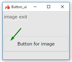
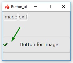
At runtime, buttons can be manipulated with ui methods.
In the example below, we use ui methods to display an image to the button.
|
lycia form designer |
|
|
|
4gl code |
MAIN DEFINE bt_ui1, bt_ui2 ui.Button, image_ui ui.Image, isImageSet SMALLINT
OPEN WINDOW w1 WITH FORM "button_ui_setimage" ATTRIBUTE(BORDER)
LET bt_ui1 = ui.Button.forName("bt1") CALL image_ui.setImageUrl("qx://application/ok.png") CALL bt_ui1.setText("Button for image") CALL bt_ui1.SetEnable(TRUE)
MENU ON ACTION "Image" IF isImageSet THEN LET isImageSet = 0 CALL bt_ui1.SetImage("") ELSE LET isImageSet = 1 CALL bt_ui1.SetImage(image_ui) END IF ON ACTION exit EXIT MENU END MENU END MAIN |
|
|
runtime appearance |
isImageSet = 0 |
isImageSet = 1 |
|
|
|
|
In the example here, we use ui methods to create a toggle button.
Example programs:
CVS server: client.querix.com
CVS repository: /lycia_doc_examples
User: client
Project: user_interface/widgets
Program: button
button_ui
Related articles:
ui Classes and Methods