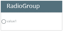
RadioGroup
Form and theme XML code and CSS element selector
Most commonly used form and theme properties
Associated 4gl syntax and ui methods
RadioGroup allows users to choose only one option from the predefined set of mutually exclusive options.
RadioGroup inserted in a GridPanel as seen in Lycia Form Builder:
<RadioGroup visible="true" identifier="f1" gridItemLocation="0,0,1,1">
<Radio title="value1" identifier="f1_1">
<Radio.value>
<StringLiteral stringValue="value_1"/>
</Radio.value>
</Radio>
</RadioGroup>
Theme element filter XML code:
<ElementFilter ElementName="RadioGroup">
...
</ElementFilter>
CSS element selector code:
|
|
|
Most commonly used form properties:
Field:
defaultValue
Layout:
horizontalAlignment / verticalAlignment
dataType
Most commonly used theme properties:
Associated ui methods:
Create ↓
ForName ↓
SetRadios ↓
GetRadios
SetRequired
getRequired
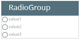
RadioGroup is a widget that allows users to choose only one option from the predefined set of mutually exclusive options.
It consists of a list of radios that correspond to the options provided to an end-user. These options are all visible to the user initially (and can be hidden only if you set a too-small height to the widget):
 Click here to learn about RadioGroup options.
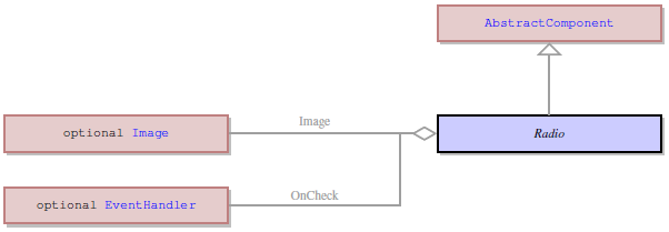
RadioGroup option, or RadioButton (called Radio in the Form Structure) is a separate but dependent widget that cannot exist outside the RadioGroup.
Every RadioGroup option has these properties:
|
identifier |
by default, the identifier of a RadioGroup option derives from the identifier of the RadioGroup – f1 → f1_1, f1_2, f1_3. |
|
title |
is the text the end-user will see as the option they can choose |
|
value |
specifies the actual value that will be passed to the corresponding variable when the RadioGroup option is selected. All values have the same data type specified by the Data type property. |
| AllowNewLines | enables multiple-line text display |
| image | Image to be displayed at the Radio option |
| OnCheck | The event invoked on the Radio checking |
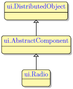
RadioGroup options - unlike combo box options and list box options - do not only have their own properties but also their own ui object, ui.Radio:
|
|
|
Form XML code of a RadioGroup option:
<Radio title="value1" identifier="f1_1">
<Radio.value>
<StringLiteral stringValue="value_1"/>
</Radio.value>
</Radio>
Properties of a RadioGroup option:
value
ui.Radio methods - ui methods associated with RadioGroup options:
|
create() |
creates a ui.Radio object: LET radio= ui.Radio.Create("f1_1") |
|
forName() |
binds a RadioGroup option existing in a .fm2 form to the specified variable of the ui.Radio type: LET radio= ui.Radio.ForName("f1_1") |
|
setAllowNewLines() |
enables multiple-line display to a RadioGroup option: CALL radio.SetAllowNewLines(TRUE) |
|
getAllowNewLines() |
returns whether multiple-line display is allowed for the RadioGroup option |
|
setImage() |
applies an image to a RadioGroup option: CALL radio.SetImage("qx://application/ok.png") |
|
getImage() |
returns the image displayed to the RadioGroup option |
|
setIsChecked() |
sets a RadioGroup option to a selected or deselected state: CALL radio.SetIsChecked(TRUE) |
|
getIsChecked() |
returns whether the RadioGroup option is selected or not |
|
setOnCheck() |
defines what event will be triggered if the RadioGroup option is checked |
|
getOnCheck() |
returns what event will be triggered if the RadioGroup option is checked |
|
setTitle() |
sets a text for the RadioGroup option: CALL radio.SetTitle("New title") |
|
getTitle() |
returns the text of the RadioGroup option |
|
setValue() |
assigns the value to the RadioGroup option: CALL radio.SetValue("my_value") |
|
getValue() |
returns the value of the RadioGroup option |
To add a RadioGroup to your form, drag-and-drop the RadioGroup widget from the Palette to the form in the Design Area. Note that the form must have a Root Container to contain widgets.
To add options, or RadioButtons, click the Add (+) button at the RadioGroup in the Form Structure.
DISPLAY statement can be used with RadioGroups.
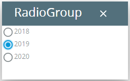
If you display the title of the option to the RadioGroup, this option will be selected at runtime:
DISPLAY "2018" TO f1
At runtime, you can manipulate RadioGroups with ui methods:
|
create() |
creates a ui.RadioGroup object and inserts a RadioGroup to the specified form element: LET rg= ui.RadioGroup.Create("f1") |
|
forName() |
binds a RadioGroup existing in a .fm2 form to the specified variable of the ui.RadioGroup type: LET rg= ui.RadioGroup.ForName("f1") |
|
setRadios() |
contains the list of the RadioGroup options: CALL rg.setRadios([r1,r2]) |
|
getRadios() |
returns the list of the RadioGroup options |
|
setRequired() |
forces the user to enter data in the RadioGroup during the INPUT statement (= it cannot be left empty): CALL cmb.setRequired(1) CALL cmb.setRequired(TRUE) |
|
retRequired() |
returns whether the user must enter data in the RadioGroup during the INPUT statement or it can be left empty |
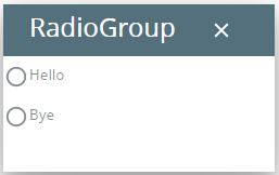
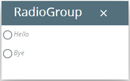
In this program, we populate an existing RadioGroup with two options:
MAIN
DEFINE rg ui.RadioGroup
DEFINE r1,r2 ui.Radio
OPEN WINDOW w WITH FORM "radiogroup_ui" ATTRIBUTE(BORDER)
LET rg= ui.RadioGroup.forName("f1")
LET r1= ui.Radio.Create("r1")
LET r2= ui.Radio.Create("r2")
CALL rg.SetRadios([r1,r2])
CALL r1.SetTitle("Hello")
CALL r2.SetTitle("Bye")
CALL fgl_getkey()
END MAIN
You can change appearance properties of a RadioGroup in Lycia Theme Designer or via css.
To apply a property to a RadioGroup, set its value in the user theme, directly or using filters.
property applied in the user theme:
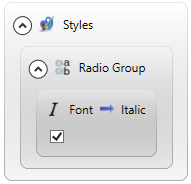
theme XML code:
<?xml version="1.0" encoding="utf-8"?>
<StyleSheet xmlns="http://querix.com">
<ElementFilter ElementName="RadioGroup">
<StyleSheet>
<DoStyleAction>
<SetProperty>
<PropertyPath>
<PropertyName>Font</PropertyName>
<PropertyName>Italic</PropertyName>
</PropertyPath>
<PropertyValue />
</SetProperty>
</DoStyleAction>
</StyleSheet>
</ElementFilter>
</StyleSheet>
or
.qx-aum-radio-group {
font-style: italic;
}
runtime appearance:
If you want to change the appearance of a RadioGroup option as a separate widget, you must use css styles - by the selector, .qx-aum-radio, or via its personal identifier, qx-identifier-xxx