textAlignment
textAlignment specifies the position of the element text relative to the element's borders.
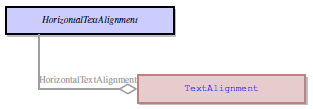
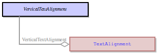
Includes two sub-properties, horizontal textAlignment and vertical textAlignment.
 in Lycia Form Builder
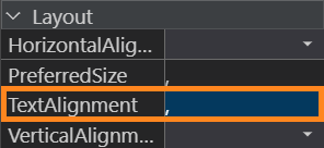

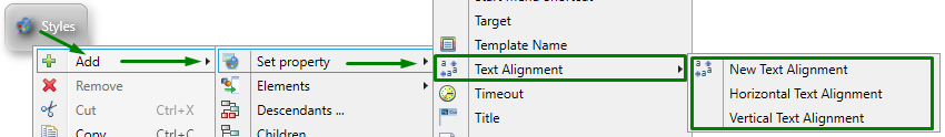
Form XML code:
Theme property filter XML code:
<DoStyleAction>
<SetProperty>
<PropertyPath>
<PropertyName>TextAlignment</PropertyName>
</PropertyPath>
<PropertyValue type="TextAlignment" HorizontalTextAlignment="Left" VerticalTextAlignment="Top" />
</SetProperty>
</DoStyleAction>
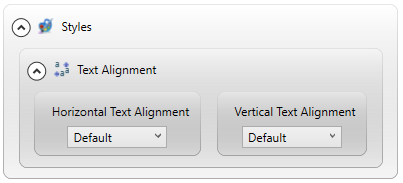
Possible values:
Horizontal:
- Default
- Left
- Center
- Right
Vertical:
- Default
- Top
- Center
- Bottom
Default value:
default, default
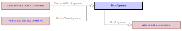
Inheritance diagram
Associated containers, widgets and theme elements:
Associated 4gl syntax:
Influence and behavior:
|
Default |
Text is aligned as it is specified by SystemTheme.css (the actual alignment can be different for different elements) |
|
Horizontal textAlignment |
|
|
Left |
Text is aligned to the left border of the element. |
|
Center |
Text is located at the same distances from both vertical borders of the element. |
|
Right |
Text is aligned to the right border of the element. |
|
Vertical textAlignment |
|
|
Top |
Text is aligned to the top border of the element. |
|
Center |
Text is located at the same distances from both horizontal borders of the element. |
|
Bottom |
Text is aligned to the bottom border of the element. |
By default, text alignment of input fields depends on the data type of the associated variable:
- fields of INTEGER, FLOAT, DECIMAL, and MONEY data types are right-aligned by default, and
- fields of CHAR, VARCHAR, STRING, DATETIME, DATE, and INTERVAL data types are left-aligned by default.
When set to a parent widget, textAlignment is not fully inherited by child widgets.
With ListBox, regardless of the textAligment value, text of the listBox items will be aligned as specified by SystemTheme.css: textAlignment=Right, Center.