ListBox
Form and theme XML code and CSS element selector
Most commonly used form and theme properties
Associated 4gl syntax and ui methods
|
|
ListBox displays structured lists of values which can be selected during the input. Is similar to ComboBox (see differences here). |

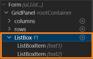
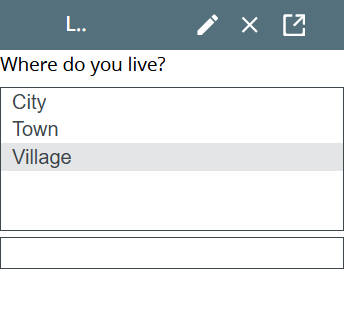
ListBox inserted in a GridPanel as seen in Form Builder:

<ListBox visible="true" identifier="f1" gridItemLocation="0,0,1,1">
<ListBoxItem text="value1">
<ListBoxItem.value>
<StringLiteral stringValue="value_1"/>
</ListBoxItem.value>
</ListBoxItem>
</ListBox>
Theme element filter XML code:
<ElementFilter ElementName="ListBox">
...
</ElementFilter>
CSS element selector code:
|
|
|
Most commonly used form properties:
Field:
Layout:
horizontalAlignment / verticalAlignment
dataType
Most commonly used theme properties:
Associated ui methods:
|
ui.ListBox.getListBoxValues() ui.ListBox.getSelectedItems() setEnableMultiSelection() ↓ getEnableMultiSelection() |
List box is a widget that allows an end-user select one or more option among the available ones.
It consists of a list of options that correspond to the options provided to an end-user. These options are all visible to the user initially (and can be hidden only if you set a too-small height to the widget).
 Difference between a combo box and a list box.
|
|
Combo box |
List box |
|
Show all the available options |
|
|
|
Occupies more space |
|
|
|
Allows selecting the value in the list |
|
|
|
Allows typing the option directly |
|
|
|
Allows multiple selection |
|
|
|
Allows selecting an option absent from the list |
|
|
List box option is a separate but dependent widget that has its own properties but cannot exist outside the list box:
Every ListBox option has these properties:
|
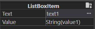
is the text the end-user will see as the option they can choose: text1 |
|
|
specifies the actual value that will be passed to the corresponding variable when the list box option is selected |
Besides these, some ui methods use the index of a list box option to refer to it at runtime (e.g., this and this).
All values have the same data type that can be specified by the Data type property.
To add a ListBox to your form, drag-and-drop the ListBox widget from the Palette to the Design Area. Note that the form must have a Root Container prior to you placing a widget to it.
DISPLAY and INPUT statements can be used with ListBoxes (see the example program, listbox):
INPUT BY NAME f1
DISPLAY f1
If you display the value of the ListBox option to the ListBox, this option will be displayed as selected at runtime (do not confuse with input):
DISPLAY "value1" TO f1
At runtime, list boxes can be manipulated with ui methods.
There are two groups of methods available for list boxes - methods that allow changing the content of a list box and methods that allow changing its properties.
Methods for changing the content of a list box
|
creates an object of the ui.ListBox class: LET lbx= ui.ListBox.Create("f1") For better understanding, try the example program, listbox_ui_00 and ui.ListBox.create. |
|
|
initializes the object of the ui.ListBox class: LET lbx= ui.ListBox.ForName("f1") For better understanding, try the example programs. |
|
|
adds a new option to the list box: CALL lbx.AddItem("added","new") CALL lbx.AddItem(option_value,option_text) For better understanding, try the example program, listbox_ui_00, ui.ListBox.AddItem_01_types, and ui.ListBox.AddItem_02. |
|
|
deletes an option from the list box: CALL lbx.RemoveItem("value") CALL lbx.RemoveItem(remove_option) For better understanding, try the example program, listbox_ui_01_add_remove_clear, ui.ListBox.RemoveItem_01_for, and ui.ListBox.RemoveItem_02_definite. |
|
|
removes all the options from the list box: CALL lbx.Clear() For better understanding, try the example program, listbox_ui_00 and listbox_ui_01_add_remove_clear. |
|
|
returns the number of options in the list box: DISPLAY lbx.GetItemCount() For better understanding, try the example programs. |
|
|
returns the value of the list box option: DISPLAY lbx.GetItemName(4) DISPLAY lbx.GetItemName(input_var) For better understanding, try the example program, ui.ListBox.GetItemName and listbox_ui_02_getitemname_text. |
|
|
returns the text of the list box option: DISPLAY lbx.GetItemText(4) DISPLAY lbx.GetItemText(input_var) For better understanding, try the example program, ui.ListBox.GetItemText, listbox_ui_02_getitemname_text, and listbox_ui_04_getitemtext_gettextof. |
|
|
returns the text of the list box option: DISPLAY lbx.GetTextOf("value") DISPLAY lbx.GetTextOf(value_var) For better understanding, try the example program, ui.ListBox.GetTextOf, and listbox_ui_04_getitemtext_gettextof. |
|
|
returns the index of the list box option: DISPLAY lbx.GetIndexOf("value") DISPLAY lbx.GetIndexOf(value_var) For better understanding, try the example program, ui.ListBox.GetIndexOf. |
|
|
getTag() |
returns the identifier of the list box |
You can populate the ListBox by means of AddItem() method:
MAIN
DEFINE lbx ui.ListBox
DEFINE option_text,option_value STRING
OPEN WINDOW w WITH FORM "lbx" ATTRIBUTE(BORDER)
LET lbx= ui.ListBox.forName("f1")
MENU
ON ACTION "add"
LET option_text=fgl_winprompt(5,3,"Enter the text for your new list box option.","",25,0)
LET option_value=fgl_winprompt(5,3,"Enter the value of your new list box option.","",25,0)
IF option_value IS NOT NULL THEN
CALL lbx.AddItem(option_value,option_text)
ELSE
LET option_value=fgl_winprompt(5,3,"You must enter the value of your new list box option.","",25,0)
END IF
ON ACTION "exit"
EXIT MENU
END MENU
END MAIN
Methods for changing the properties of a list box
|
allows selecting several options at a time: CALL lbx.setSetEnableMultiSelection(1) CALL lbx.setSetEnableMultiSelection(TRUE) For better understanding, try the example program, enableMultiSelection_ui. |
|
|
renames the list box options: CALL lbx.SetListBoxValues("new_option") CALL lbx.SetListBoxValues(["new_option1","new_option2","new_option3"]) For better understanding, try the example program, listbox_ui_04_set_getlistboxvalues. |
|
|
selects one or more list box option: CALL lbx.setSelectedItems(1) For better understanding, try the example program, listbox_ui_05_set_getselecteditems. |
The table above describes only the setters for changing the ListBox's properties. Getters are available as well.
In this program, you enable multiselection for your ListBox (enableMultiSelection_ui):
MAIN
DEFINE lbx ui.ListBox
OPEN WINDOW w WITH FORM "enablemultiselection_ui" ATTRIBUTE(BORDER)
LET lbx = ui.ListBox.Forname("lbx1")
MENU
ON ACTION "check"
DISPLAY "enableMultiSelection = ", lbx.getEnableMultiSelection()
ON ACTION "change"
IF UPSHIFT(fgl_winquestion("", "Do you want to enable multiselection?", "Yes", "Yes|No", "question", 1))="YES" THEN
CALL lbx.setEnableMultiSelection(1)
DISPLAY "enableMultiSelection = ", lbx.getEnableMultiSelection()
ELSE
CALL lbx.setEnableMultiSelection(0)
DISPLAY "enableMultiSelection = ", lbx.getEnableMultiSelection()
END IF
ON ACTION "exit"
EXIT MENU
END MENU
END MAIN
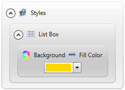
You can change appearance properties of a ListBox in Lycia Theme Designer or via css.
To apply a property to a ListBox, set its value in the user theme, directly or using filters.
In the example below, we change the background color of a ListBox when not in input by applying the Fill Color property directly to the element (without additional filters).
|
property applied in the user theme |
|
|
theme XML code |
Click here see the theme XML code.
<?xml version="1.0" encoding="utf-8"?> <StyleSheet xmlns="http://querix.com"> <ElementFilter ElementName="ListBox"> <StyleSheet> <DoStyleAction> <SetProperty> <PropertyPath> <PropertyName>Background</PropertyName> <PropertyName>FillColor</PropertyName> </PropertyPath> <PropertyValue type="CustomizedColor" RedColor="255" GreenColor="215" BlueColor="0" Alpha="255" /> </SetProperty> </DoStyleAction> </StyleSheet> </ElementFilter> </StyleSheet> |
|
runtime behavior |
|
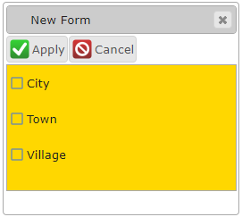
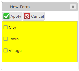
In the example below, we use css to do exactly the same - change the background color of a ListBox:
|
css code |
.qx-aum-list-box { background-color: yellow !important; } |
|
changed runtime appearance |
|
If you want to change the appearance of the options of a ListBox, you must use css styles and use the selector, option.
In the example below, we change the background color of all the 2nd option:
|
css code |
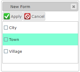
.qx-identifier-f1 .qx-option:nth-child(2) { background-color: aquamarine; } |
|
changed runtime appearance |
|