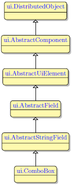
ComboBox
Form and theme XML code and CSS element selector
Most commonly used form and theme properties
Associated 4gl syntax, functions, and ui methods
ComboBox is a widget that allows selecting one option from the drop-down list of options.
Is similar to ListBox (see differences here).

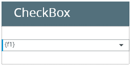
ComboBox inserted in a GridPanel as seen in FormBuilder
<ComboBox visible="true" identifier="f1" gridItemLocation="0,0,1,1">
<ComboBoxItem text="value1" identifier="f1_1">
<ComboBoxItem.value>
<StringLiteral stringValue="value1"/>
</ComboBoxItem.value>
</ComboBoxItem>
</ComboBox>
Theme element filter XML code:
<ElementFilter ElementName="ComboBox">
...
</ElementFilter>
CSS element selector code:
|
|
|
Most commonly used form properties:
Field:
notNull
required
editable (unique to ComboBox)
Layout:
horizontalAlignment / verticalAlignment
dataType
Most commonly used theme properties:
Associated functions:
Associated ui methods: ↓
|
Create() GetAutonext() SetEditable() GetEditable() SetHelperText() GetHelperText() |
SetLabelText() GetLabelText() GetMaxLength() SetRequired() GetRequired() |
Clear() GetItemCount() GetTableName() GetColumnName() GetTag() |
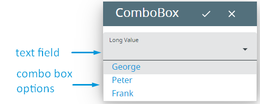
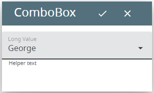
Combo box is a widget that allows an end-user select one option among the available ones or provide his/her own variant.
It consists of
- a single-line editable text field where you can enter your variant, and
- a list of options that correspond to the options provided to an end-user. These options are initially hidden and open only when you press the drop-down button.
 Difference between a combo box and a list box.
|
|
Combo box |
List box |
|
Show all the available options |
|
|
|
Occupies more space |
|
|
|
Allows selecting the value in the list |
|
|
|
Allows typing the option directly |
|
|
|
Allows multiple selection |
|
|
|
Allows selecting an option absent from the list |
|
|
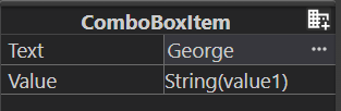
Combo box option is a separate but dependent widget that has its own properties but cannot exist outside the combo box:

Every combo box option has these properties:
|
is the text the end user will see as the option they can choose: George |
|
|
specifies the actual value that will be passed to the corresponding variable when the combo box option is selected |
Besides these, some ui methods use the index of a combo box option to refer to it at runtime (e.g., this and this).
All values have the same data type that can be specified by the Data type property:
To add a ComboBox to your form, drag-and-drop the ComboBox widget from the Palette to the Design Area. Note that the form must have a Root Container prior to you placing a widget to it.
DISPLAY and INPUT statements can be used with ComboBoxes (see the example program, combobox):
INPUT BY NAME f1
DISPLAY f1
If you display the value of the ComboBox option to the ComboBox, this option will be displayed to the ComboBox's text field at runtime (not input):
DISPLAY "value1" TO f1
As a programming language, 4GL provides a number of built-in functions used to manipulate a combo box:
|
removes the options of a combo box specified by their index |
|
|
returns the number of options in the combo box |
|
|
returns the index of the option that has the specified value |
|
|
returns the text of the option specified by its index |
|
|
adds an option to the combo box taking the future index as a parameter |
|
|
sorts the options in the ascending or descending order by their text |
|
|
adds all the original options (and not only removed ones) to the combo box |
|
|
changes the text of the specified option |
You can try these functions in the example program, combobox_02_functions.
At runtime, combo boxes can be manipulated with ui methods.
There are two groups of methods available for combo boxes - methods that allow changing the content of a combo box and methods that allow changing its properties.
Methods for changing the content of a combo box
|
create() |
creates a ui.ComboBox object: LET cmb = ui.ComboBox.Create("f1") For better understanding, try the example program, combobox_ui_01. |
|
binds a ComboBox existing in a .fm2 form to the specified variable of the ui.ComboBox type: LET cmb = ui.ComboBox.ForName("f1") For better understanding, try the example programs. |
|
|
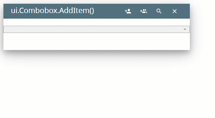
adds a new option to the ComboBox: CALL cmb.AddItem("added", "new") CALL cmb.AddItem(option_value, option_text) For better understanding, try the example program, combobox_ui_02_add_remove_clear. |
|
|
deletes an option from the ComboBox: CALL cmb.RemoveItem("value") CALL cmb.RemoveItem(remove_option) For better understanding, try the example program, combobox_ui_02_add_remove_clear. |
|
|
clear() |
removes all the options from the ComboBox: CALL cmb.Clear() For better understanding, try the example program, combobox_ui_02_add_remove_clear. |
|
getItemCount() |
returns the number of options in the ComboBox: DISPLAY cmb.GetItemCount() For better understanding, try the example programs. |
|
returns the value of the ComboBox option: DISPLAY cmb.GetItemName(4) DISPLAY cmb.GetItemName(input_var) For better understanding, try the example program, combobox_ui_03_getitemname_text. |
|
|
returns the text of the ComboBox option: DISPLAY cmb.GetItemText(4) DISPLAY cmb.GetItemText(input_var) For better understanding, try the example programs. |
|
|
returns the text of the ComboBox item: DISPLAY cmb.GetTextOf("value") DISPLAY cmb.GetTextOf(value_var) For better understanding, try the example program, combobox_ui_04_getitemtext_gettextof. |
|
|
returns the index of the ComboBox option: DISPLAY cmb.GetIndexOf("value") DISPLAY cmb.GetIndexOf(value_var) For better understanding, try the example program, combobox_ui_05_getitemtext_getindexof. |
|
|
getTag() |
returns the ComboBox identifier |
|
specifies the default function that will initialize every ui.ComboBox object newly created by the 4gl application: CALL ui.ComboBox.setDefaultInitializer("init_func") |
In this program, you populate the ComboBox by means of AddItem() method:
MAIN
DEFINE cmb ui.ComboBox
DEFINE option_text, option_value STRING
OPEN WINDOW w WITH FORM "cmb" ATTRIBUTE(BORDER)
LET cmb = ui.ComboBox.forName("f1")
MENU
ON ACTION "add"
LET option_text = fgl_winprompt(5, 3, "Enter the text for your new combo box option.", "", 25, 0)
LET option_value = fgl_winprompt(5, 3, "Enter the value of your new combo box option.", "", 25, 0)
IF option_value IS NOT NULL THEN
CALL cmb.AddItem(option_value, option_text)
ELSE
LET option_value = fgl_winprompt(5, 3, "You must enter the value of your new combo box option.", "", 25, 0)
END IF
ON ACTION "exit"
EXIT MENU
END MENU
END MAIN
Methods for changing the properties of a combo box
|
specifies whether input must move to the next field after the value specified for maxLength is reached: CALL cmb.setAutonext(1) CALL cmb.setAutonext(TRUE) For better understanding, try the example program, combobox_ui_06_autonext_tocase. |
|
|
setEditable() |
specifies whether you can select an option by typing its text directly to the text field of a ComboBox: CALL cmb.setEditable(0) CALL cmb.setEditable(FALSE) For better understanding, try the example program, combobox_ui_08_editable. |
|
specifies maximum length in bytes for string input to an editable ComboBox: CALL cmb.setMaxLength(10) For better understanding, try the example program, combobox_ui_06_autonext_tocase. |
|
|
SetRequired() |
forces the user to enter data in the ComboBox during the INPUT statement (= it cannot be left empty): CALL cmb.setRequired(1) CALL cmb.setRequired(TRUE) For better understanding, try the example program, combobox_ui_10_setrequired. |
|
specifies the case of a text input to the ComboBox: CALL cmb.setToCase("up") For better understanding, try the example program, combobox_ui_06_autonext_tocase. |
|
|
setHelperText() |
sets the helper text for the ComboBox (material design): CALL cmb.SetHelperText("helperText") For better understanding, try the example program, combobox_ui_09_helpertext_labeltext. |
|
setLabelText() |
sets the label text for the ComboBox (material design): CALL cmb.SetLabelText("labelText") For better understanding, try the example program, combobox_ui_09_helpertext_labeltext. |
The table above describes only setters for changing the ComboBox's properties. All the getters methods are available as well.
In this program, you make the ComboBox required - so that an end-user will not be able to proceed to another field in INPUT (combobox_ui_10_setrequired):
MAIN
DEFINE cmb ui.ComboBox
DEFINE f1, f2 STRING
OPEN WINDOW w WITH FORM "combobox_ui_10_setrequired" ATTRIBUTE(BORDER)
LET cmb = ui.ComboBox.forName("f1")
CALL cmb.setRequired(TRUE)
INPUT BY NAME f1 WITHOUT DEFAULTS
INPUT BY NAME f2 WITHOUT DEFAULTS
CALL fgl_getkey()
END MAIN
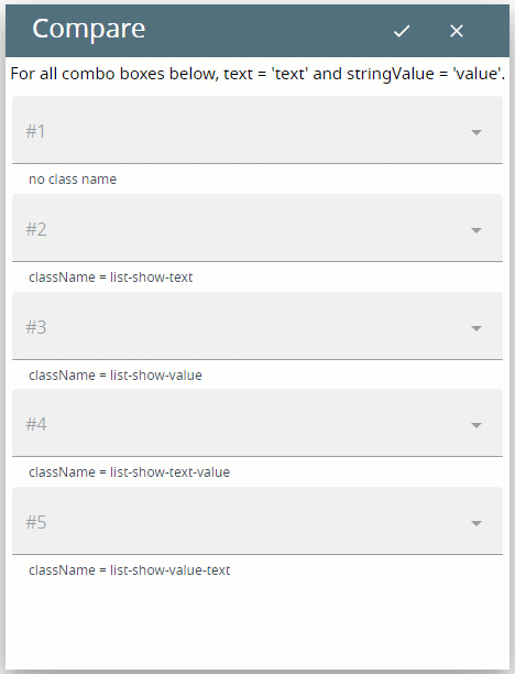
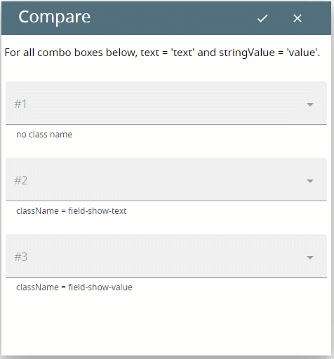
You can use different class names to specify how texts and values of ComboBox options are displayed to the end user at runtime.
Classes that specify how ComboBox options are displayed in the drop-down list:
list-show-text – the text of the option is displayed in the drop-down list
<ComboBox visible="true" identifier="f2" gridItemLocation="0,1,1,1" classNames="list-show-text">
<ComboBoxItem text="text">
<ComboBoxItem.value>
<StringLiteral stringValue="value"/>
</ComboBoxItem.value>
</ComboBoxItem>
</ComboBox>
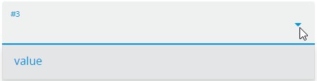
list-show-value – the value of the option is displayed in the drop-down list
<ComboBox visible="true" identifier="f3" gridItemLocation="0,1,1,1" classNames="list-show-value">
<ComboBoxItem text="text">
<ComboBoxItem.value>
<StringLiteral stringValue="value"/>
</ComboBoxItem.value>
</ComboBoxItem>
</ComboBox>
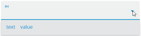
list-show-text-value – both text and value of the option are displayed in the drop-down list, text precedes
<ComboBox visible="true" identifier="f4" gridItemLocation="0,1,1,1" classNames="list-show-text-value">
<ComboBoxItem text="text">
<ComboBoxItem.value>
<StringLiteral stringValue="value"/>
</ComboBoxItem.value>
</ComboBoxItem>
</ComboBox>
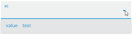
list-show-value-text – both text and value of the option are displayed in the drop-down list, value precedes
<ComboBox visible="true" identifier="f5" gridItemLocation="0,1,1,1" classNames="list-show-value-text">
<ComboBoxItem text="text">
<ComboBoxItem.value>
<StringLiteral stringValue="value"/>
</ComboBoxItem.value>
</ComboBoxItem>
</ComboBox>
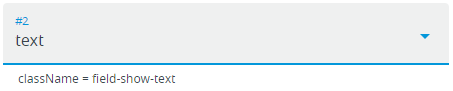
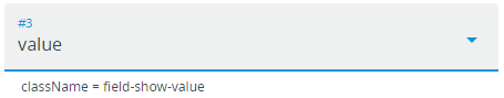
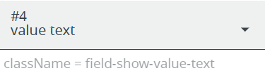
Classes that specify how ComboBox options are displayed to its field when selected:
field-show-text – when the option is selected, its text is displayed to the field of the combo box
<ComboBox visible="true" identifier="f2" gridItemLocation="0,1,1,1" classNames="field-show-text">
<ComboBoxItem text="text">
<ComboBoxItem.value>
<StringLiteral stringValue="value"/>
</ComboBoxItem.value>
</ComboBoxItem>
</ComboBox>
field-show-value – when the option is selected, its value is displayed to the field of the combo box
<ComboBox visible="true" identifier="f3" gridItemLocation="0,1,1,1" classNames="field-show-value">
<ComboBoxItem text="text">
<ComboBoxItem.value>
<StringLiteral stringValue="value"/>
</ComboBoxItem.value>
</ComboBoxItem>
</ComboBox>
field-show-text-value – when the option is selected, its text is displayed to the field of the combo box
<ComboBox visible="true" identifier="f2" gridItemLocation="0,1,1,1" classNames="field-show-text-value">
<ComboBoxItem text="text">
<ComboBoxItem.value>
<StringLiteral stringValue="value"/>
</ComboBoxItem.value>
</ComboBoxItem>
</ComboBox>
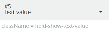
field-show-value-text – when the option is selected, its value is displayed to the field of the combo box
<ComboBox visible="true" identifier="f3" gridItemLocation="0,1,1,1" classNames="field-show-value">
<ComboBoxItem text="text">
<ComboBoxItem.value>
<StringLiteral stringValue="value"/>
</ComboBoxItem.value>
</ComboBoxItem>
</ComboBox>
Try the example programs, combobox_05_list_display and combobox_06_field_display, to see the effect of these class names in action.
Click here to view how these class names work at runtime.
List display:
Field display:
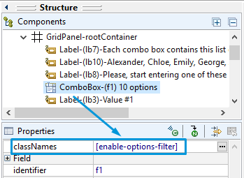
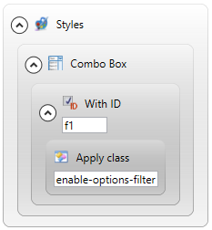
With Material Design, ComboBox supports autocomplete.
To switch on this feature, you must set enable-options-filter as the value for the classNames property in Lycia Form Designer or apply the Apply Class... filter in Lycia Theme Designer.
Runtime behavior:
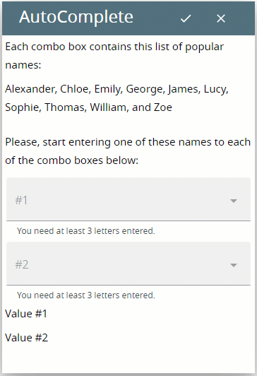
Try the example program, combobox_03_autocomplete, to learn more about the autocomplete feature.
You can change the appearance of a ComboBox in Lycia Theme Designer or via css.
To apply a property to a ComboBox, set its value in the user theme, directly or using filters.
property applied in the user theme:
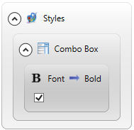
theme XML code:
<?xml version="1.0" encoding="utf-8"?>
<StyleSheet xmlns="http://querix.com">
<ElementFilter ElementName="ComboBox">
<StyleSheet>
<DoStyleAction>
<SetProperty>
<PropertyPath>
<PropertyName>Font</PropertyName>
<PropertyName>Bold</PropertyName>
</PropertyPath>
<PropertyValue />
</SetProperty>
</DoStyleAction>
</StyleSheet>
</ElementFilter>
</StyleSheet>
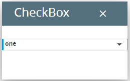
runtime behavior:
You can also use css styles to change the appearance of ComboBoxes and their options.