Label
Form and theme XML code and CSS element selector
Most commonly used form and theme properties
Label defines a text area to display a read-only text, image, or both.
<Label text="Label"identifier="lb1">
<Label.onInvoke>
<ActionEventHandler type="actioneventhandler"actionName="actDisplay"/>
</Label.onInvoke>
</Label>
Theme element filter XML code:
<ElementFilter ElementName="Label">
...
</ElementFilter>
CSS element selector code:
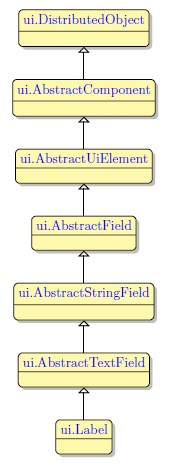
Most commonly used form properties:
image
Most commonly used theme properties:
Image:
Image Url
Image Scaling
Image Position
Size
Size
Associated ui methods:
SetImage
GetImage
SetText →
GetText
SetIsDynamic →
GetIsDynamic →
SetAllowNewlines →
GetAllowNewlines
Create
ForName
In 4gl, there are two types of labels - static and dynamic.
Static labels cannot be modified at runtime. These labels are created by the DISPLAY...AT statement.
Dynamic labels can be modified at runtime. These labels can be made dynamic - by setting the isDynamic property to true in Form Builder, LTD, or via setIsDynamic().
To add a Label to your form, drag-and-drop a Label widget from the Palette to the Design Area. Mind that the form must have at least one container (a Root Container) to be able to contain widgets.
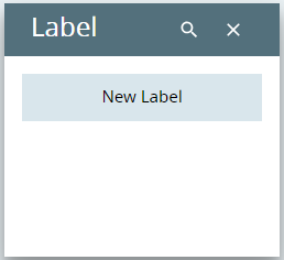
With Material Design, the label text is aligned to center, center.
Main Properties
Main properties for labels are text and image.
You can change the text of a label in the .fm2 form (using the master or user theme, via ui methods, or by the DISPLAY...TO statement.
Here you can find out how to change the image of the label both when designing the form or at runtime.
 When you use DISPLAY...TO to change the text and image of a label at runtime, you must remember this:
If you want to display an image to your label like this:
DISPLAY "qx://application/image.svg" TO lb1
your label must have an <Label.image></Label.image> XML element:
<Label.image>
<Image/>
</Label.image>
If it does, then the label will get an image at runtime:
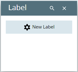
If it does not, then Lycia will consider your display as a simple text:
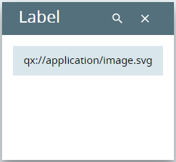
The <Label.image></Label.image> XML element appears in your .fm2 form when you set any image-related property in LFD.
At runtime, labels can be manipulated with ui methods:
|
create() |
creates an object of the ui.Label class: LET lb= ui.Label.Create("lb1") |
|
forName() |
initializes the object of the ui.Label class: LET lb= ui.Label.ForName("lb1") |
|
setAllowNewLines() |
enables multiple-line display to the label: CALL lb.SetAllowNewLines(TRUE) |
|
getAllowNewLines() |
returns whether multiple-line display is allowed for the label |
|
setImage() |
sets the image for the label (requires setImageURL()): CALL lb.SetImage(img_var) |
|
getImage() |
returns the image set for the label |
|
setIsDynamic() |
makes the dynamic label static: CALL lb.SetIsDynamic(FALSE) |
|
getIsDynamic() |
returns whether the label is static or dynamic |
Here you can read how to make a label static or dynamic using the setIsDynamic() method.
You can change appearance properties of a label via .qxtheme themes and CSS styles.
To apply a property to a label, set its value in the user theme, directly or using filters.
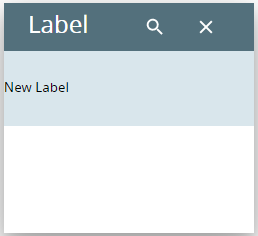
In the example below, we make a label look different by applying Background and Element Border properties with a With ID filter (the label has no text).
property applied in the user theme:
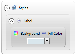
theme XML code
Spread to see the theme XML code.
<?xml version="1.0" encoding="utf-8"?>
<StyleSheet xmlns="http://querix.com">
<ElementFilter ElementName="Label">
<StyleSheet>
<DoStyleAction>
<SetProperty>
<PropertyPath>
<PropertyName>Background</PropertyName>
<PropertyName>FillColor</PropertyName>
</PropertyPath>
<PropertyValue type="CustomizedColor" RedColor="217" GreenColor="230" BlueColor="236" Alpha="255" />
</SetProperty>
</DoStyleAction>
</StyleSheet>
</ElementFilter>
</StyleSheet>
runtime appearance:
In the example below, we use CSS to change the style of the label text:
.qx-aum-label .qx-text {
padding: 2px;
padding: 5px 10px;
color: white !important;
font: bold 14px "Calibri","Helvetica Neue", Sans-Serif;
}
Label: Rating Bar

By assigning the label a couple of classes, you can turn it into a Rating Bar, assign colours to it, specify the value, and set the max value:
|
Classes |
Purpose |
|
rating |
Turn a Label into a Rating Bar. A mandatory class for this feature. |
|
rating-max-<maxvalue> |
Specify a maximum value of a Rating Bar (5 or 10). Example: rating-max-10. Default (if not specified): max=5. |
| rating-value-<value> | Display a certain value to the Rating Bar (amount of stars of the max value). Example: rating-value-5. Default (if not specified): value=0 |
The colour of the Rating Bar follows the current colour of the Label. However, you can also specify the appearance of your Rating Bars using CSS ↑.
You can also turn your labels into tags:

To do that, add classes:
|
Classes |
Result |
|
tag |
Turns a Label into a Tag. A mandatory class for this feature. |
|
tag, attribute_red |
Turn a Label into a Tag, uses a built-in Lycia class attribute_red. |
|
tag, attribute_red, attribute_reverse |
Turn a Label into a Tag, uses a built-in Lycia class attribute_red with the colour inversion for the text appearance. |
|
tag, attribute_red, attribute_dim |
Turn a Label into a Tag, uses a built-in Lycia class attribute_red with the colour dimming for the text appearance. |
Alternatively, you can specify custom colors in the CSS file (e.g. UserTheme.css) and then add that custom class to the Label (in the example below, the custom class is called custom1. The custom class must have two variables - the background colour variable --md3-bg and the foreground colour variable --md3-fg:
.custom1 {
  --md3-bg: #DBEAFE !important;
  --md3-fg: #1E40AF !important;
}

Label: Avatar
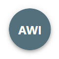
To turn a Label into an Avatar, add the avatar class to the Label widget and fill in the text property. This will turn a widget into a circular icon and render the text value as an abbreviation (in the example below, the text value is Avatar Without Image):
Example:
Customization
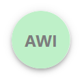
- Specify colours for the label with predefined classes or custom CSS classes:
<Label isDynamic="true" text="Avatar Without Image" visible="true" verticalAlignment="Center" horizontalAlignment="Center" classNames="avatar, attribute_green, attribute_reverse, attribute_bold, attribute_dim" gridItemLocation="3,0,1,2" identifier="ava0">
Example:
- Specify an image for the widget using the Image property:
<Label isDynamic="true" text="Avatar Without Image" visible="true" verticalAlignment="Center" horizontalAlignment="Center" classNames="avatar,attribute_green,attribute_reverse,attribute_bold,attribute_dim" gridItemLocation="3,0,1,2" identifier="ava0">
	<Label.image>
		<Image imageUrl="qx://application/ava_01.png" />
	</Label.image>
Example:

- Fill in the toolTip property with a string or an HTML entity; this will produce a one- or two-symbol inscription in the lower-right corner of the avatar:
<Label isDynamic="true" text="Avatar Without Image" toolTip="✓" visible="true" verticalAlignment="Center" horizontalAlignment="Center" classNames="avatar,attribute_green,attribute_reverse,attribute_bold,attribute_dim" gridItemLocation="3,0,1,2" identifier="ava0"> <Label.image> <Image imageUrl="qx://application/ava_01.png" /> </Label.image>
Examples:

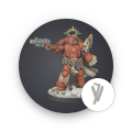
-
There are two predefined sizes of the Avatar - normal size (72px) and small size (40px). To get a smaller avatar, just add avatar-small class to the Label widget.