Border Properties
 Border allows to set the border for almost any element available
in Theme Designer, e.g. for a toolbar button, a form widget, etc.
Border allows to set the border for almost any element available
in Theme Designer, e.g. for a toolbar button, a form widget, etc.
Border () is a group property which sets specific properties of the parent element border. To create a border for any object you need to set the following properties as the minimum requirement:
- Border Theme
- Thickness
Other properties are optional and their effect in some cases depends on the border theme you've selected. For example to be able to see a line border you need to add the border brush that will change the color of the border. On the other hand, a raised etched border does not need color to be visible.
Element Border
ElementBorder is a set of properties that create a border around the
object.
ElementBorder itself has three possible types of borders:
- Line border: the object is surrounded by a line of the given color and thickness. Requires the Border Brush applied to be visible.
- Etched border: a thin border around the object which is raised or lowered a little above the background. Border Brush is not required.
- Bevel border: a thick border raising or lowering the object itself a little above the background. Border Brush is not required.
Is Raised: The property which specifies whether the bevel or etched border is to be raised (checked) or lowered (unchecked).
When a border type is specified, a list of border set-up properties appears. They are:
- borderBrush - sets up the border color
- cornerRadius - sets up the radius of the border corners curve
- Thickness - specifies the border thickness. If set to 0, the border is not displayed.
Associated containers, widgets and theme elements:
The most common border theme is the line border when the outline of an object is just represented by a simple line of the given thickness and color.
In LFD (once switched on), the name of this property is elementBorder.
Border Brush
 Border Brush is an option
which specifies the color of the border. As with any other color option,
you can select from system colors or chose a custom one. If you do not
specify the border brush, the border will be invisible, if its border
theme is a 'Line Border' one.
Border Brush is an option
which specifies the color of the border. As with any other color option,
you can select from system colors or chose a custom one. If you do not
specify the border brush, the border will be invisible, if its border
theme is a 'Line Border' one.
Thickness
 Thiknesssets the border thickness.
Possible values:
Left
Top
Right
Bottom
You can correspondingly specify the thickness of each border side in pixels either by moving the slider to a predefined value (from -1 to 100) or by entering your own value into the provided text field.
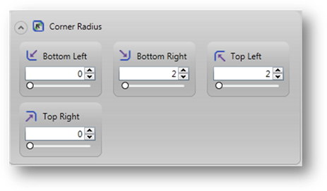
Corner Radius
 The
Corner Radius property option specifies the radius of border corners rounding.
It is optional and is used only for adjusting the border appearance.
The
Corner Radius property option specifies the radius of border corners rounding.
It is optional and is used only for adjusting the border appearance.
Possible values:
bottom left
bottom right
top left
top right